Let’s focus on Pictures
My “advice” isn’t from Social Media or achieving Association Distinctions. – It’s from forty years of real-life “on-the-ground” experience as a job. – Conflict in the Philippines 1987.
A Lifetime of Professional Knowledge to Pass On.
Everyone “Takes Photos”. Few Understand “Pictures”.
– This is WHY Most Photographs Fail.
Let’s Focus on Pictures.
You already have The Cameras. – Now let’s focus on The Pictures.
Artistic Vision, Intentional Style, A Professional Way of Seeing.
Create images that stand out from the crowd.
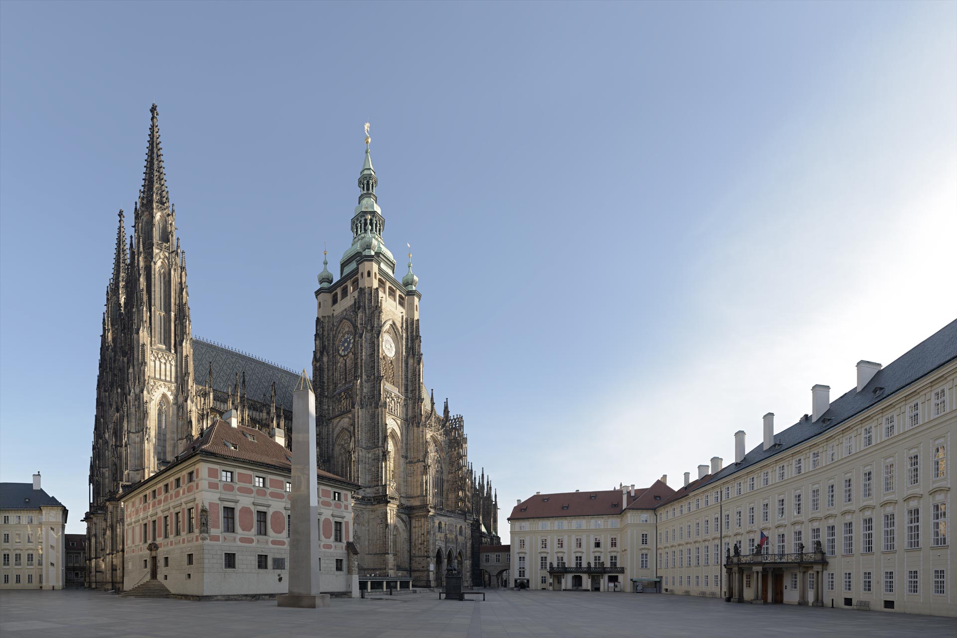
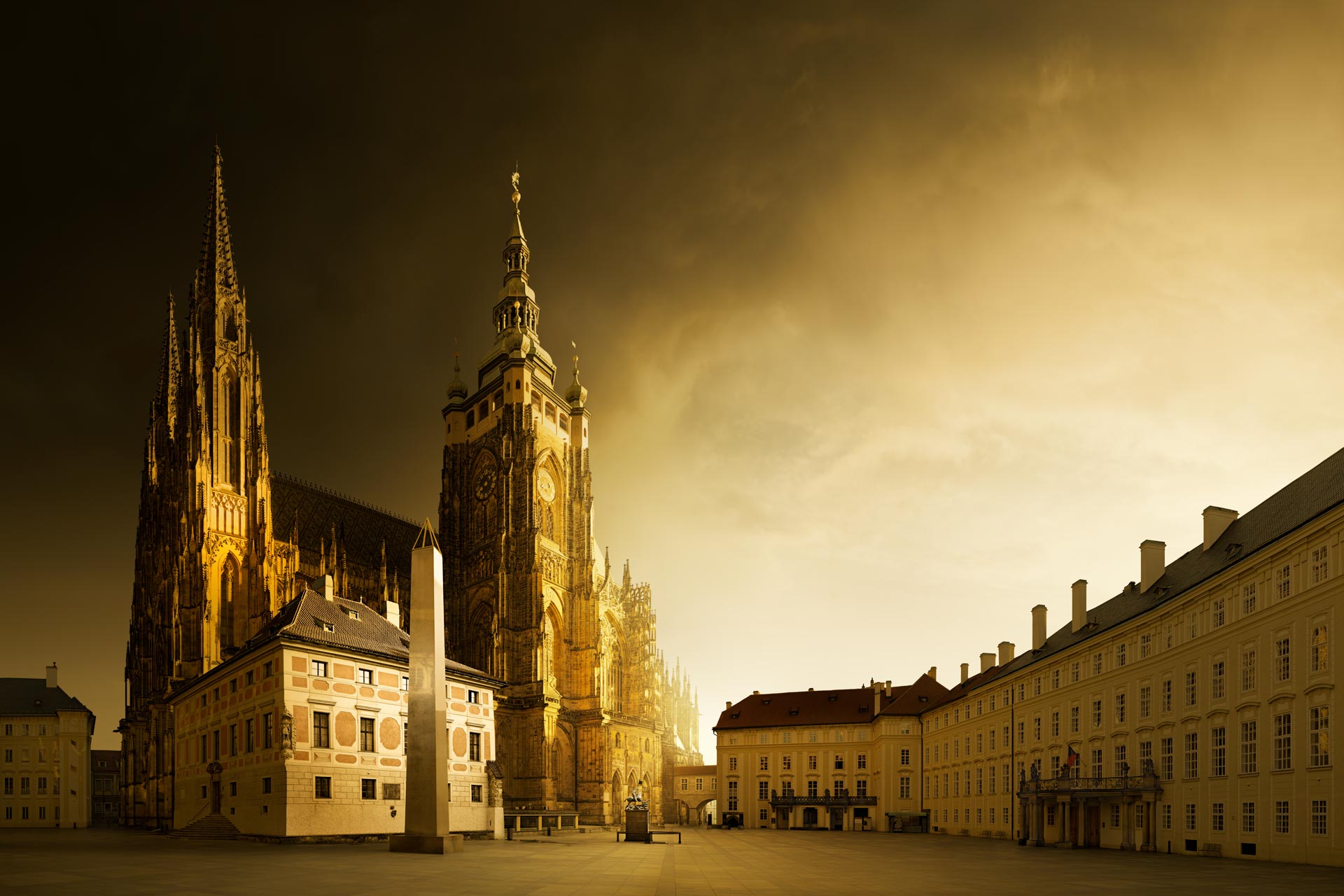
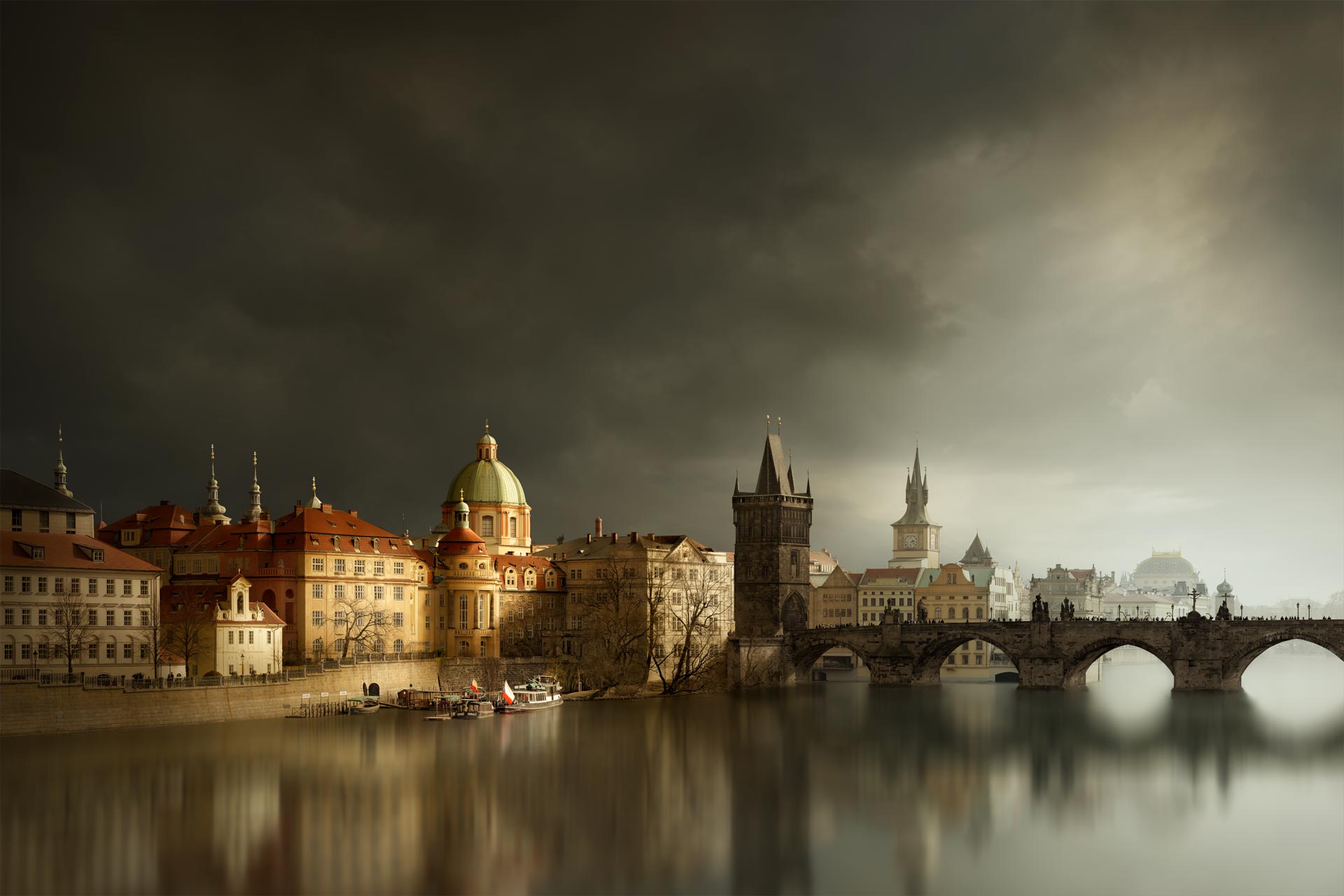
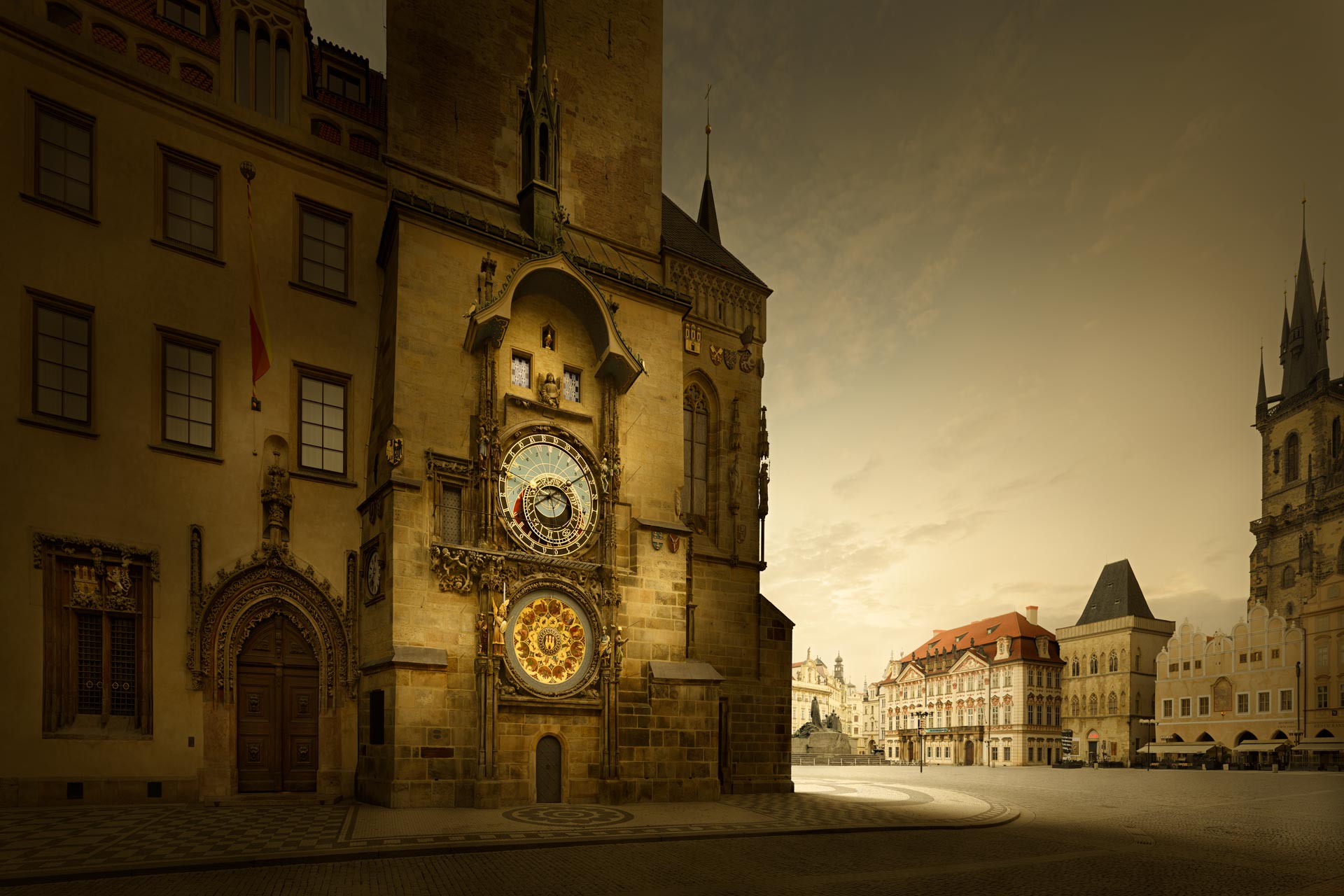
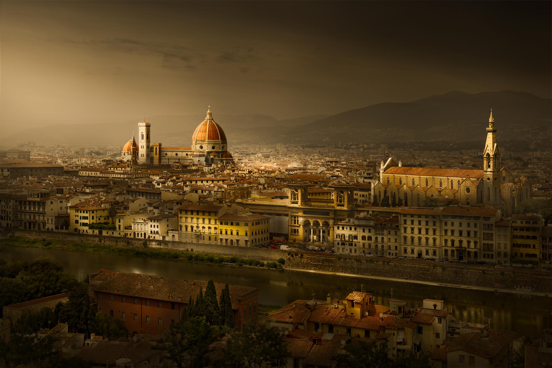
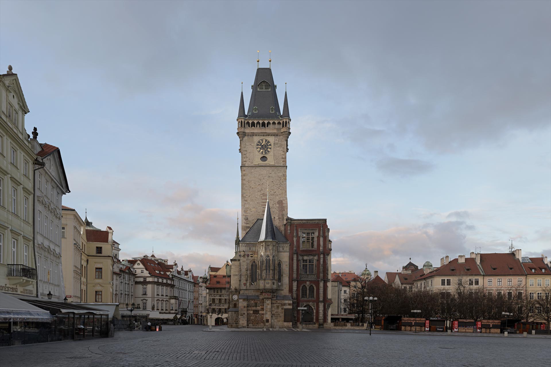
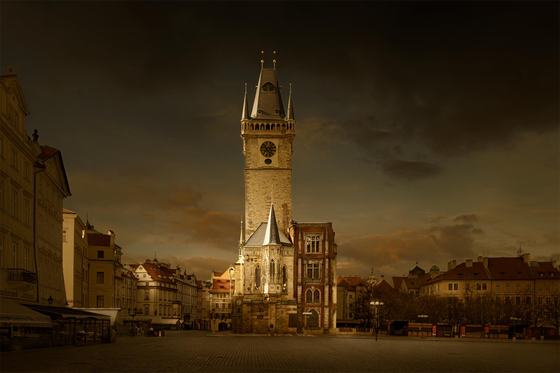
The Story is About Light: I want to show you the light on the beautiful architecture of Prague, Czech Republic.
– The three-dimensional quality gives it realism. The artistic treatment triggers curiosity.
David Osborn Photography.
Why Some Photographs Work – And Most Don’t.
“Stop Taking Photos That Fail” – It’s all about Visual Storytelling.
Why do some photos instantly grab your attention and jump out? – What is it they do, that I don’t know? – I’m going to tell you. Good photography is within everyone’s reach because it has simple underlying principles that I will explain. If you don’t know these principles, you will struggle to make good photography. – The key is understanding “The Viewer” and prioritising – The Picture.
Think of Good Photography as a “Theatrical Play in a Single Image”
– Its job: “Stop, Captivate and Reward The Viewer”.
For Best Self-Learning Benefit:
Read the tutorial slowly while comparing my points to your own images. Also, compare my points to other photographers’ images that you do like, and those you don’t. – You’ll learn a lot!
Let’s get started.
“Early Days”
Forty Years of Professional Photography Experience.
Part 01: Early Days.
What Forty Years of Professional Experience Taught Me.
“Think More. Shoot Less”.
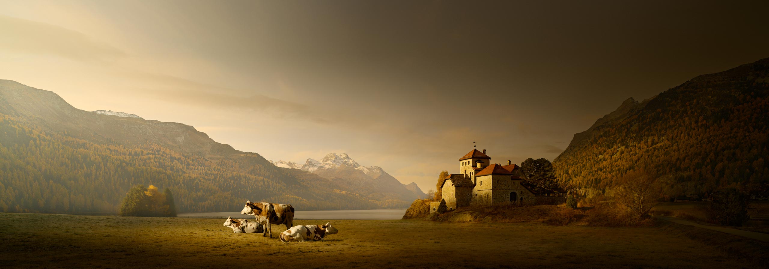
The Subject is the Cows. The Context is the Swiss Alps. The Mood is Painterly Morning Light.
“Subject, Context & Mood” – My Formula For Forty Years.
Early Days
The Biggest Lesson I learned was to – “Think More, and Shoot Less”.
Across four decades working at the highest levels of professional photography – from photographing world leaders, royalty, and major global events for Reuters and The Australian, to long‑form commercial commissions across Europe, Asia, Australia, and the United States – including project managing the six‑year documentation of the £4 billion Heathrow Terminal 5 construction. – I learned how professionals create strong images every time while under pressure. Those years taught me the mindset, clarity, and decision‑making process that separate the confident photographers from those who rely on luck. – But with all that experience under my belt now, I look back, and it started very differently.
Has your mind ever gone blank, you don’t know what to shoot or can’t decide if what you’re looking at will make a good photo? – Have you looked at a scene and you know it’s a good picture, but you don’t know how to make it a good picture? – Now imagine that with your client standing next to you, asking, “What’s the first picture”? A nightmare. I used to bury my head in my camera bag, pretending to find something just to take a moment to calm down and destress. – I realised very early on, as a working photographer, that I needed a fast, efficient, logical, and reliable system for creating good photographs every time. – “Subject, Context & Mood” is that system, and I’ve used it for over 40 years.
When I began working as a photographer, I thought my job was to shoot everything; so that my client or picture editor had a good selection of images to choose from. I was the photographer, they were the picture editor, and they chose the best image. This couldn’t be more wrong for two reasons. – First, you never had the luxury of time to shoot everything. Second, even if you did shoot everything but didn’t know why you were taking the picture, it didn’t matter how many shots you took – you still wouldn’t have one shot that summed up the “Story”. – You don’t have time to shoot everything, so you have to find a way to invest your time in shooting quality. – Learn to think more, and shoot less.

Photography is about the passion for finding great pictures. Not awards or letters after your name!
Solution
Then, Edit “As You Shoot” – Not “After You Shoot”.
When I worked for Reuters News Agency, we were allowed one roll of film per job, 36 exposures, because it was all about speed. Getting the photograph available to newspapers worldwide as fast as possible. The more film there was to process and picture-editing to do, meant the longer the delay in getting the picture out. This forced you to shoot fewer pictures, but higher-quality pictures. By understanding “The Story” you’re covering, you “picture-edited” as you shot because you could decide what was relevant to the story in real time. Move the questions you use to edit your pictures at home, to being the questions you ask at the camera before shooting. Doing this will improve your pictures.
I still remember the day this was driven home. I came back from a job, again with three rolls of film. The chief photographer, Denis Paquin, told me to pick one roll and put the other two in the bin. I had no idea which roll held the best picture. I told him I’ve no idea. I said, ” Why don’t we process all three, then we go through each roll frame by frame. You mark and tell me which frames you would have taken and why, and which you would not have taken and why. He agreed. That was the most brilliant five minutes of education in my whole life. – The whole concept of photography suddenly became clear. My life was less stressful; I knew how to concentrate on what mattered and confidently ignore the rest.

Early Days: Part of a photo story about child soldiers. Philippines 1987.
Being Intentional Means – “Thinking Before Shooting”.
As a corporate photographer, you may spend four hours constructing and lighting one picture, and you cannot give the client one picture and have them not like it; if you do, you have an instantly short career! You’re not employed as a photographer because you own a camera; you’re employed because you know how to create pictures. You’re a visual problem solver whose expertise is to “see, think and create visually”. Your cameras are just the tools of the trade. – It’s your ability to translate a story into a good visual image that defines you as a good photographer. The problem today is that the thought process behind creating good images is never discussed. – Too many rely on cameras and equipment.
Before you “take a photo”, you must understand the “Story” your picture must communicate. This is where photographers go wrong. They see a scene they “like”, but haven’t clearly defined what they want to “say”, so the picture says “nothing”. – Imagine yourself as the viewer: “What’s the ideal picture that would illustrate my Story”? – Get “The Story” crystal clear in your mind first, and everything else becomes easier. – Then, the problem becomes – “How can I construct my ideal image from what I have”? – You build the picture in a logical way. – Good photography is way more intellectual than the superficial “rule of thirds”, “foreground objects”, and “leading lines”. – A photograph is visual communication.
When your client manufactures sewer pipe, it’s not very photogenic. But, it’s still your job to create a good photograph!
Examples
My “Advice” is Based on Forty Years of “Real-Life” Professional Experience.
In the 1980’s, a Reuters job took me to a private hospital in London. I met a well-built Arabic-looking man in a suit who checked who I was but never said a word. He led me into the lift to a private floor, where more well-built security stood in silence. We entered the private room with yet more security and an old man in bed. As I entered, the man was lifted from his bed and placed in the chair next to it, a blanket placed over his legs. The bodyguard gestured to me to take a photo, which I did. The instant the flash went off, one exposure, I was instantly told to leave. The only words spoken so far, so I left. A seriously weird event, but I later found out that I had photographed Habib Bourguiba, the President of Tunisia. It was a “proof of life picture”. – A photograph that proves he was alive back in Tunisia, to prevent a coup in his medical absence.
I had to take the portrait of a militant trade union leader who was notorious for calling strikes that caused havoc. I took some pictures of him behind his desk, but they were boring; they said nothing about him, only showed what he looked like. Then I noticed his office had an ornate balcony. I suggested it would be a more creative photograph for me to stand in the street and take his portrait, looking up at him. He agreed, so I went down to the street and started shooting away. Then he went mad with anger and flew into a rage. He understood what I was doing. I was intentionally portraying him as the all-powerful dictator that he was. I portrayed him as Il Duce, the fascist Mussolini. He understood the power of the picture and visual communication, as did I. – My only problem was that I hadn’t planned on him knowing the power of pictures!
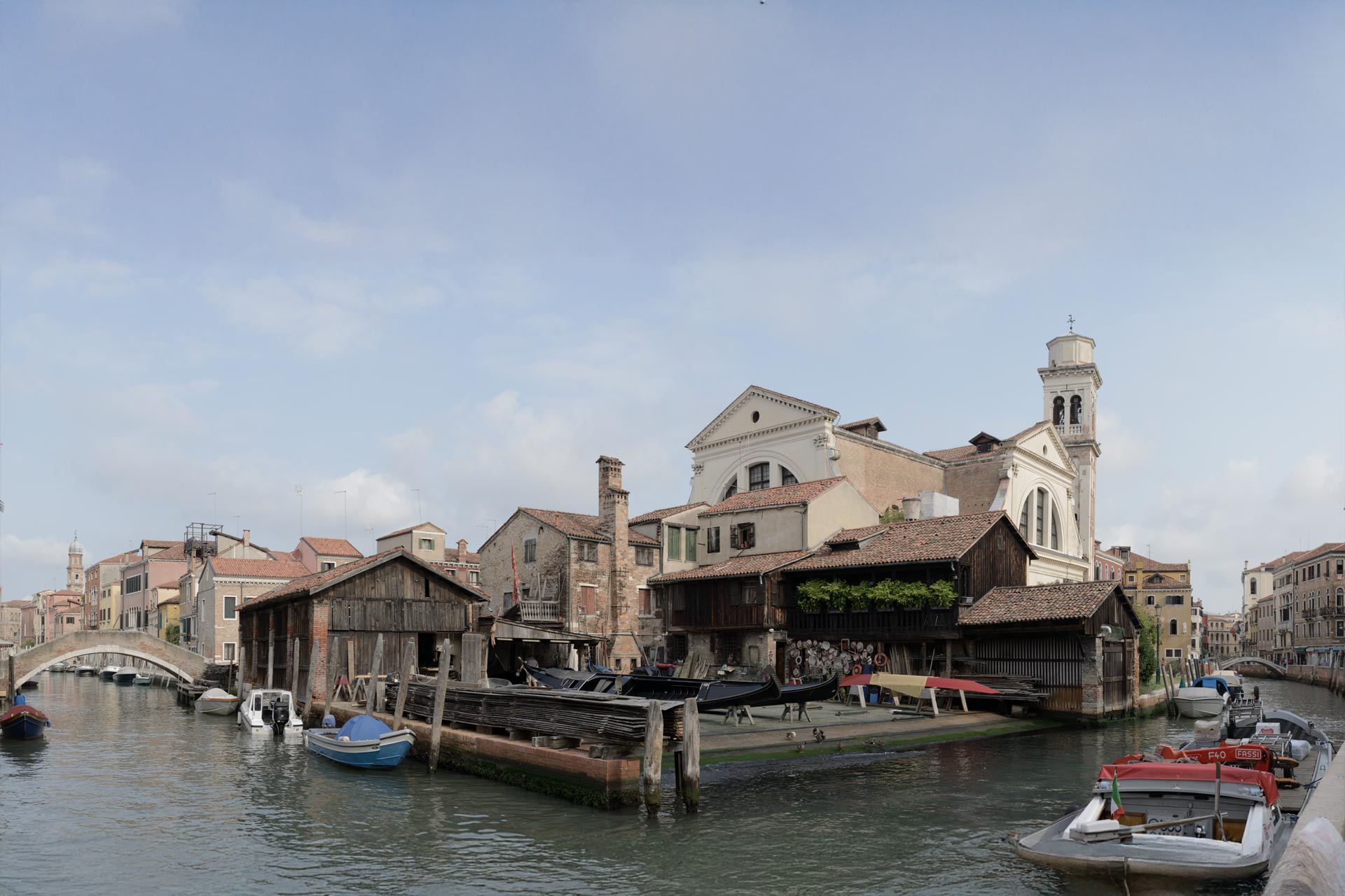
The photograph below is nothing special. It was taken in the Philippines. I had been covering the conflict between the government and rebel forces in the southern islands of Mindanao, living in the jungle for about six months, covering both sides. One story I wanted to cover was the rebel arms shipments that “island hopped” their way across the Sulu Sea to Mindanao. I tracked down the village where the arms arrived, but was told that I couldn’t photograph the shipment, the whole purpose of being there. After deliberation, I decided to go to the beach anyway and photograph as it ended. When the commander saw I’d disobeyed him, I was detained and held at gunpoint for 24 hours as they decided “what to do with me”. They didn’t want photographic evidence. People worldwide understand the power of pictures; the story they convey.
Photography isn’t about “The Photographer”. It’s about “The Picture” and “The Story” it communicates.
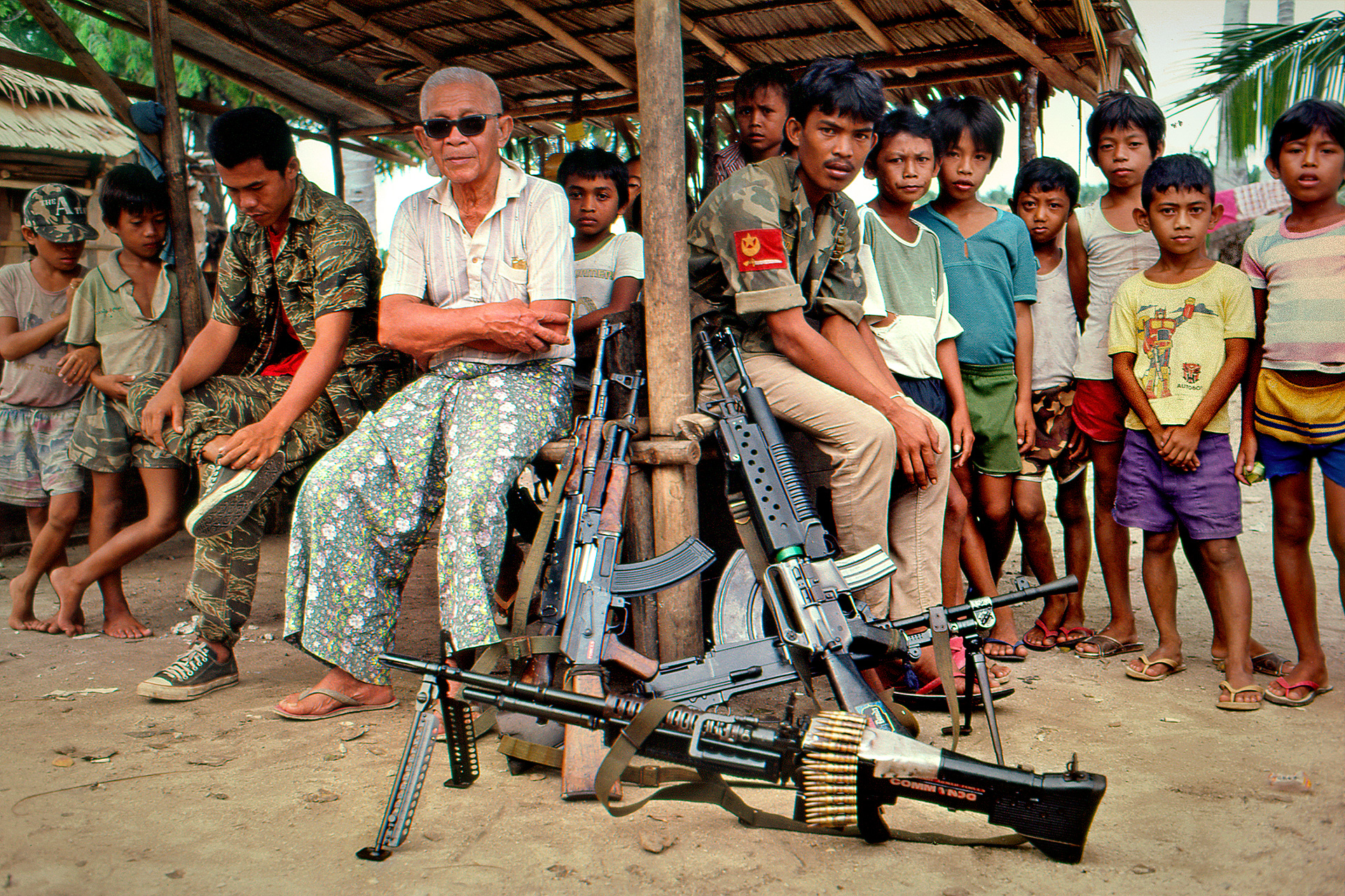
Pictures have power. It’s a mundane picture, but it’s “visual evidence” of something they didn’t want “visual evidence” of, and that put me at risk. 1987.
“Photography”
What’s the Purpose of Photography?
Part 02: Photography.
First, Let’s Understand “What Good Photography is”.
We need to “Look Outside Photography to Understand Photography”.
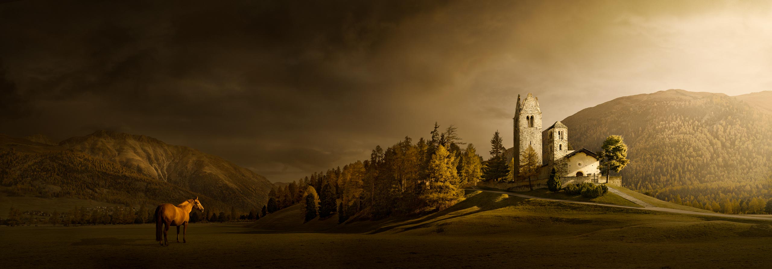
The Story: I want to convey an old church and a horse in the Swiss Alps with beautiful light.
Photography
Photography produces a “Product” which has a “Purpose”.
Photography may be for personal enjoyment and self-expression. However, if people don’t understand what you’re expressing, then it fails as “self-expression”. It fails as a photograph because photography is “visual communication”, and viewers failed to understand the idea you were trying to communicate. When someone else looks at your photograph, a fundamental change happens. Photography is no longer about your enjoyment of “the process”; the viewer only has “the picture”. They will judge your picture like any “product” because that’s the way our brain is hard-wired, and we cannot change it. This may sound very cold and clinical, but that’s reality, and it makes sense. – Let’s look at “Products”.
Think about any product you have ever bought: – A product is defined as one that provides a benefit to the end user and delivers a good user experience. The picture is our “product”, the “end user” is our viewer, and the viewer expects a “benefit”. Have you ever bought a product that had no purpose and gave no benefit? No, it would contradict basic common sense. The “purpose” of the picture is the story it communicates. The viewers’ “benefit” is the enjoyable mental stimulation your story triggers. A good “user experience” is the combination of visual efficiency and mental stimulation: “Minimum effort for maximum benefit”. Do you like looking at boring photographs that give you no enjoyment? – No.
If we create a “good product”, do we not create a good photograph? – This approach doesn’t take the “fun” out of photography; it makes self-expression successful because viewers will understand what you’re expressing. When you see photography only as self-enjoyment, it doesn’t force you to prioritise the picture or think about the viewer. – Equally, you gain more creative satisfaction because you create the images you want to create; it puts you in control of the image. – This tutorial is going to concentrate on the picture and the viewer, the two subjects that most tutors and workshops overlook, yet are the core ingredients. – We need to look beyond photography to understand photography first.

Once you’ve established a simple story, it must be presented as a good product with a simple design and composition.
Purpose
The “Purpose” of Photography is to “Tell A Story”.
Photography today lives in an isolated bubble, disconnected from reality. – The reality is that photography lives within the broader context of “The World of Art”; photography and art live within the broader context of “Human Nature”. If we don’t consider “People” or “Art”, we produce weak photography; pictures that don’t relate to people. – Photography alone only gives us limited, superficial rules and questionable personal opinions. Art, science and human perception gives us provable fundamental principles we can trust. – Everyone takes photos. Few understand “pictures”. Let’s look outside photography and learn from the worlds of art and science. – You can’t ignore people and art and be successful.
Everything begins by defining the end goal. – What is good photography? – Good photography stimulates the viewer’s curiosity, imagination, thoughts, and feelings – they evoke an emotional response without the need for words or explanation beyond a caption stating the picture’s location and date taken. Photographs are like a conversation; your picture makes a statement, and the viewer responds. A good photograph makes people “think”. Your job as a photographer is to ignite a response in the viewer. Make the viewer “think”. In order to make people think, you need something to say, you need an idea, a “Story”. – Isn’t this what you want yourself – when you look at other people’s photographs?
We read books because they communicate ideas, and we look at photographs for the same reason. – The only difference is that authors use a written language; photographers, artists and painters use visual language: the purpose is always communication. Photographers must learn to be good visual communicators; “visual authors” who “speak” fluently in visual language. Like written and spoken language, visual language has its own rules and vocabulary. Learning begins with being very clear about the end goal first. Ask what you like and enjoy as an “end user”. This is your brief as a “producer”. – You don’t enjoy boring pictures or conversations – so the end goal is to make engaging pictures and stories!
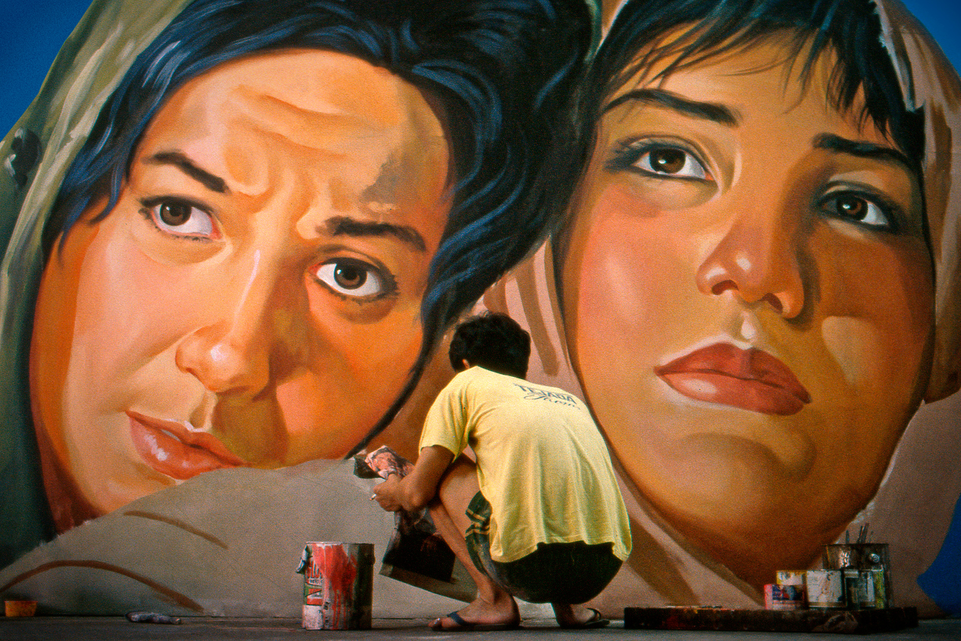
The Story: About a mural painter, which is a popular form of cheap film advertising. Philippines 1987.
Critical
But “Good” and “Like” are Different Subjects.
Good is dictated by how well it performs as visual communication. Like is dictated by personal bias and taste. You may not like a photograph, but it can still be a good photograph. – If the viewer understands the story you’re communicating and it evokes an emotional response, it’s a good photograph, even if they don’t like the story you depict or its aesthetics. Good is defined by principles. Like is defined by personal taste. If you’re a vegetarian, you don’t “like” eating steak. That doesn’t mean the steak isn’t “good”; it just means you don’t like it. – Good and like are different. – Don’t worry about being liked, worry about being good. – People respect good images, even if they don’t like them personally.
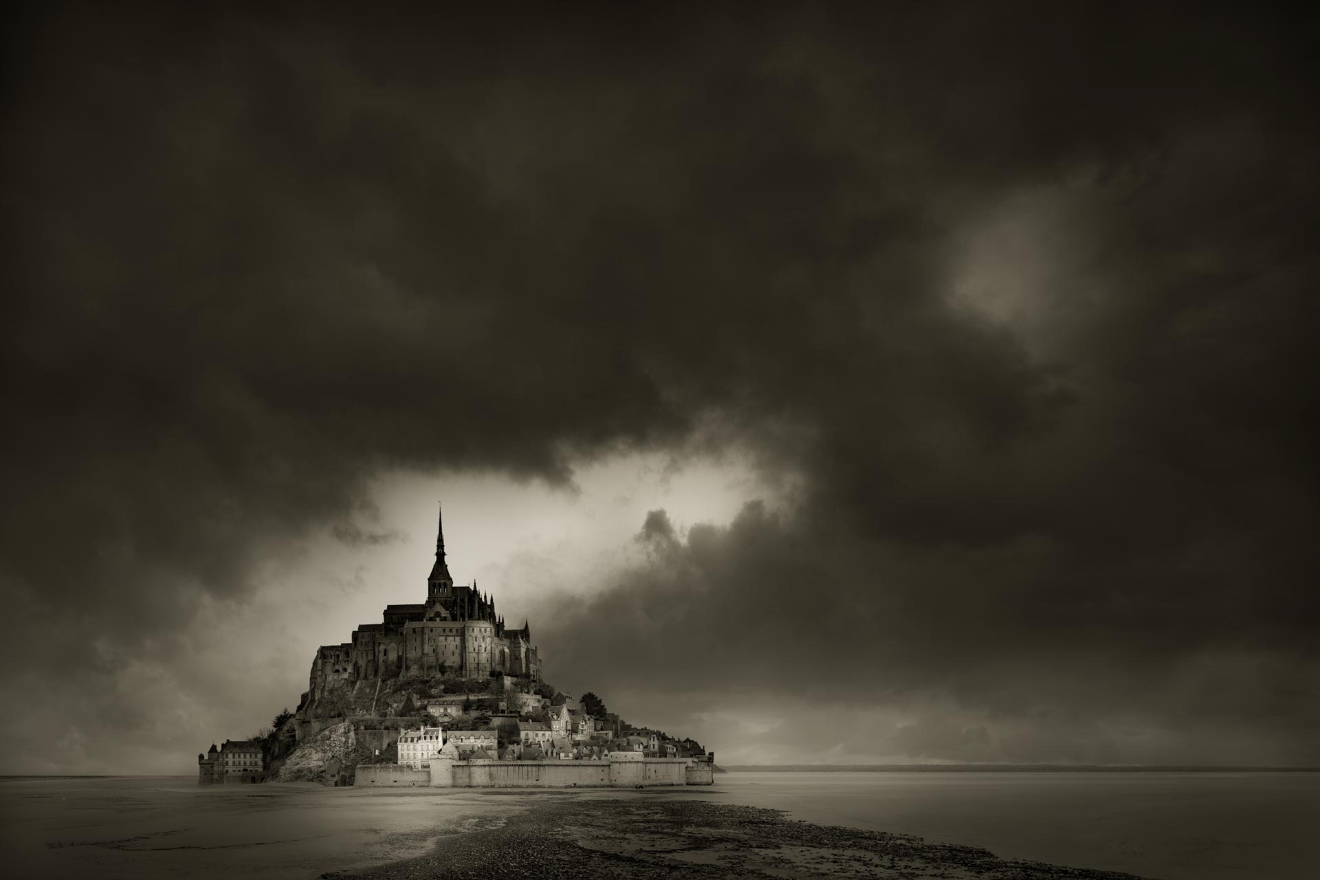
The Story: I want to convey the feeling of a fairytale castle in stormy weather. The white house is the “visual doorway” into the picture.
Section Summary.
Understand “What Photography is”.
The photographer’s job is to visually communicate an idea or story to the viewer. Photography is a form of “Visual Communication” that has its own “Visual Language”. You must prioritise the picture and the viewer. – The story your picture communicates is both its purpose and its benefit to the viewer. The purpose is to make viewers “Think”. – We need to look beyond self-enjoyment to understand good photography.
“The Story”
Without a Story, your Picture has no Purpose for Viewers.
Part 03: Story.
The Heart of Your Photograph is “The Story”.
What are you telling me about the subject you show me?
The Subject is a Swiss village. The Context is the landscape. The Mood is sunset. The Focal Point and Life Element is the figure.
Story
Let’s Understand How to Create “The Story”.
Your job as the photographer is to tell the viewer “something”. – Would you read a book you gained nothing from? – If you just mechanically record “what you saw”, then it’s just a statement of fact, not a conversation. You make no comment for me to respond to; it’s like a one-way, dead-end conversation. You’re basically telling the viewer to do your job and find their own story, which is like being told to “cook your own meal” at a restaurant. That’s not the deal. Would you engage in a dull or confusing conversation with someone who has nothing worthwhile to say? No. – Pictures are no different. Photographs fail when viewers don’t understand “the story” or find “the story” dull and uninteresting.
It’s Not a Book – So, Keep “The Story” very Simple.
In 2002, I was tasked with documenting the £4 billion Heathrow Airport Terminal 5 construction project in London for 6 years, which meant project management, planning, and photography. It was a wealth of little micro-stories. The story doesn’t need to be complicated. I love the picture below because of the construction worker’s body language, as if he’s saying, “Sorry mate, you can’t come through here, I’m working”, as if he had the power to decide the fate of a jumbo jet. The construction worker symbolises “construction”, the aircraft symbolises “airport”, and the interaction between the two is humorous. – A simple story creating a simple functional picture that implies a crazy scenario.

The Story. What I liked was the body language that said, “You’re not coming through here, mate. Roads closed”. Like it’s roadworks. 2002.
Ask: What are you telling me about the subject you show me?
Don’t just show me “what you saw”; tell me something interesting about “what you saw”. Let’s say you photograph a waterfall. What’s special about your waterfall, what makes it unique from any other waterfall? Is it enormous with a powerful flow of water? Or is it very small, but in a beautiful location? Is it in a tranquil village or isolated in lonely mountains? – Your subject is the waterfall, your “Story” is to convey the feeling of “enormous”, “small”, “beautiful”, “tranquil”, “isolated” or “lonely” – the “feeling” you had when looking at the subject and taking the picture. It is your job to “make me feel what you felt”. The image isn’t about the waterfall, it’s about “how you felt about the waterfall”. – I’ll explain how.
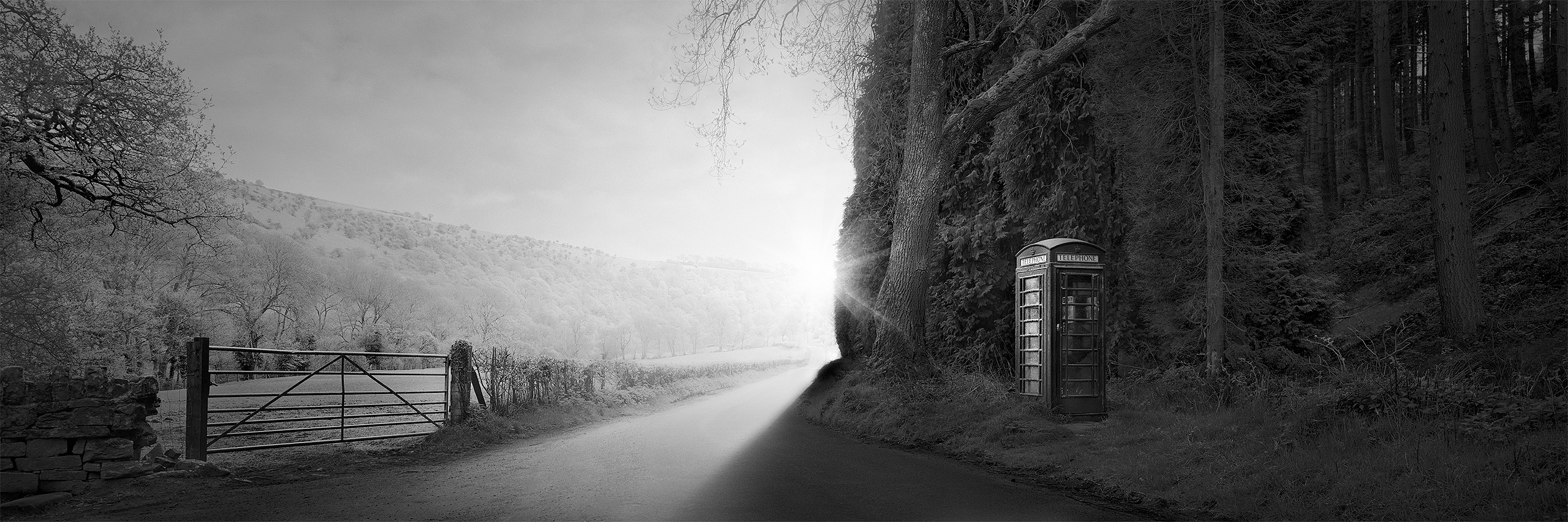
The Story: I want to convey the strange, lonely location of a phone box in the English landscape at sunset.
Formula
Create “The Story” Logically – “The Lighthouse” Example.
Let’s imagine that I’m at a Lighthouse by the coast. The subject tells you “The Picture”. – Ask yourself, “What is the purpose of a Lighthouse”? “The purpose of a Lighthouse is to warn ships of the rocks in bad weather”. – Therefore, the ideal picture is: My picture must include the sea, because that’s the function of the Lighthouse, and I must show the Lighthouse in stormy weather, because that’s its purpose. The three core components of your “Story” are: The subject is “The Lighthouse”. The context is “The Sea”. The mood is “Stormy Weather”. It sounds incredibly obvious, and it really is. – This logical process instantly gives you “Story Clarity”. – Now, it’s just a matter of composition and timing. Waiting.
“Subject, Context and Mood” – Will Create Self-Contained Stories.
A photograph consists of three elements: “Subject, Context and Mood”; the combination of these forms the basis of a story. – Imagine word association. At the camera, break down your composition into the minimum number of words; one word must be an adjective. For example, the photograph below: Cottage (subject), Mountains (context) and Isolated (mood and adjective). – The portrait would be: Person (subject), Room (context), and Happy (adjective), or an event would be: Demonstration (subject), London (context), and Violent (adjective). Reducing your photograph to the fewest possible words gives you clarity about the core components of your story. One picture, one story, one hero.

The Story: Is a small isolated cottage in the enormity of a Scottish valley at sunrise. “A new day begins”.
Think of portraits: the physical subject only describes what they look like; their mood, expression, and environment tell me something unique about them; it brings them to life. What you show me, tells me “what it is, or where you are”. The mood gives it life and tells me how you feel. “The Story” means tell me “something more” than just coldly and mechanically recording what you see. Identify a particular quality that makes your subject unique; emphasise that quality and visually communicate it to viewers in a single image. Is it beautiful, ugly or mysterious? Old or modern, big or small. Use light to convey the mood you want viewers to feel. – If you have “nothing to say”, you have no story, and no picture.
Example: A Constructed Portrait to “Communicate” a Weird Lifestyle.
Deep in the jungles of Mindanao, Philippines, the government would support a wide variety of weird and wonderful vigilante groups in their fight against the insurgency. – One such group is this Christian “Tad-Tad” group, meaning “Chop-Chop”. They would fight in battle with “bolos” (swords) and cut the heads off their enemy. They believed the symbols drawn on their clothing and an amulet of oil around their neck would protect them from gunfire. My “visual-problem” to solve was how to communicate all this in a single image, with them not speaking a word of English, and with very little time before the army patrol I was with had to move on. – It’s a self-contained story showing all of the elements.
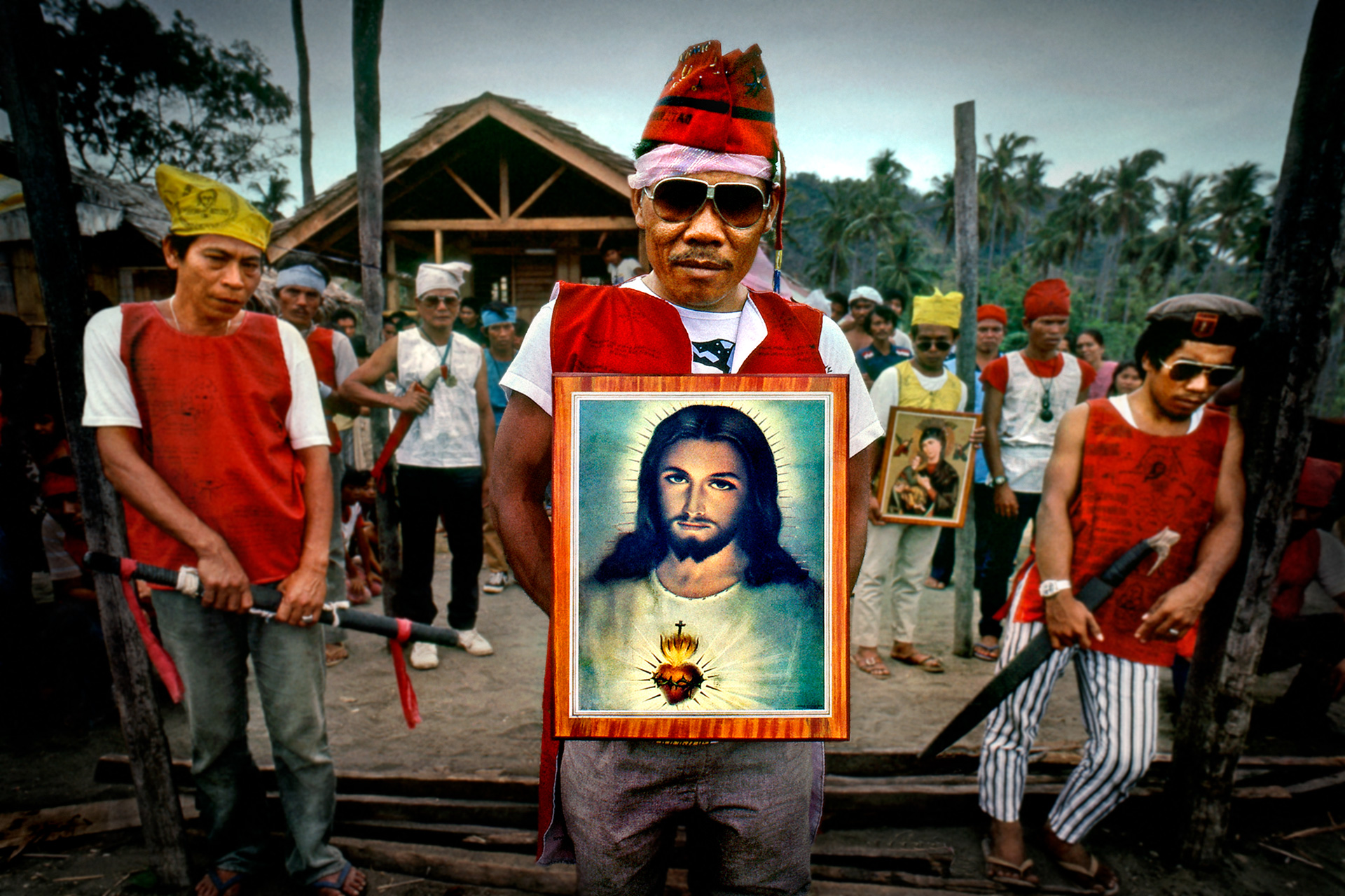
It’s the combination of elements that tells a story. The picture of Christ for religion. The swords, jackets, and hats with magical symbols for protection.
Practical
Consider “The Lead Actor, Supporting Cast, Backdrop and Stage Lighting”.
Think of your composition as a theatrical play. Your subject is the lead actor. The context is the supporting cast and stage backdrop. The mood is the stage lighting. – We must create a “Visual Hierarchy”, order, structure and emphasis relative to the importance of each component. Your lead actor, the “hero”, is emphasised to make them instantly identifiable to the viewer. Build the entire photograph around the lead actor and what you want to say about them. Everything else is downgraded to a supporting role. The stage lighting creates your mood – how you wish viewers to feel. – The viewer creates “The Story” in their imagination. – Are your photographs just “Factual Statements” or “Theatrical Plays”?
But, The Purpose of “A Story” is to “Mentally Stimulate” the Viewer.
“Order, Structure & Emphasis” refers to “Visual Efficency”. We also need “Mental Stimulation”. It’s only when you combine both that you create a great picture. – Photographers commonly make a massive mistake: they believe “good photography” requires overall, easy-to-read clarity. If you do this, you leave no work for the viewer to do; there’s nothing to engage the viewer and make them think. That’s why all “postcards” fail, yet so many images look like postcards. You must make the viewer “do some work”. Your photograph only supplies clues, not the answer. The viewer creates the answer in their imagination. Don’t give them the answer, don’t be literal. Be slightly ambiguous, create a feeling of mystery.
And, Don’t overlook the “Element of Time” in your Story.
“The Story” may be about a static object. In my case, I love old architecture; in your case, it may be the natural landscape. “Time is life”. Without life, a picture feels dead, but inject time, and it comes alive. – If the story is about a static object, let life come to you; don’t chase it. Compose the main subject, the overall theatrical stage, then wait and let fleeting light or momentary person come to you, let them walk on stage. You must be patient, wait, it will happen. That momentary element changes the whole feel of your image. Equally, the story may be about having a “timeless” feeling of being there forever, in which case we want the opposite: the feeling of stillness and calm, “that nothing ever changes”.

The road is the Lead Actor. The car is the Supporting Cast, and the landscape is the Stage Backdrop. The mood is the Stage Lighting.
The car also acts as the visual Focal Point and momentary Time Element.
Retouching
The Job of Post-Production is “Simplify, Amplify and Enhance” your Story.
The camera records everything it “sees”, and what it “sees” may be chaotic and visually confusing. There’s a limit to how much order, structure and emphasis you can achieve through camera composition alone. Post-production is where we amplify the story: clean and boost the signal. A percentage of our signal will be “lost in transit”. Therefore, the more pure we make the signal, the more efficient and effective it is because a weak, confused, or noisy signal won’t communicate well. More critically, when we alter the input signal, we alter the output signal; we can influence the viewer’s response. – In post-production, we simplify, refine, and strengthen “The Story” to communicate it more effectively.
But, I explain much more about “The Story” in my Photography Workshops.
The universal principle of “The Story” is that pictures visually communicate information. – Viewers enjoy the mental stimulation and emotional response from engaging with the image. However, there are many genres of photography: news, documentary, portrait, fashion, and still life. Landscape and architecture, etc., but they all share the same universal goal: a “Story” in some form. – The principle remains the same, only the message changes. Mental stimulation can be triggered by Connection, Ambiguity, Symbolism, Time, Memory, Novel and New. The workshop explains how each genre has a particular form of story and how to create it. What I cover underpins all pictures regardless of subject or style.
Write a very short caption before you shoot, summarise your story. Your photograph is then a simple illustration of your caption.
Always
Think More. Shoot Less: – Ask 3 Questions:
What is the subject of my photograph?
What do I want to tell you about my subject?
How am I going to tell you that in a visual way?
One Idea. One Story. One Picture
Don’t just show me “what you saw”. – Tell me something about “what you saw”. – Do your images contain a story?
The Story: A beautiful, lonely, and isolated old building with a surreal and timeless feel. – Holborn Viaduct, London.
How To Create a “Story”.
“Have a clear idea first. Then think: “Subject, Context & Mood”.
Think More. Shoot Less!
Summarise your story as a very short caption before shooting. – Illustrate that caption in your photograph.
Section Summary.
Understand “The Story”.
The heart of your photograph is “The Story”. – Think of it as a conversation between you and the viewer. “Tell me something unique about the subject you show me”. – The story is very simple, and you create it in a logical way using – “Subject, Context and Mood”, or as a Theatrical play with a “Lead Actor, Supporting Cast, Backdrop and Stage Lighting”. – Write a very short caption before you shoot, summarise your story. Your photograph is then a simple illustration of your caption. – The critical point is you must know why you’re taking the photo before you take it.
“People”
The Most Important Section.
Part 04: People.
The “Keep” or “Delete” Filter – How People Process Pictures.
Our Brain Dictates Absolute Truths. Those Truths are the Foundation Principles of Good Photography.
Let’s stand back from photography for a moment and look at science. – To the viewer, your image is just visual data that requires processing. If we understand “How people process images”, it tells us one fundamental fact: We can only control half of the equation. – We can’t control how people “process images”. We only control “the pictures” we give people to process. – Our brain dictates the rules of the reading process.
The brain’s primary role is survival. – If our brain processed every piece of incoming visual data in detail, it would be overwhelmed in seconds and cease to function. The data comes in faster than it can be processed.- But, if it didn’t identify useful information, it would put our survival at risk. – Our brain has a brutally simple and efficient solution. – It treats all visual data as “useless by default” – unless you prove otherwise.
However, our brain quickly passes all the incoming visual data through a filter to identify any “useful information”, and only investigates that information in detail; it treats your photo as “useless” by default unless you intentionally make it “useful”. It puts the responsibility on you to make your photo stand out from the “background noise”. – By default, it will be ignored by the viewer. – That’s your “Keep or Delete Filter”.
If we don’t learn “How people process pictures ” –
We don’t “Create pictures people can process ” – so they instantly fail.
Viewers dictate the “Reading Process”, which dictates the Photographers’ “Writing Process”.
This is the Most Important Section of the Tutorial.

The “Subject” is the Burj Al Arab. The “Context” is the buildings, palm trees and the figure that indicate its geographic location: The Middle East. The “Mood” is sunset.
People
First, I’ll prove that we all have a “Keep” or “Delete” Filter Process.
How many times have you driven to work, but don’t recall doing so? – You have no memory of the journey details. Your eyes must have sent a constant flow of visual data to your brain of the entire journey, or you would have constantly crashed. – Our conscious level is reserved for problem-solving, planning, and investigation. Everything else, our brain prefers to handle at an automated subconscious level because doing so conserves resources. – However, we can’t “engage” with anything that’s subconscious. We have no “memory” of it; it’s like it never existed.
On a “routine journey”, nothing special happened worth investigating, so your driving was handled at an efficient subconscious level to save resources, which also means you have no memory of it. The visual data was “Deleted”. – To be factually correct, it is “Ignored” because it was never saved. Now, what about that day someone walked out in front of your car, you reacted instantly. – That visual data was filtered out as “important” and got instantly diverted to your conscious level to investigate the problem and plan a solution. – You became very “engaged”.
The event was not “what you predicted to see” on your journey to work. – Now, if your brain processed all the incoming visual data in detail, you would have hit the person because the data comes in faster than our brain can process it. If our brain ignored all the incoming data, you would have hit the person because you ignored the “useful” data. – This is our “Keep” or “Delete” filter in daily life. – Our photograph is “visual data” to be processed; therefore, it’s also subject to the “Keep” or “Delete” filter. – This has absolutely enormous photography implications.
Filter
Now, I’ll Explain How “The Filter Process” Works – A Simplified “Motorway Analogy”.
Imagine the endless flow of incoming visual data as a fast-moving motorway full of cars, every car representing an image from your eyes. The motorway is your subconscious. At one end, they enter through the eyes; at the other, they simply disappear, as if they never existed. Ignored and forgotten. As they travel along the motorway, each car passes under a traffic signal that decides whether it stays on the motorway and is ignored, or leaves it and gets investigated. – That traffic signal is your “Keep” or “Delete” filter, quickly checking all the images as they pass by.
In a fraction of a second, the traffic camera checks each car for several indicators that it’s “useful data”. “Useful data” being primarily defined as data which helps make sense of the world around us, navigate it and survive. No single indicator is sufficient; its “usefulness” is the result of all the indicators combined. – If the data shows the potential of being “useful”, it flags the data and triggers the traffic signal to direct that image off our subconscious motorway for more detailed investigation at a higher conscious level. – Our photograph must pass this initial inspection.
Your photograph must trigger the traffic signal; otherwise, the viewer will ignore it, and it will fail as a photograph. – Your image has survived initial inspection; now it must survive secondary inspection. In secondary inspection, the brain uses the same criteria again, but examines your image in much greater detail; it’s no longer a quick glance, but a detailed investigation. Equally, if your photograph isn’t created to be “visually efficient”, secondary inspection will also reject it simply because it takes too long to process. It would cause a backlog of images to process.
If the image fails secondary inspection, it’s simply overwritten by the next one in the queue. If it passes, it’s judged to be “useful data”, like the person walking in front of your car. It’s available for use. The “Keep” or “Delete” decision is based on a pure “profit and loss” calculation. It’s not an artistic decision – “Is it a good photograph?” – it’s “Does the image provide enough useful data to help make sense of the world around us, navigate it and survive? If it passes, you have a successful image; it’s “Visually Efficient & Mentally Stimulating”. – Let’s look at the filter criteria.


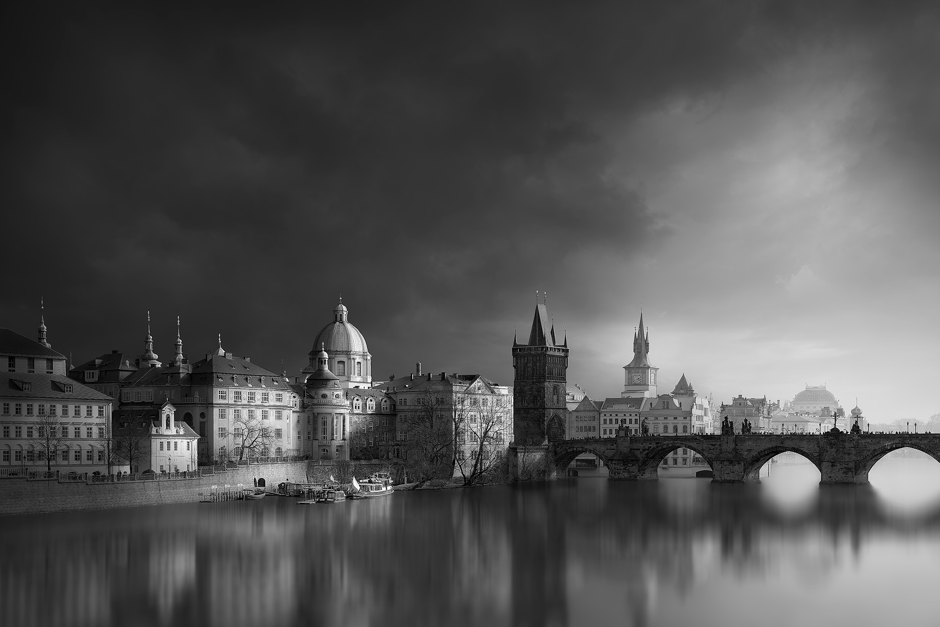
The before image is in cold, mechanical “Camera Language”. – The after image has been “Translated using Visual Language” from a dull conversation into an interesting one because I know how to speak fluently in the visual language viewers use to read. – Ghent, Belgium.
The Properties Our Brain Likes.
What the “Keep” or “Delete” Filter looks for.
How they Directly Impact our Pictures.
Our Brain is filtering out data based on: “Visual Efficiency & Mental Stimulation”.
Is it “New, Novel or Different”?
Our brain is drawn to anything new, novel, or different because it offers the potential to provide useful information we don’t already have. If I already know it or have seen it before, it’s a waste of my limited resources to investigate it again. I gain no benefit by doing so. Literal, generic images rarely succeed. – Simply recording a scene usually creates an image we have seen before; it’s not different enough to trigger curiosity. We must avoid giving the viewer “What they predict to see” or “Have seen before”. – New, novel, or different triggers “Mental Stimulation“.
* The Disruptor Element. – Disrupt the “Viewers Prediction”.
A “disruptor element” disrupts our confirmation. We predict “what we will see” then wait for confirmation. If the confirmation is correct, the image remains subconscious and is ignored. If the confirmation isn’t correct, the image doesn’t match “what we predict to see”; it is diverted to the conscious level for investigation to resolve the discrepancy. The disruptor element is something “we don’t predict to see”. An element in a “predictable image” that makes the image “unpredictable”. – This then forces conscious investigation and triggers “Mental Stimulation“.
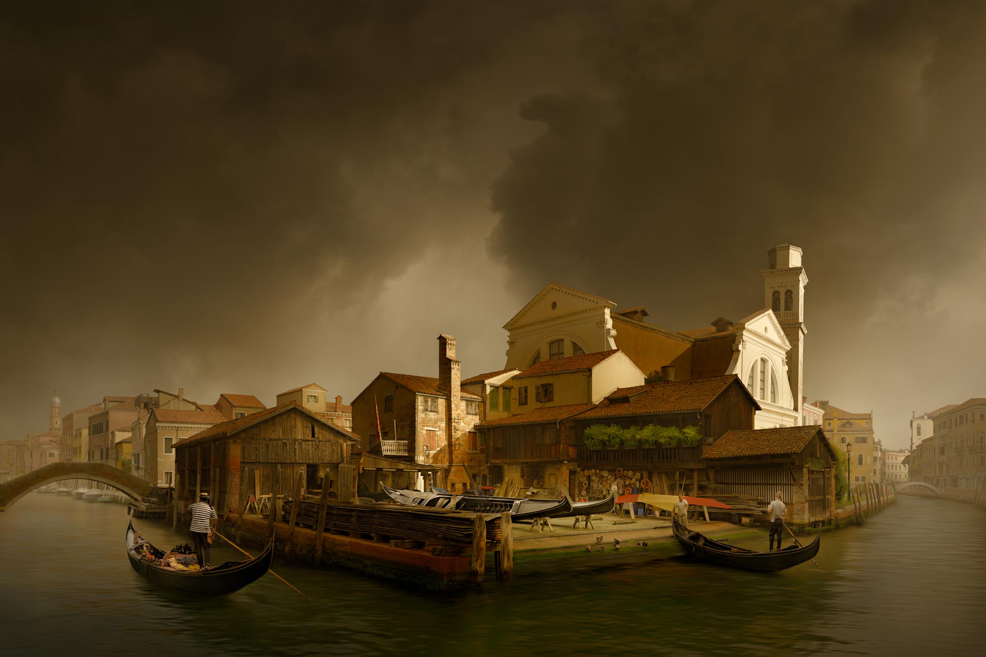
The detail of a photograph, the feel of a painting. – I don’t give you “What you predict to see”, so it triggers your curiosity. – By removing the modern boats, I remove your “points of reference” to date it as a modern photograph. The artistic treatment makes you assume it’s a painting, but the detail contradicts your assumption. – I force you to “think” in order to resolve the discrepancy of “Is it a photograph or a painting”?
Does it have “Light, Mood and Atmosphere”?
Our brain assigns a subconscious “feeling” to an image before it understands what it’s about, tagging images as positive, negative and neutral. We associate a bright day with feeling “happy”, a grey day with feeling “depressed”, and some days are just “forgettable”: neutral. The mood in your image triggers an emotional response in the viewer. Light influences how we feel, and what we see visually, we respond to emotionally. If there’s no defined mood or atmosphere, it’s flagged “forgettable”. – Portray the light, convey the mood. – This triggers “Mental Stimulation“.

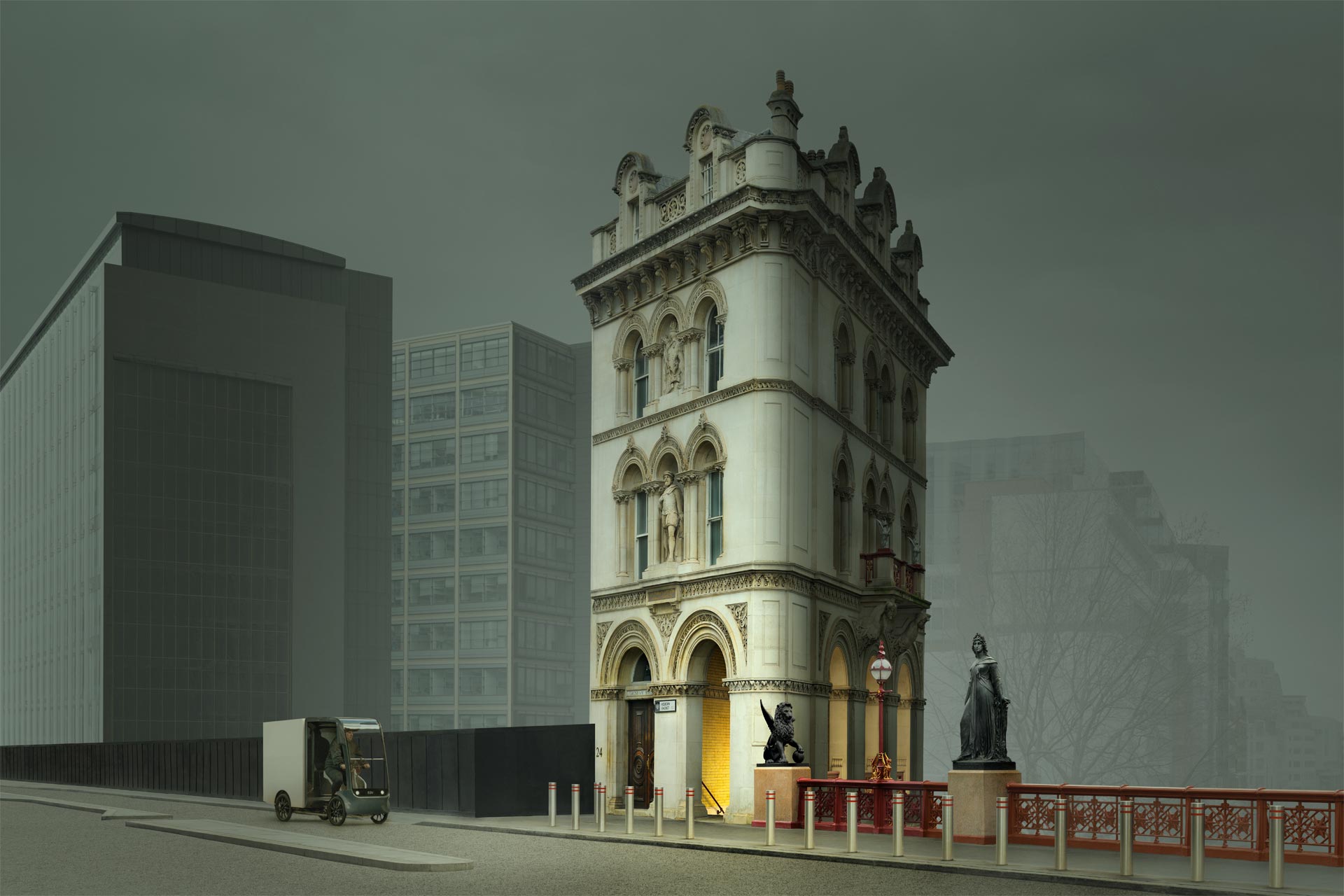
I wanted to portray the strangeness of a defiant old building in modern London. The feel “everyone else can change, I’m not”. By removing everything possible, the road markings, etc., I created a surreal and dystopian feel. – The weird vehicle added to the atmosphere, and the light of the orange stairs invites the question, “What do they lead down to?” – The overall transformation is to create a surreal, dystopian mood.
Does it comment on “Life, People or an Event”?
Our brain prioritises survival: to identify and avoid potential threats, pain and danger, and to identify any resources for food or pleasure. Visual data that identifies opportunities that could affect our well-being is prioritised. – Photographs that feel “biologically relevant”. – Photographs that comment on our lives, featuring life, people, events, and moments in time. News and documentary images feel more “relevant” than the generic landscape image, which feels more like entertainment. – Photographs that are “biologically relevant” trigger “Mental Stimulation“.

The image is a play on English society. – The people make it “biologically relevant”; they reinforce the fact that buildings are for people. The red man on horseback draws the eye to a group of upper-class, country people. – The buildings have a 3D quality, and the spatial distance creates depth. The hero of the picture is the country gent walking away from the group and out of the picture. – This creates tension in the theatrical play; it invites the question “Why is he leaving the group?” – The picture provides a scenario, but each individual viewer creates their own unique answer in their imagination.
Does it have “Three-Dimensional Form”?
Our brain constructs and updates a mental 3D model of the world around us to navigate and understand where we are within it. It prioritises 3D information because it updates our 3D model, whereas 2D graphical information, such as patterns, offers little benefit. – Photographs that convey 3D form, volume, and spatial distance deceive the brain into believing it’s high-priority “useful” 3D data from reality. 2D information is labelled as low-priority and “less useful” data. Create a strong 3D illusion, and you upgrade the benefit of the visual data. – “Visual Efficiency“.
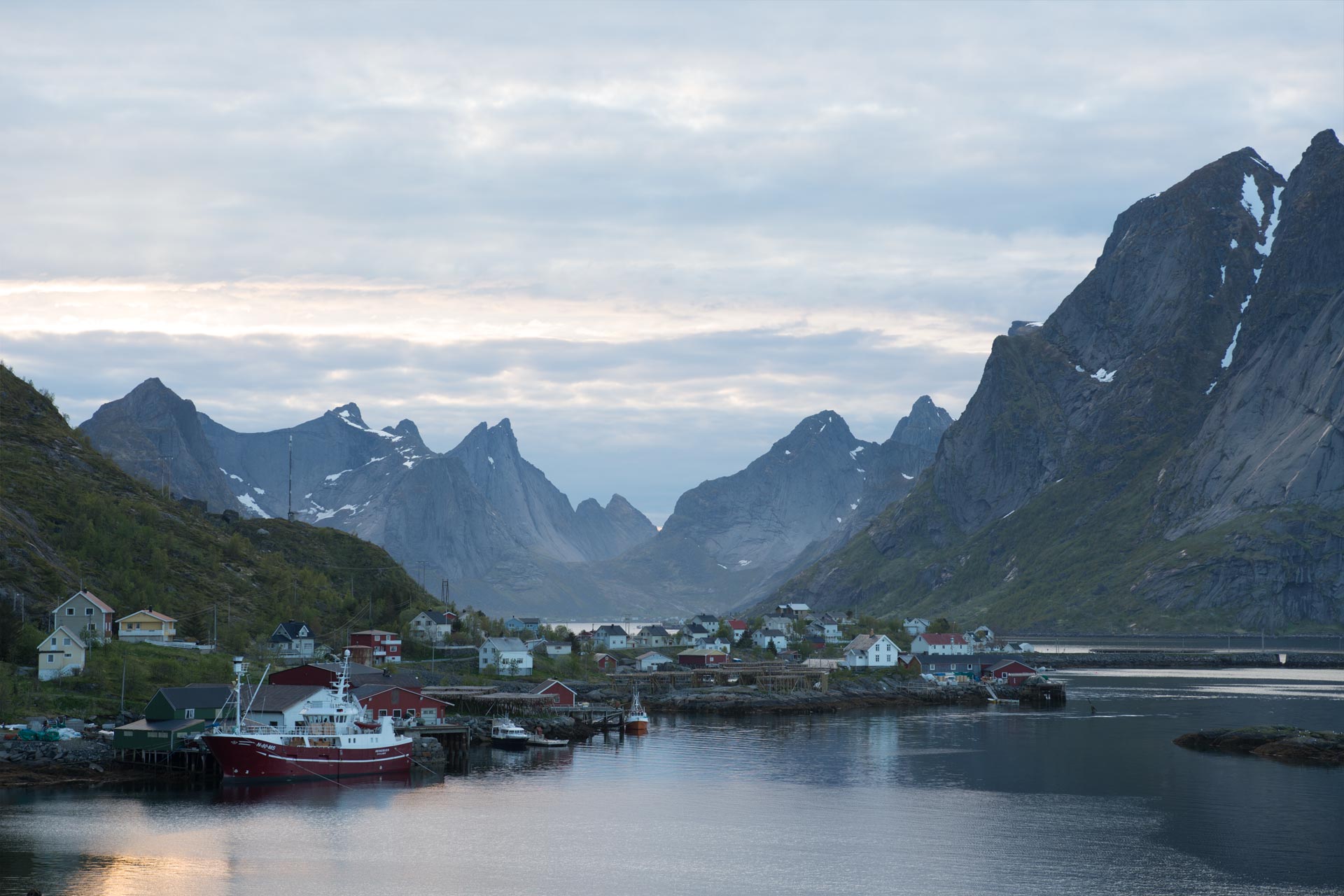
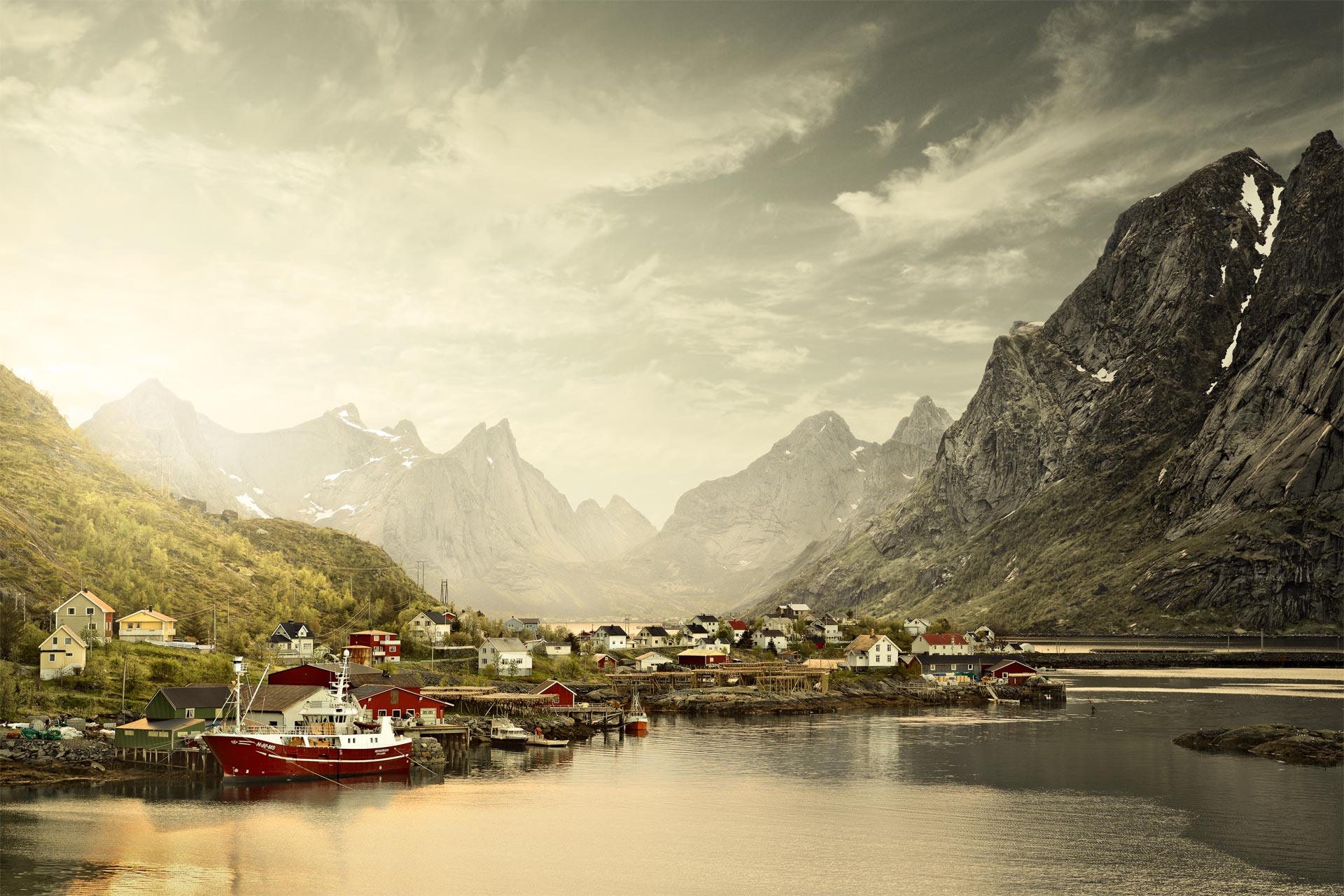
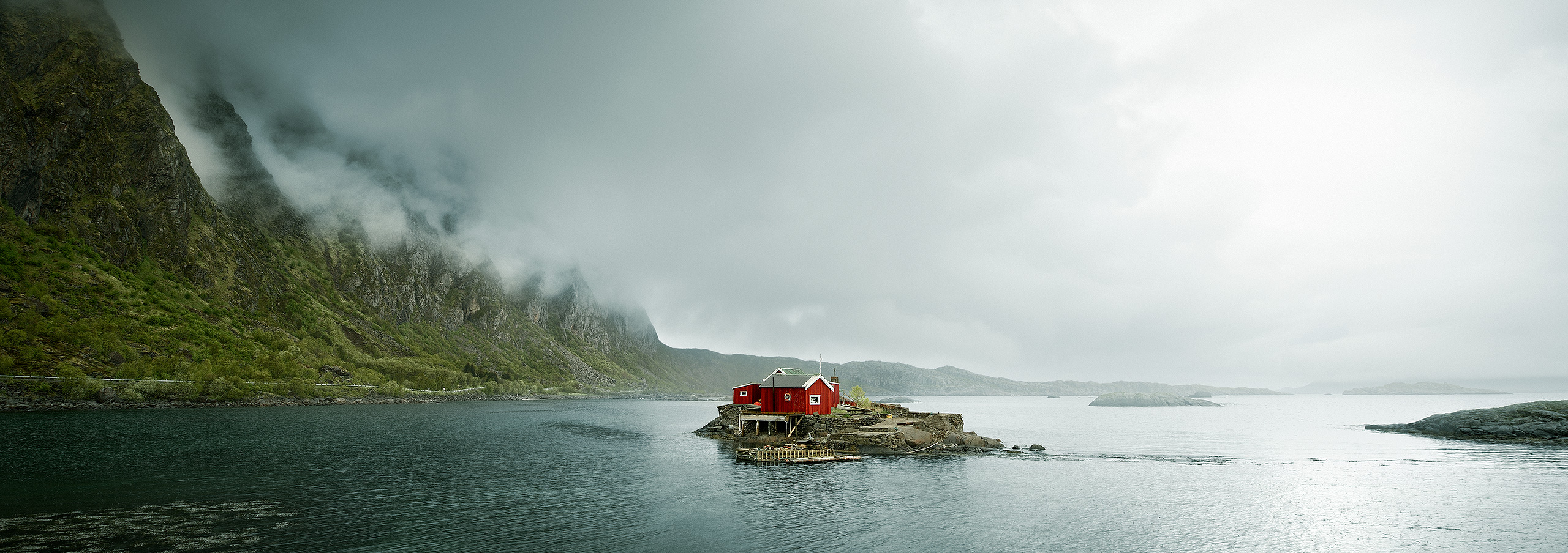
A fishing village in the expanse of the Lofoten mountains, with a bright, airy feel. – We know it’s a “fishing village” because our “prior knowledge and experience” tells us the hero is a “fishing boat”; therefore, by association, it must be a “fishing village”. – The before image is flat; it has no benefit for our 3D model; the after image has depth and “feels” more real because we trick the brain into believing it’s seeing high-priority, real-world 3D data.
Does it have “Order, Structure, Emphasis, and Simplicity”?
Our brain can’t decide if it’s “useful data” if it doesn’t know what it’s looking at first. The brain must understand what the shapes represent. It breaks shapes down into their simplest forms and then compares them with our prior knowledge and experience to assign a meaning. Is it a mountain, building, or person, etc? This allows for fast identification without investing time-consuming, detailed investigation. – Visual order, structure, emphasis, and simplicity make images faster to process. – Noise, confusion, ambiguity, and clutter all slow down “Visual Efficiency“.

The before image has no order, structure, emphasis, or simplicity. It has no “visual hierarchy”. Everything is of equal importance; therefore, the picture has no “entry point” for the viewer. The “play” has no story, no lead actor or direction. The after image has a defined “visual hierarchy” because the buildings are clearly emphasised by the light and colour, making them the lead actor. Everything else is just the supporting cast.
The Filter Conclusion.
This is the reality of life, how we all process visual data. – Our photograph is such a minuscule proportion of our daily visual data that the brain isn’t going to evolve any special process just for our few images. – And yet, our images do need processing. – It’s very simple: our brain simply dictates, “You fit in with my process, or I’m ignoring you”. The brain doesn’t care about your photo; it’s got more important things to do. – Your choice as a photographer is to create pictures that comply with the process or go against the process and be ignored. Not understanding the process is the same as going against the process. – For whatever reason, if you don’t comply, you’re ignored – the brain really doesn’t care.
“Our Brain Dictates Absolute Truths.
Those Truths are the Foundation Principles of Good Photography”.
Section Summary.
Understand “The Process”.
You’re free to make your photograph however you want it, “there are no rules”. – BUT, if you want it to be successful, it must be in the format our brain can easily process; our brain only has one way to process images, and it will not change it for you. The brain dictates “rules”, whether the photographer likes it or not. – Our brain prefers “New and Different”, “Mood and Atmosphere”, “Life and People”, “Three-Dimensional Form and Spatial Depth”, “Order, Structure, Emphasis and Simplicity”. It likes “Visual Efficiency & Mental Stimulation”. Science, not personal opinion.
“Problem”
Our Brain “Doesn’t Want Your Photograph”.
Part 05: Problem.
Our Brain – “Doesn’t Want Your Photograph”.
It’s not “useful” high-value real-world visual data that helps survival.

The car’s red colour adds visual efficiency. The viewer doesn’t need to investigate the image to know where to look first. The enhanced spatial distance makes the visual data more useful for the brain.
Problem
The Major Problem is: “Our Brain Doesn’t Want Your Photograph”. Why?
People prefer “Not to think”.
The brain’s primary function is survival: conserving time, effort, energy, and resources helps survival. – Conscious thinking requires enormous resources; subconscious processing doesn’t. Therefore, the brain prefers to automate everything subconsciously to conserve resources. This keeps the resource-intensive conscious level free for important problem-solving, planning, and investigation: “Thinking”. But, we can’t “Think” about a photograph if it’s subconscious. – Also, thinking about your image takes enormous resources, which contradicts the survival priority.
People always “Predict what they will see”.
Second, when we’re born, we have no memories. Our memory is built as we gain new knowledge and experiences. To conserve resources, our brain has evolved a “predictive process”. – We constantly use our prior knowledge and experience to predict “what we will see”. – If “what we see” matches “what we predict to see”, we don’t investigate it. We don’t think about “what we already know” because it wastes our resources for no benefit. If your picture shows “what we have seen before”, we don’t engage or “think” about it. It’s a waste of resources for no benefit.
People create a constant “Mental 3D model of the world”.
Third, our brain constructs and maintains a three-dimensional mental model of the world around us to make sense of the world and navigate within it to survive. – The brain, therefore, prioritises three-dimensional “real-world” visual information; it helps update our three-dimensional model, and de-prioritises flat two-dimensional “graphic” information because it adds little value to our three-dimensional model. Photographs are two-dimensional, low-priority “graphic” information, not high-priority “real world” information. – It’s low-value “useless” information.
Default
Therefore, by default, our Brain Assumes your Photo is “Worthless, NOT Worthwhile”.
The brain’s got a lot of work to do, and your photograph isn’t a priority; it’s an annoyance. – Its priority is survival; your photograph is just extra work. It’s a luxury. Unlike law, where you’re “presumed innocent until proven guilty”, the brain takes the opposite approach. It assumes “you’re guilty until proven innocent”. It assumes you’re guilty of making a photograph that has little value to viewers unless you prove otherwise. The default position is: “I’ll assume your photo is worthless, NOT worthwhile.” – It takes this stance by default for efficiency because 90% of visual data is “useless”. – The brain won’t care, “it’s your photograph”, it will just treat it as “background noise” by default. – That’s just brutal reality.
By default, our brain doesn’t want to think about your photo. This is the case with the before image. It has no value. However, the after image, I force you to think, because it’s not “What you predict to see”, or “Have seen before”. It also creates a 3D illusion of reality. I’ve transformed a flat 2D image by adding a 3D illusion of reality, making the visual data more useful for the brain. The result is an image that is engaging and worth thinking about.
“Catch-22”
How to Stand Out from the “Background Noise”.
Part 06: Catch-22.
The “Catch-22″ Photographers Must Resolve.
Your Photograph must stand out from all the “Background Noise”.
I like this image because it’s clean, simple, and “Visually Efficient”. Yet, the house makes me ask: Where are the local shops when you need some milk? “Mental Stimulation”.
Critical
The “Catch-22″ Photographers Must Resolve.
Two equally important fundamental principles are in direct conflict. On one hand, we defined successful photography as: “it makes the viewer think”. Yet, on the other hand, our brain “prefers not to think” by default, especially since it’s a 2D photograph and “low value visual data”, and the brain dictates the rules. However, if we don’t make the viewer “think”, the photograph has no purpose, because it gives no benefit to the viewer. The “Catch-22 photographers must resolve is “How to make viewers think and engage with your photograph and go against the brain natural instinct not to want to do so”. – This is why literal, generic-looking images are rarely successful – they don’t make the viewer “think” or engage with them. – We must “add value”; add something to the photograph to trigger the brain into “thinking” and engaging with it.
Solution
How do we Resolve this “Catch-22”?
The brain dictates all the rules, so play within the rules it sets. Our “Keep” or “Delete” filter dictates our brain prefers New and Different, Mood and Atmosphere, Life, People and Time, Three-Dimensional Form and Spatial Depth, Order, Structure, Emphasis and Simplicity. Use Disruptor elements to prevent the image from being “What viewers predict to see” or “Have seen before”. – Mental stimulation will also be triggered by Connection, Ambiguity, Symbolism, and Memory. – The brain dictates all these; use them as the foundational principles for your photography, and you give the brain “what it likes”. – The brain wants “Visual Efficiency & Mental Stimulation”. – Make these your new “Photography Rules”.
The Solution – Create Pictures in the “Sweet Spot between Two Extremes”.
Successful photography is in the sweet spot between two extremes. – Literal photography doesn’t benefit the viewer because it shows them ‘what they expect to see’. Not showing anything new doesn’t ignite their curiosity. – Photography people can’t understand, won’t benefit the viewer because you can’t engage with something you don’t understand; there’s no “point of reference”. Therefore, engaging photography has an underlying foundation of realism – the illusion of three-dimensional form and spatial distance, which gives the picture a point of reference to understand it, but different enough so it’s not “what viewers predict to see”, which triggers curiosity and forces the viewer to think. In brief, they communicate a story, evoke an emotional response and reward the viewer. – A good “Product” providing a good “User Experience”.
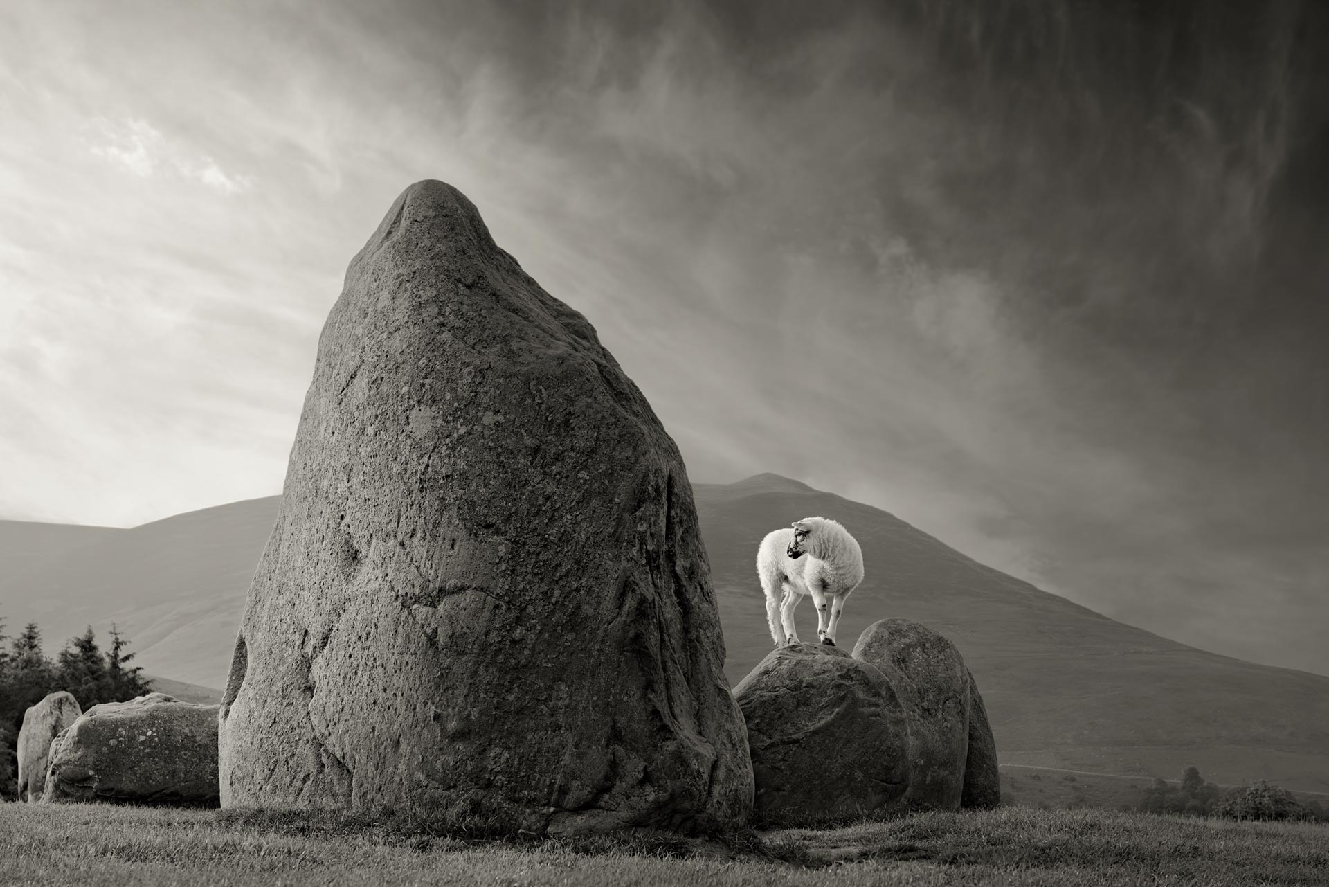
The Story: A beautiful single frame of a lamb playing on the rocks in the English Lake District. (No compositing).
Section Summary.
Understand “The Catch-22″.
If you want to create good photography, you must accept a brutal reality. – By default, the brain dictates that your viewer will not care about your photography; they will ignore it. – Our brain puts all the responsibility on you to give the viewer “a reason to care”; to stand out from the “background noise”. – The good news is that if you give the viewer “a reason to care”, they will care. They will notice your image above all the background noise, but this is very unlikely to happen on its own. – You need to learn “How Pictures Work”. Just “Taking Photos” isn’t enough.
“The Viewer”
Photographers enjoy “The Process”. Viewers only have “The Picture”.
Part 07: Viewer.
Let’s Understand Images from “The Viewers’ Perspective”.
Why care? – Because if you don’t, you won’t create “Good Pictures”.

The Story: I want to convey the sheer size, three-dimensional form, space and volume of this modern building.
Critical
Photography Does NOT Define The Rules. – People Do.
A Quick Story – My Moment of Clarity in Venice, Italy.
I was running a workshop in Venice, standing on the Academia Bridge with my client. He is very sociable and talks to people standing around us. To my embarrassment, he’d ask if they would like to see my photography portfolio. – Not wanting to appear rude, they politely agreed, so he took out his mobile phone and showed them my work. The instant they saw my photographs, the conversation transformed from politely muted and reserved to energetic, enthusiastic and passionate. I suddenly realised that if all these bystanders had no photographic or artistic knowledge, but they all had the same response, then their response could not have been due to their knowledge of photography, but it had to come from something far more fundamental. I’d overlooked the obvious, which explains everything – Human nature and perception.
How can we create a good “Product”, if we don’t understand the “End User”?
Not everyone takes pictures, but everyone processes images – it’s pre-programmed into our brains to make sense of the world around us and survive, and we all process images the same way: we gather information, process it, and then generate a response. Our photograph is nothing more than visual data that needs processing. If we reverse-engineer this intuitive process, learn how people process images, we can use that knowledge as guidelines to create successful photographs. If we learn the fundamentals, “How pictures work”, we create “Pictures that work”.
People judge photography based on intuition, NOT, on their knowledge of photography. That’s why people can recognise good photography but not explain why it’s good. – The only common denominator people share worldwide is human nature. Human nature defines how people perceive, process and respond to visual images. – Human perception defines visual language, which then defines how we “create successful photography”. Photography does NOT define the rules. Human nature and perception do. – Not understanding people is the biggest problem.
The 20:1 Tonal System. – Did you know: “We See the World in Black & White”!
The human eye has 120 million rods to detect tone and 6 million cones for colour – a 20:1 ratio that makes tone our primary visual data. Tone is the “backbone” of vision, defining 3D form, spatial depth, separation, motion, and edges. Colour is only a secondary overlay used to enrich the underlying tonal information; it helps differentiate objects of identical tonal value, identifies surface cues, like the freshness of food, and sets the emotional mood. While colour attracts the eye, tone carries the essential structure of everything we see. – Using a building analogy: “tone constructs the building, colour is the coat of paint when it’s finished”. – The 20:1 Tonal System – Where science underpins art in photography.
Don’t create a colour image first, then strip out the colour to make a black-and-white image. – Create a black-and-white image first, then add colour to make a colour image. It’s a fundamentally different approach that complies with scientific logic. In a “literal sense”, we see the world in colour, but colour distracts us from clearly seeing the underlying structure. We must get “the building’s structure correct first, before giving it a coat of paint”, or “the coat of paint will hide the bad underlying structure”. The 20:1 ratio of rods to cones tells the overwhelming majority of our photograph depends on tonal values, not colour. – We must be very good at tonal control and quality; it underpins every photograph.

The Science of Perception: Mathematically, colour accounts for only 20.5% of this image. – That’s why tonal structure comes first.
And, We’re “Born to Read, Not Write”. – “Creating Visually is a Learned Skill”.
We learn to “read visually” quickly from birth, but we don’t learn to “write visually”. – The ability to visually read the world around us is critical for our survival. The ability to create or write visually has little survival benefit, so we don’t learn it. Reading visually is a natural ability; creating visually is a learned skill. – That’s why “people can recognise good photography but not explain why it’s good” – they can’t explain it because they can only “read”, not “write”. The implication is that because you can recognise a “good picture”, you then assume you can create a “good picture”, which is totally false. Creating is a learned skill. – Many are geniuses as “End Users”. NOT so much when it comes to being “Creators”!
To Repeat: You Must Understand One Fundamental Principle.
To Repeat: – An incredibly important concept photographers overlook. Photographers dictate “the story”. Our brain dictates how we “read it”. An analogy: If I want to write a book for people in Japan, it’s my job to write in Japanese; otherwise, they won’t be able to read it. The reader sets the rules, not the writer. The ability to “Visually Read” is pre-programmed into our brain’s operating system; we can’t control or change it. Our brain dictates “How we read pictures”. Photographers must create pictures using the same rules we use to read. The viewer dictates the rules: that’s why pictures fail. Photographers don’t care about the language they use to “write “; they assume viewers can “read” it: they can’t.
The reason why photographers go wrong and why most pictures fail is that photographers don’t appreciate one absolute, unchangeable, and basic fact. – We can’t control “How people process images”. We can only control “The pictures we give people to process”. – We must adapt our photograph to the viewer because the viewer cannot adapt their “reading process” to our pictures. – If viewers can’t process our pictures, our pictures have no purpose for viewers; they give no benefit. People dictate and can’t change their “reading process”. – Our images must be created in perfect harmony with people’s “reading process”. – You must learn the “Reading Rules” first so you can create good photography.
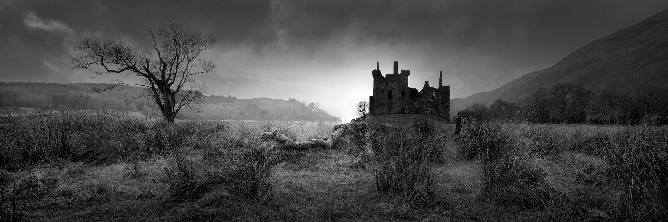
The Story: I want to convey the feeling of a spooky, old and abandoned castle in Scotland.
Practical
There’s no point in “Creating a Story” that “People can’t Read”.
Like written or spoken communication, “Visual Communication” has its own language. “Visual Language” is how we translate, understand, and give meaning to visual information we see in everyday life. The same principles we use for “reading” can be used for “writing”. – We can create images by combining visual elements, as we do with words, to convey a “Story”. “Visual Language” is simply a term for how we translate visual data into meaningful information. – Like “French” or “Spanish”: it’s just a label; however, everyone worldwide uses the same universal language to read and understand pictures. – The core problem is: You won’t be able to create good pictures if you can’t “speak” in good visual language.
Remove “The Photographic Signature” – Novoflex Panoramic Heads.
The more we remove the “Photographic Signature”, the more we believe the photograph to be real. Lens distortion is a photographic artefact that reminds the viewer of our production method: photography. – This only adds unnecessary friction for viewers when “reading” the image. To reduce the friction, the “photographic signature”, I use a Novoflex panoramic head and PTGui stitching software because the combination creates a more natural-looking image, the way we see the world, which means the viewer accepts the image as being more “real”, therefore it becomes more engaging. – We want to invest viewers’ limited time in engaging with the story, not in investigating the photographic process.
A Quick Summary – Imagine Photography Being an Electronic “Signal”.
Imagine photography as an electronic “signal”. The photographer creates the signal by making the picture. It’s transmitted to the viewer, who then decodes the signal to understand “The Story”. The photograph’s purpose, and viewer’s benefit, are “The Story” the signal communicates. The photographer only dictates the content and quality of the signal: “The Picture” and “The Story”. – The viewer dictates “How that signal is decoded”, how the picture is processed, read and understood. If you ignore the need for a “Story” or don’t understand how to create a signal in a format viewers can decode, the photograph fails because viewers gain no benefit. Our goal is to “Stop, Captivate & Reward the Viewer”.
The before image is the input signal. The after image is the output signal. By altering the signal, I altered your response. I gave the story visual order, structure and emphasis. – I created “Visual Efficiency & Mental Stimulation”, which the original image doesn’t have.
Section Summary.
Understand “The Viewer”.
How can we create a “good product” if we don’t understand “our end user”? – Every company worldwide will understand the end user of their product first. They produce products that the end user finds beneficial, or they have no purpose. Finally, they learn the manufacturing process to produce their product. Why should understanding photography be any different? – It makes learning both very easy and fast. Social media promotes photography only as self-enjoyment. They don’t look at photography from the viewer’s perspective or prioritise “The Picture”. Good photography is within everyone’s reach, if you’re given the correct knowledge. – Photography isn’t magic; it has simple, provable principles.
A “Successful Photograph”.
“Don’t show viewers ‘What they predict to see‘. – Realism gives a point of reference to understand the picture. The artistic interpretation triggers curiosity.
– Stop, Captivate, and Reward the Viewer”.
Focus the eye. Stimulate the mind.
The Story: I want to show you the beautiful architecture of Prague Castle, Czech Republic, in the golden light of early morning. – Say something very simple, but say it very well.
“Retouching”
“Simplify, Amplify and Enhance” your Story.
Part 08: Retouching.
Transform “Rough Diamonds” into “Sparkling Jewels”.
Don’t Destroy Your Images in Post-Production.

The Story: The building reminded me of an insect, a beetle. Therefore, I composed and enhanced the image in Photoshop to convey that idea.
Critical
We must create a Stunning Black & White image first.
As discussed, the majority of visual information is tonal values; very little is colour. When we take a photograph, the camera’s response curve radically alters the tones. The camera adds 45% more contrast to the highlights, darkens the mid-point by 2.5 stops and lowers the dark tones by 55%. The darkest shadow tones by 80%. The camera totally changed the photograph’s underlying structure in a negative way. – We need to retouch the image to repair the structural damage caused by the camera. We must “put back what the camera took out”, even if we don’t want a radical artistic transformation. – Tonal values are the “engine” of the image; we must get them correct so the photograph performs.
There’s also a fundamental problem that only post-production can resolve. As we reduce the scene’s dynamic range to fit within the range of a photograph, we reduce global contrast, but by default, this also reduces local contrast. It’s the local contrast that gives our pictures life. This is a structural problem with tone, not colour. Our ideal is low global contrast but with areas of high local contrast; otherwise, the picture feels dead. We must rebalance the tonal values. Highlights dictate the picture’s light, life and sparkle. The midtones dictate the 3D form and mood. The shadow tones dictate the picture’s structure. – This is why my workflow explains, “How to create a great Black and White image” first.
There is also a quality reason for creating a black-and-white image first. The camera will not have the subtlety of tone and the fine palette of rich, subtle greys that make both black-and-white and colour images look beautifully rich. The raw file simply doesn’t contain the tones; they are created in post-production: – A technique I call “Tonal-Painting”. Applying this technique creates the “Rembrandt Light”. The tones in “The Bodleian Library, Oxford”, shown next, do not come from the camera; they come from post-production. The same “Tonal-Painting” technique is used in all my colour images. My colour images are all created as black-and-white images first, but I just keep the colour “turned on”.
The Camera Raw File is a “Low-Quality Signal”.
The camera raw file is a “low-quality signal”. – Image editing cleans and boosts the signal. Amplify the “useful data”, downplay and remove the “useless data”; the background noise. – But, editing also has a rule: “If you contradict the rules of nature, your photograph won’t be perceived as real”. If you have mountains that tonally recede into the background, they are perceived as real 3D data, but if you make them too black for “graphic effect”, they now contradict the “laws of science that govern how we perceive spatial distance”. The brain will instantly downgrade the original high-value 3D data to low-value 2D data because “you contradicted the laws of nature”. Post-production must be done carefully.
Photoshop isn’t Cheating. – “It’s Essential”.
Successful photography is engaging; it requires a balancing act between turning up the “realism” element of the signal and turning down the “graphic” signature of photography, while retaining an element that triggers the viewer’s curiosity. – This is why post-production is so critical; it’s where we fine-tune this balancing act. The raw file out of the camera is too unrefined; the signal is too weak and polluted to be effective. Cameras record. People create. Who decided that what the camera records is “perfect”? – Photoshop is the creative opportunity, where you can overlay your “Artistic Vision & Style” to be unique, not literal and generic looking. – It’s where you stamp your personality on the image.
Mental Stimulation is a Blend of “Realism with Different”.
Photographers often go to two extremes when editing. – They go for realism and create literal, generic-looking images that the brain ignores because they don’t trigger our curiosity, or they go for dramatically different, a totally “graphic feel”, and create images the brain then ignores because it labels them low-importance “2D graphic information”, not “real-world data”. Neither extreme creates maximum mental stimulation. Maximum mental stimulation is achieved only when there is a blend of both “realism” and “different”. Realism creates understanding. Different triggers curiosity and imagination. – Good photography is a psychological “mind game”; it’s also logical – but it’s NOT just “Push the Button”.
Retouching Must Respect the Photography Genre.
Everything written to date applies to pictures in general, across all genres, subjects, and in any style; indeed, any media. Photoshop, however, must respect the genre. – A news or documentary photograph cannot have anything added, removed, or transformed because we must trust its authenticity as an honest visual document of a person or event. Therefore, all the above picture qualities still apply, but must be created in the camera through composition and timing, not in Photoshop post-production. – However, an obviously artistic photograph, with no intent to mislead or misrepresent, can undergo as much artistic transformation as feels right for the image and what it’s trying to communicate.
“Photoshop is cheating”. OK. Let me ask you a question: – Do you prefer the before or the after image? – I rest my case! It’s not worth wasting time on the argument. – The camera alone can’t create the visual order, structure and emphasis to create a successful story. – We need post-production to simplify and amplify the story, clean and boost the signal. – The raw file is only a “rough diamond”. Photoshop polishes it into a “sparkling jewel”.
Section Summary.
Understand “The Retouching”.
The camera records the image. Photoshop polishes the picture and refines the story so it communicates more effectively. Production begins at the camera and ends in Photoshop – it’s all one continual production process to produce the idea you had at the camera. It’s not a case of taking the photograph without an idea, then applying Photoshop techniques to create one. It’s one idea from camera to print. Photoshop is where you rebalance and fine-tune the picture to improve it. – The camera alone doesn’t allow any refinement; it just mechanically records everything it “sees” with cold impartiality. Photoshop allows fine-tuning in selective areas. – Photoshop for us is what a brush is to a painter.
“Example”
The Bodleian Library, Oxford.
Part 09: Example.
“Theory into Reality”: The Bodleian Library, Oxford.
Question: Is this a “Good Photograph” and Why?
Retouching: The camera will not give you these beautiful, subtle, rich tones; only retouching will. – It’s called “Tonal-Painting”.
Example
The Story: A beautiful, lonely, and isolated old building with a surreal and timeless feel. – The Bodleian Library, Oxford.
Let’s Evaluate this Photograph Based on “Keep” or “Delete” Principles.
Is it “New, Novel or Different”?
The photograph doesn’t look like a literal, generic-looking image. It’s not a postcard picture. Based on “your prior knowledge and experience”, it’s not “what you predict to see” or “have seen before”. Yet it’s in the sweet spot between two extremes, realistic enough to serve as a point of reference for understanding the image, and different enough to spark your curiosity, imagination, thoughts, and feelings. – Because it’s an interpretation, not a literal depiction, being unnaturally clean, simple and polished, it’s worth investigating. – It triggers “Mental Stimulation”.
The Disruptor Element. – Disrupt the “Viewers Prediction”.
There are a number of subtle “disruptor” elements. – The fact that it’s black-and-white is the obvious one. The image is unrealistically clean of litter and everyday background objects we all “expect to see” in a street scene. There is only one figure. – Who is he? – Why is he there? – His body language looks like he is being crucified on the cross. – If the image were a literal depiction of a street scene, it shouldn’t contain these anomalies, the “disruptor elements”, so the brain is forced to investigate these discrepancies to resolve them, triggering “Mental Stimulation”.
Does it have “Light, Mood and Atmosphere”?
The mood is soft and peaceful, with a beautiful palette of rich dark tones, the “Crucifixion” lit like a religious Rembrandt painting, which adds to the mystery of the picture and the story. I waited for the soft grey clouds to act as a low-contrast backdrop against the building’s brighter, high-contrast, and detailed facade. A contrast of textures. The light focuses the eye on the figure and links the figure to the building. The light emphasises the main actor, our “hero”, and downplays the supporting cast. The light mood, drama and atmosphere are “Mental stimulation”.
Does it comment on “Life, People or an Event”?
Without a figure, the image would feel dead and lifeless; the figure adds “biological relevancy”. However, it’s not just a case of “any figure will do”, I need one that adds to “The Story”. Oxford is a university town; the only way I can indicate this is by finding a student in university robes. We know from our “prior knowledge and experience” that these robes are associated with a university; we make the connection and “join the dots”. An ordinary pedestrian with shopping bags would offer no supporting evidence for the story’s theme. – Again, it’s “Mental Stimulation”.
Does it have “Three-Dimensional Form”?
The more “real” we make the image, the more we engage with it; our brain assigns higher value to the information. It thinks it’s analysing real-world 3D data, not flat “graphic” 2D data that doesn’t add value to our 3D mental model of the world. The way we make the image feel “real” is through three-dimensional form and spatial distance; the image has both. – The more we remove the “graphic signature of photography”, the more we deceive the brain. – Without three-dimensional form and spatial distance, the image is forgettable. – This is “Visual Efficiency”.
Does it have “Order, Structure, Emphasis, and Simplicity”?
Can the image be reduced to a limited number of basic shapes? Yes. The photograph has a simple graphic design, without clutter, confusion or noise. The elements are: Library, figure, background buildings and sky – four components with clear emphasis on the figure first and library second. A clean structure and cohesion, which makes understanding the image and therefore “The Story” fast and efficient at a quick glance. “The journey is easy, and the destination interesting”: you can invest your time in “The Story”, not decoding it. – That’s “Visual Efficiency”.
Retouching
Photoshop Post-Production.
The Photoshop post-production has only been used as an extension of the concept I had at the camera before taking the picture. – It has only been used to “polish a rough diamond into a sparkling jewel”: to boost and clean the signal, not to create anything “fake” that never existed. It doesn’t “contradict the laws of nature”, so it looks believable. – I’ve just enhanced the three-dimensional feel and spatial depth. Created order, structure, and emphasis from the low-quality signal of the original raw file. – Photoshop isn’t cheating; Photoshop is basic common sense.
Section Summary.
Conclusion – “Why it’s a good photograph“.
“The Story” is simple, clear and easy to understand. A very simple story of “A student in front of a beautiful building”. You understand the story visually; I don’t need to add any supporting words to explain it. – If your picture needs any supporting words, it probably indicates a weakness in your image. – The viewer only needs to invest a minimum of effort to understand the photograph, but gains a maximum reward from doing so, which makes it a “good user experience”. – It’s “Visually Efficent & Mentally Stimulating”. – It “Stops, Captivates and Rewards the Viewer”.
“Learn”
Good Photos are within Everyone’s Reach.
Part 10: Learn.
“Knowledge Removes Guesswork”. – Guesswork Causes Failure.
Gain more “Creative Satisfaction” and Enjoyment.

My one-to-one photography workshops teach practical photography skills and Photoshop techniques.
Learn
Discover Your Own Unique “Artistic Vision & Style”.
Most photography workshops will focus on “how to take photos”, but don’t concentrate on pictures. – Those who teach you about pictures teach you how to “duplicate the tutor’s artistic vision and style”; replicate their photographs using their subjects. Both approaches don’t give the fundamental groundwork knowledge you need to create your own unique “Vision & Style”. – My knowledge doesn’t dictate your style; it teaches you the fundamentals of good photography. – It’s how you apply the principles that dictate your style. It’s knowledge that gives you the freedom to be unique. – Good photography is within everyone’s reach because what I teach applies to “pictures”, not a subject or style.
For Photographers of “All Experience Levels”.
It’s all about “The Picture”, not the camera and equipment. – When you travel or go outdoors, time may be limited, and conditions may not be perfect. You may use a lightweight travel camera or even your mobile phone. Possibly a 20×16 film camera, or be a purist who likes the image in-camera rather than radically transformed in Photoshop. It doesn’t matter; the end product is always a picture, and the picture must always tell a story. How you create the photo is only a production method using different “tools”; the underlying visual principles of “picture-making” never change. The purpose is to give you professional “picture-making” knowledge so you take far fewer images, but of much higher quality.
No More Chaotic “Shoot, Hope & Pray”.
Knowledge removes the guesswork; guesswork causes failure. Knowledge doesn’t remove the “joy of photography”; it removes the stress and frustration from not fully understanding “what you are doing”. It puts you in control of the image, which provides greater creative satisfaction. Knowledge removes the endless pain of slow trial-and-error self-learning. My personal one-to-one mentoring is focused on knowledge based on my 40 years of professional photography experience and years of personal research to fully understand “images”. This makes my workshop a cost-effective solution: you learn far more in less time, at your own pace and only what you need to know. – You only learn “what works”.
Successful Photography takes “Knowledge”. Not just “Cameras and Equipment”.
Part 11: Workshops.
If this opened your eyes – imagine what a private workshop will do.
When you learn from someone who’s mastered the craft, your photography follows.
Limited To 20 Photographers Each Year.
Conclusion.
“By default, your photograph will be lost in the ‘background noise‘. By learning about pictures, we create successful pictures”. – We stand out from
“The background noise”.
Just “Taking Photos” isn’t enough to create “Successful Photographs”.
“Please Share this Page with others”.
Thanks and best regards, David Osborn Photography.

David Osborn Photography
69 Grange Gardens, Southgate,
London N14 6QN, England.
UK +44 (0) 771 204 5126
David@DavidOsbornPhotography.com
Let’s Talk.

Let’s chat live on a video call first, free of charge and with no obligation, to answer any questions and concerns you may have before you make any booking. – Please email me, and we will arrange a date to talk in person.