
Let’s focus on Pictures
2026 VISUAL EDUCATION FOR PHOTOGRAPHERS | David Osborn Photography. London UK.
Create Successful Photography.
The Engineering Behind Pictures: Learn How Pictures Work To Create Pictures That Work.
I walk you through the science and art of creating successful pictures.


Successful Pictures Make People Think.
They Stop, Captivate & Reward the viewer by being
Visually Efficient & Mentally Stimulating.
I explain how to achieve this.
Cameras Record. People Create.
THE ENGINEERING BEHIND PICTURES. – Learn “How pictures work” to “Create pictures that work”. – Good photography should “Stop, Captivate, and Reward” the viewer, but most photographs don’t fail for technical reasons; they fail for reasons beyond photography. – The viewer only needs to “Feel” it’s a good photograph, but the photographer must know “Why” it’s a good photograph, because if you don’t understand the principles behind “What you do”, then you’re not in control of “What you create”. – Your camera can’t do all the work. Cameras are great tools, but tools alone don’t guarantee you great pictures; knowledge does. Photographers tell me, “They don’t know, what they don’t know”. This tutorial explains “What you don’t know”. – It gives you the practical knowledge and understanding to create better pictures. – “The Principles behind Successful Photography”.
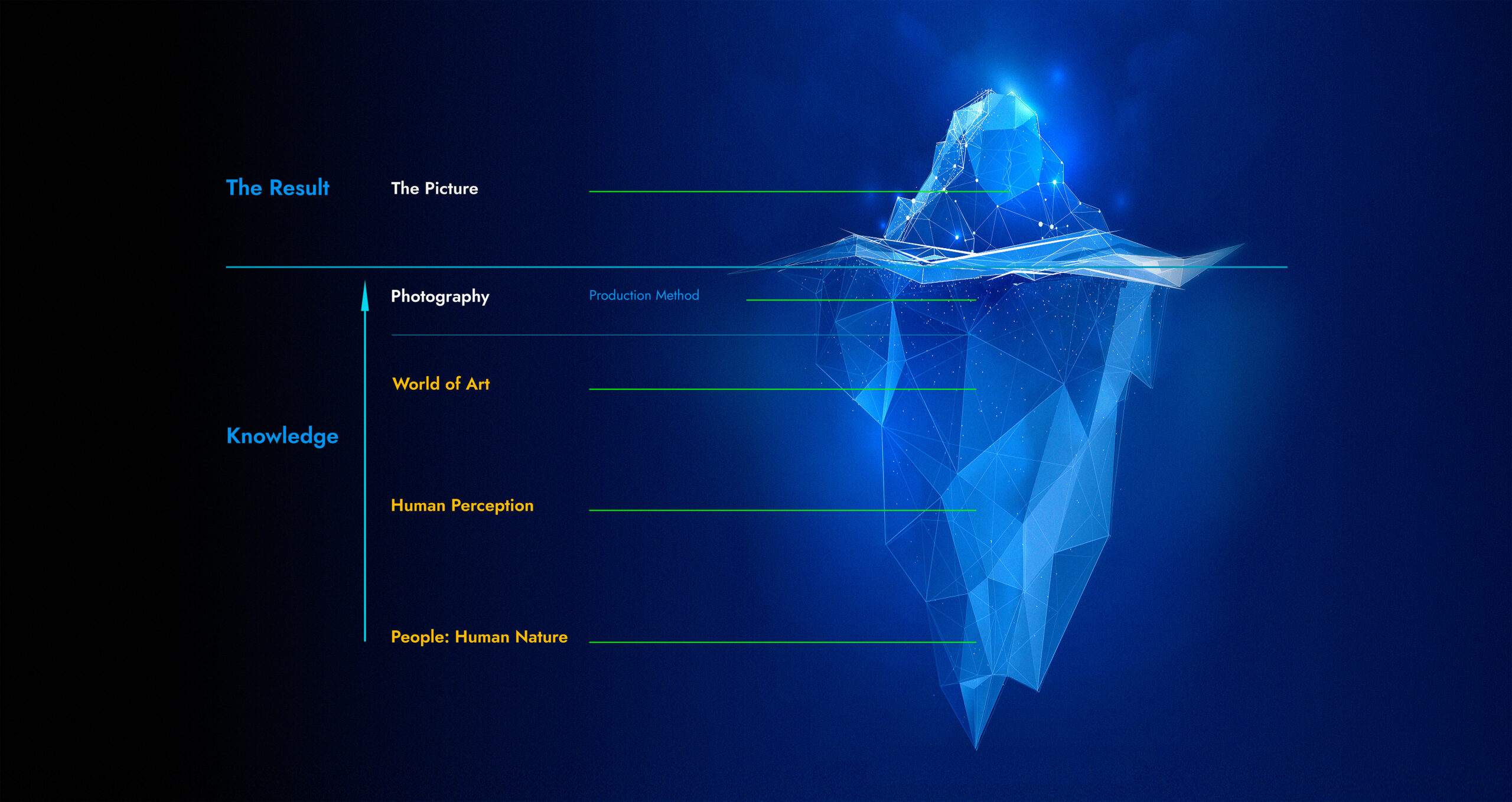
The Unified Theory Of Image-Making.
Producing an image is easy; it’s the tip of the iceberg. – What makes it a successful picture is the knowledge beneath the surface: the much larger mass you never see. – Naturally, photographers seeking to improve their photography look to photography for answers, unaware that the answers lie in subjects beyond photography. The camera only produces the picture, but the camera doesn’t decide whether the picture works. That decision happens beyond the camera, at a human level in three subjects most never study, and social media never discusses: Understanding Human Nature, Human Perception, and The World of Art. – Without this underlying knowledge, the picture has no substance, so it fails.
You have the cameras and know what a good photograph looks like, but do you understand what makes it good and why it works? – Do you have the knowledge to create great pictures? – Good photography requires three subjects to succeed – Human Nature demands that everything has a “purpose & benefit”. The picture’s purpose is to tell a story that benefits the viewer. – Human Perception explains how people process pictures and understand a story. – The World of Art explains the artistic principles and visual language for creating successful pictures that tell the story in a visual way. – Photography alone is just a production process that makes an image. – These principles apply to any medium.
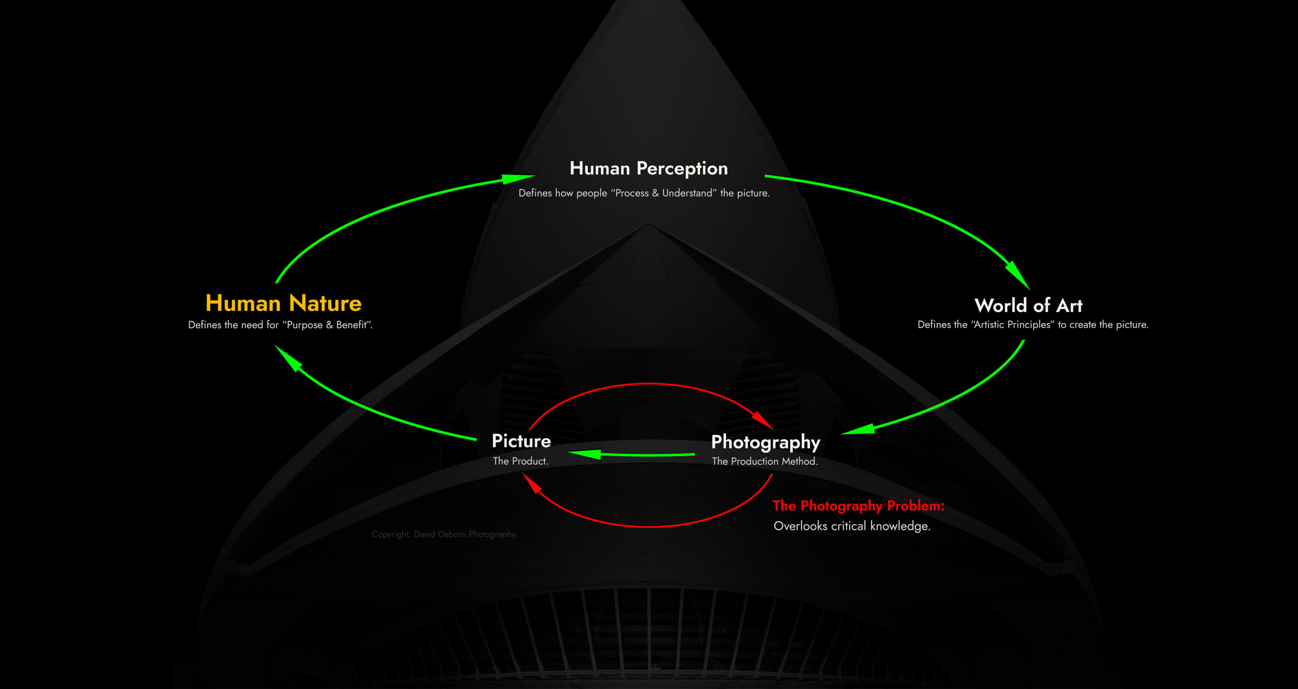
Why Some Pictures Work – And Others Don’t.
The Unified Theory of Image-Making accounts for every influence that shapes a successful image – and it was never really a theory about photography at all. Photography is only one node in the loop: the method of production, one way of making a picture among many. The same loop applies whether the final image is painted in oil or watercolour, drawn in pencil, or part of graphic design or advertising. Human Nature still demands that the image has a purpose. Human Perception still decides, instantly, whether it works. The World of Art still supplies the principles that shape it. Photography is simply our chosen medium, but the theory itself applies to everyone working in visual communication and the arts.
Think about all this at a practical level. If you don’t understand what your viewer needs – Human Nature – how would you know what makes a picture worth looking at in the first place? If you don’t understand how people process an image – Human Perception – how would you know why some pictures work and others don’t? And if you don’t understand the underlying principles that shape a picture – The World of Art – how could you actually produce a successful picture? Missing any single subject isn’t a small gap. It’s why most photographs fail for reasons beyond the camera, at the visual level. Photographers are very rarely taught the critical “Visual Literacy” to know how to create successful pictures.
The theory leaves no knowledge gaps, and because the loop is closed and accounts for every aspect a good picture requires, you can self-diagnose why a picture is weak. Simply ask: Is it a failure of purpose, a failure to process efficiently, a failure of artistic principles or photographic technique? – Normally, it’s a certain amount of each one. This is recursive self-improvement: a feedback loop in which improving one subject feeds directly into the next. Improving one doesn’t just help that subject alone; it improves your photography as a whole. – What follows is the complete explanation of “The Unified Theory of Image-Making” as a new and innovative, holistic approach to improving your pictures.
Index: What This Tutorial Covers.
Background.
Three Kinds of Knowledge. Knowledge creates “Confidence”. – Practical experience and academic knowledge: A combination you can trust.
A Professional Career. Experience creates “Credibility”. – I learned to “Think More & Shoot Less”. A few “Pearls of Wisdom” from my early days.
Moment of Clarity. How this theory “Began”. – I realised in Venice: Photography doesn’t dictate the rules of successful pictures; people do.
The Unified Theory of Image-Making: The Subjects.
Human Nature. Demands “Purpose & Benefit”. – Everything starts with human nature.
Human Perception. Demands “Visual Efficiency & Mental Stimulation”. – The brain filters the data and processes the picture.
The World of Art. Production Knowledge: Translate Ideas Into Pictures. –
A Convergence. My moment of clarity in Venice is explained. – Where Science Meets Art. Two sets of principles combine to create one successful picture.
Photography. Production Process. –
The Picture. Production Result. –
Conclusion.
The Proof of Concept. Why “The Unified Theory of Image-Making” works.
Knowledge Creates Confidence.
Academics. – Limited practical experience.
Academics bring genuine rigour – real research into art history, human nature and perception, often more thorough than anything a working photographer has time for. But their income doesn’t depend on whether that research provides practical, commercial benefit: finding clients, meeting deadlines, or creating pictures every day that sell. – Research can be entirely correct and yet still offer no commercial application in the real world. An academic’s income comes from the university or organisation, not from producing pictures for paying clients on a deadline.
Enthusiasts. – Limited academic knowledge.
Many photography tutors today have no real experience. Someone who enjoys taking pictures decides they want to turn a hobby into a job, so they teach. They have no history of taking pictures to satisfy a paying client, meet a deadline, or earn a living under real pressure. We’re in the world of social media influencers, where personal opinion is presented as professional knowledge; most is superficial. – They don’t earn their living by being paid to take pictures, where bad pictures cost you money and risk your career, yet teach people how to take pictures.
My knowledge. – Practical experience & academic knowledge.
There’s a third kind of knowledge: My knowledge. The most valuable and rarest knowledge of all; it’s tested in the real world. A photographer who combines over 40 years of professional experience with years of personal academic research. – The working knowledge proves it works in reality; the academic knowledge explains “Why” it works. – Before I started teaching, my income relied 100% on clients willing to risk their money to pay me to take their pictures. – Clients won’t take that risk unless they’re totally confident in your picture quality and knowledge.
A Professional Career
Over forty years of professional photography experience.
A Professional Career
Over Forty Years Of Professional Experience.
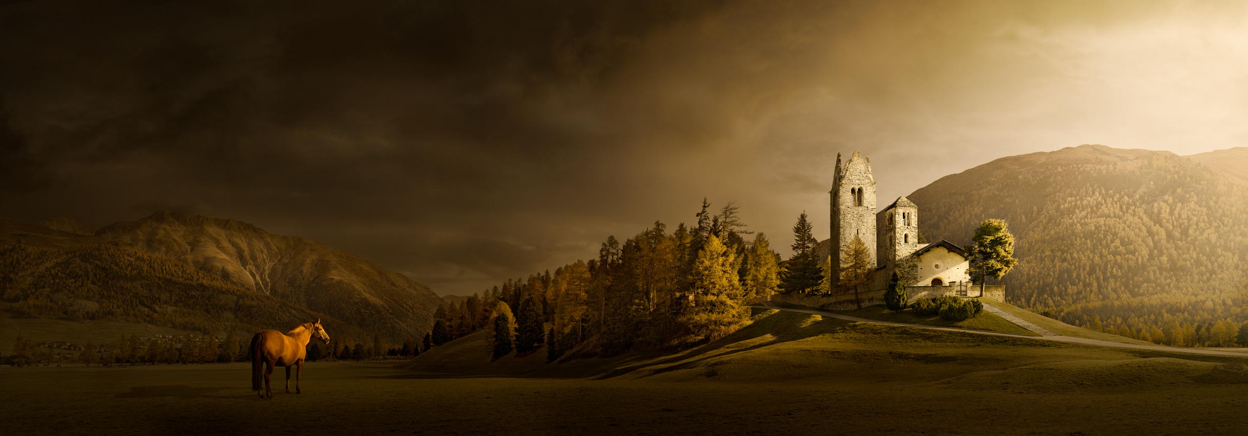
Experience Creates Credibility.
From Reuters News Photographer to exhibiting with Leica in Germany.
I have worked at the highest level of professional photography. I’ve photographed world leaders, royalty, and major global events for Reuters and The Australian. I’ve completed commercial commissions across Europe, Asia, Australia, and the United States, and then spent six years as a photographic project manager on the £4.2 billion Heathrow Airport Terminal 5 construction. That work taught me how professionals create strong images every time, under pressure, with no second chance. It gave me the mindset, clarity and decision-making process that separate confident photographers from those who rely on luck. – But it did not start that way. – Looking back, my early years were very different.
When I began my career as a working photographer, I thought my job was to take as many pictures as possible so my client or picture editor had plenty of material to choose from. I was the photographer, they were the picture editor, and their job was to find the best picture. – That was wrong for two reasons. First, you don’t have time to shoot everything. Second, even if you did shoot everything but didn’t know why you were taking the picture – “What the picture is about” – it wouldn’t matter how many shots you took – you still wouldn’t have one picture that summed up “the story”. – I realised very quickly that volume doesn’t replace thinking; it’s thinking first that produces quality, not volume.






We Need To Think More & Shoot Less.
Edit while you shoot. Not after you shoot.
When I worked for Reuters News Agency, the general rule was one roll of film per job, 36 exposures – because everything was about sending one or two pictures fast – not volume. Getting your photograph to newspapers worldwide as fast as possible meant keeping processing and picture-editing to a minimum, and every extra roll of film added delay. That rule forced us to shoot fewer pictures, but better ones. Once you understood the story you were covering, you could decide in real time what was relevant to shoot. In effect, you picture-edited as you shot. Because you knew what to look for to convey the story, you didn’t need to shoot everything. – You only concentrated on “what matters”.
One day it became clear. I came back with three rolls of film instead of one. The chief photographer, Denis Paquin, told me to pick one roll and bin the other two. I had no idea which held the best picture. – I suggested we process all three rolls, and he mark which frames he would have taken, which he wouldn’t, and tell me why. He agreed. It was the most valuable five minutes of education I have ever had. His reasons all came back to “the story”: Which frame summed up the story best in one picture. – Realising that we only need to take one picture that sums up the story was liberating. – Move the questions you use to choose your best picture at home to being the questions you ask before you shoot.





Intentional Pictures Require A Story.
If you don’t know “What to say”, your picture says “Nothing”.
Reuters taught me to decide on the best picture while I shot. Corporate work taught me to plan the best picture beforehand. As a corporate photographer, you may spend four hours constructing and lighting one picture, and you cannot hand the client a photograph they don’t like, or your career will be short. You are not employed because you own a camera – you’re employed because you know how to create pictures. A photographer is a “visual problem solver” whose expertise is to “see, think and create visually”. Your ability to translate a story into a strong visual image that communicates the story to viewers, is what defines you as a good photographer – your cameras are just tools of the trade.
Has your mind ever gone blank, so you didn’t know what to shoot, or you couldn’t tell whether what you were looking at would make a good photograph? Have you looked at a scene, known it was a good picture, but didn’t know how to turn it into one? – Now imagine the stress of that with your client standing next to you, asking, “What’s the first picture?” I used to bury my head in my camera bag, pretending to look for something, just to calm down. – I realised very early on that, as a working photographer, I needed a fast, logical and reliable system to create good photographs every time. The “Shoot, Hope and Pray” approach was far too risky to survive in the competitive world of photography.
Before you take a photo, you must understand “the story” your picture needs to communicate. – This is where photographers go wrong. They see a scene they like, but haven’t defined what they want to say, so the picture says nothing. Imagine yourself as the viewer, then ask, “What does my picture need to show the viewer, so they will understand my story”? Get the story crystal clear first; everything else becomes easier. You can summarise your story in a short caption, then build your picture logically, step by step, so that it illustrates your caption. The problem today is that people rarely discuss the thought process behind creating good pictures, and too many rely on their equipment alone.
A Moment Of Clarity
Venice, Italy. 2019.
A Moment Of Clarity.
Venice. Italy: How This Theory Began.
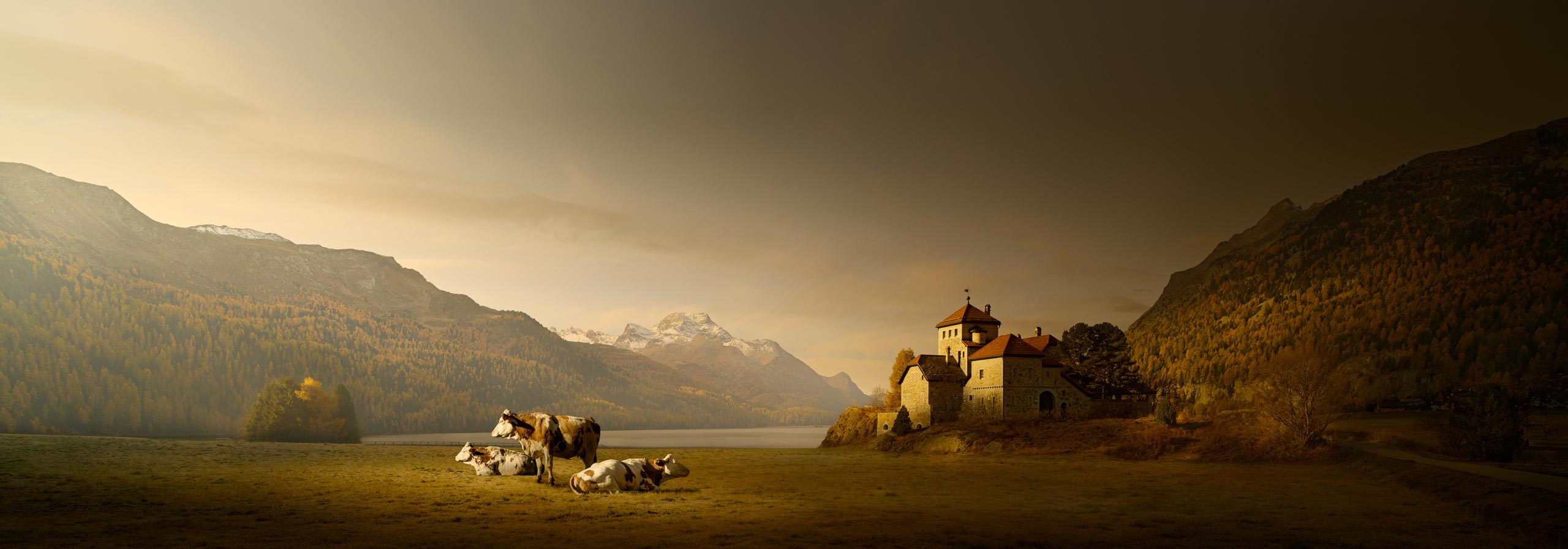
Venice. Italy. 2019.
In 2019, I was standing on the Accademia Bridge, crossing Venice’s Grand Canal with my client. He was very sociable and talked to the people beside us, explaining that he was attending a workshop. To my embarrassment, he asked if they wanted to see my photographs. Not wanting to appear rude, they politely agreed, so my client took out his mobile phone and showed them my work. – The moment they saw my photos, the conversation transformed from muted and reserved to energetic and enthusiastic. The compliments came fast, one after another, all from strangers who had no reason to be enthusiastic. – A surprising and enjoyable experience, even if it was genuinely embarrassing at the time.
I suddenly realised a critical contradiction. As far as I could tell, none had any photographic or artistic training, yet their reactions were similar and immediate. – Whatever caused their response couldn’t be explained by their knowledge of photography; it had to come from something more basic. Something everyone shared on the bridge, regardless of any background, language, or education. The only common denominator was being human. I’d overlooked the single most obvious factor in the photography equation. “People”. – I realised that understanding people was the real key to understanding how to create good photography. – I’d spent my career trying to improve my photography, but I’d studied little about the people who look at my pictures. I’d looked at photography from only one side of the coin; I should have looked at both sides.
People dictate the rules. Not photography.
People judge photography by intuition, not by their knowledge of photography. That’s why people can instantly “feel” it’s good photography, but can rarely explain why they “feel” it’s good. I suddenly realised the obvious: we spend every minute of our day processing visual images; a photograph is just another visual image people have to process. – Therefore, the viewer must process our photographs in the same way they process all other day-to-day visual images. – I realised that if we reverse-engineer how people process and respond to visual images, we can create creative guidelines for making images people respond to. – Photography doesn’t dictate the rules of successful pictures; people do.
Human Nature
The Feedback Loop: Subject One.
Human Nature.
Everything Starts With Human Nature.
Human Nature Demands Purpose & Benefit.
We expect everything to have Purpose & Benefit.
When was the last time you did something that had no purpose and gave you no benefit? I’m guessing never. It would be illogical and totally irrational behaviour; it would contradict our human nature to do so. – Human nature is our “basic operating system”, and it shapes everything we do. – It dictates that everything we do must have a purpose and provide a benefit because we don’t like to waste time, effort, energy and resources for nothing in return. If this applies to life in general, then why would art, photography and pictures be an exception? First, we need to accept that everything we do, even as photographers, has an underlying “Purpose & Benefit” and see photography from this perspective.
Photographers have a Purpose & Benefit. – What’s the viewer’s?
When you take pictures, you do so for a reason: enjoyment and self-expression, social reasons with friends, or a relaxing holiday – but there’s always an underlying “Purpose”: a reason. The purpose is your motivation, and the “Benefit” is the reward: your enjoyment. Without both, you wouldn’t take pictures because it would be pointless. When you look at other people’s pictures, you need a “Purpose” and expect a “Benefit”; without both, you’d feel that looking at them was also pointless. – So what happens when other people look at your pictures? – Do you give viewers a “Purpose & Benefit”? – You may take pictures for yourself, but you still have to give viewers a “Purpose & Benefit”, or they fail.
When did you do anything that had no Purpose and gave you no Benefit?
Now, consider your pictures from the viewer’s perspective.
What’s your viewer’s Purpose & Benefit?
Let’s Define A Good Product.
Every product has: Purpose, Benefit & End User. So does every picture.
A product has: “Purpose, Benefit & End User”. The purpose of a product is to give a benefit to the end user and create a good user experience. Everything we buy fits that definition. Every business exists to provide a benefit to its customer; the benefit to the business is being paid. You can’t make a good product that provides a benefit if you don’t understand the product’s purpose or the end user. – Pictures are no exception. The “Product” is the picture, the “Purpose” is the message, the “Benefit” is what the viewer gains, and the “End user” is the viewer. Pictures are only successful when all three product components are fulfilled and work in harmony: “Purpose, Benefit & End User”; if not, the picture fails.
Products fail when Purpose, Benefit & End User are confused.
When you prioritise enjoyment, the “Product” is the “process of taking pictures”. Your “Purpose” is enjoyment, the “Benefit” is enjoyment, and the “End User” is you. The “Purpose & Benefit” are the same: Enjoyment; the picture is secondary, and you do not have to account for another viewer. However, the instant anyone else looks at your picture, this dynamic changes radically, and pictures fail if you don’t account for it: the picture is now the priority, not your enjoyment. Your enjoyment is irrelevant to viewers because viewers only see the picture. The “Function” changes. – The “Product” has radically changed from “The Process” to “The Picture”, which also radically changes its “Purpose & Benefit”.
The viewer’s Purpose & Benefit is different to yours.
Photographers go wrong, and pictures fail, if they don’t realise their “Purpose & Benefit” is different to the viewers’, and don’t account for the change. The photographer assumes their “Purpose & Benefit” will transfer to the viewer, but the viewer only has the picture; the picture alone must provide all of their “Purpose & Benefit”. – Pictures fail when you don’t give the viewer a purpose, or they gain no benefit. This “Function” shift introduces a new element: “The Viewer”, and puts pressure on picture quality. – The solution is to look at photography from the viewer’s perspective, prioritise the picture, and understand the viewer. – Then you make good pictures for viewers, and good pictures for yourself.
Let’s Define A Good Picture.
A picture’s Purpose & Benefit is to make viewers Think.
Good photography stimulates the viewer’s curiosity, imagination, thoughts, and feelings. It evokes an emotional response. – Photographs are like a conversation; your picture makes a statement, and the viewer responds. – The purpose of a photograph is to make people think and ask questions; to trigger “Mental Stimulation”. It’s your job as a photographer to mentally stimulate the viewer and ignite an emotional response; to make the viewer “Think”. To make people think, you need something to say; a “Story” to communicate visually. The viewer’s benefit is their mental stimulation; the response triggered by your story; and a good user experience means gaining maximum benefit for minimum effort.
You make viewers think by Telling A Story.
We read books for the ideas and stories they contain, not because we simply enjoy the act of reading. Pictures are no different. A picture that has nothing to say is dull and uninteresting, like a dead-end conversation. – If you simply record what you see, that’s a statement of fact, not a conversation. You’ve made no comment or personal opinion for the viewer to respond to; it’s a dead end with nowhere to go. In effect, you’re telling the viewer to do your job for you, to find their own story, which is like being told to cook your own meal at a restaurant. That’s not the deal. – Your job is to tell the viewer something, and your picture fails the moment the viewer doesn’t understand the story or finds it dull.
Don’t confuse Good with Like.
“Good” is dictated by how well the picture performs as visual communication. “Like” is dictated by personal bias and taste. You may not “like” a photograph, but it can still be “good”: if the viewer understands the story and it evokes a genuine response – it’s a good photograph – even if they dislike the subject or the aesthetic. If you’re a vegetarian, then you don’t like eating steak; that doesn’t mean the steak isn’t good; it just means it isn’t to your taste. – Good and like are simply different conversations. Don’t worry about being liked; worry about being good. People respect good pictures, even if they don’t personally “like” them. I can teach you to be good, but not liked. – Good has teachable principles.


Photographic Knowledge Isn’t Enough.
Weak, noisy or confused Signals simply never arrive.
Think of your photograph as an electronic signal. – The photographer creates the signal by making the picture; the signal is transmitted to the viewer, who decodes it to understand your “Story”. The photograph’s purpose and the viewer’s benefit are the same – it’s the story the signal communicates. The photographer only controls the content and quality of that signal: the picture and the story inside it. The viewer controls how it’s decoded: how the picture’s processed, read and understood. A weak, confused or noisy signal simply doesn’t communicate. Alter the input signal, and you alter the output response. – Our job is to control the input signal well enough to “Stop, Captivate & Reward” the viewer.
Photographic knowledge alone isn’t enough.
People create pictures for others to see, yet we spend all our time learning photography and almost none learning about people, the subject that most influences whether a picture succeeds. Photography is only the end of the equation: Production. – Human Nature and Perception, then Art, make up the pre-production knowledge; the majority of the knowledge required to create successful pictures, and almost nobody teaches it. How can we hope to create good photography if we ignore most of the equation that creates it? – We’re shooting blind, relying on luck. – We’re producing a product we don’t understand, for an end user we don’t understand – yet still hope to create good products!
Analogy: The Street Address.
Learning photography alone is like trying to find an address knowing only the street name, ignoring the town and the country entirely. – This isn’t just inefficient; it’s impossible to solve: a street name alone could belong to any of a thousand towns, in any of a hundred countries. Only the town and country make it findable. The town and country provide the global context within which the street resides. Photography needs the same global context. Human Nature, Perception, and Art aren’t optional extras; they set the context in which photography lives. – Human Nature explains “Why”. Human Perception explains “How”, and Art explains “What”: The artistic technique that translates ideas into pictures.
Self-Expression’s Not An Excuse.
Your Satisfaction isn’t The Viewer’s Benefit.
Self-expression requires less to succeed than creating something good for others. – Photography for personal enjoyment is entirely valid. You can take pictures that satisfy you. But your satisfaction alone doesn’t mean the pictures are good for anyone else. A chef can enjoy expressing himself through food, but if nobody enjoys eating it, his personal satisfaction doesn’t make him a good chef. – He may have succeeded in self-expression, but that’s not the same as creating food that works for others. – Your photography may be self-expression, but if nobody but you understands what you’re expressing, your photograph fails as an image because the viewer gains no benefit. – Self-expression is a legitimate reason to make pictures, but it can’t be used as an excuse to justify presenting poor-quality pictures when the viewer isn’t you.


The Photographers’ Purpose & Benefit.
The Purpose.
Your purpose is to communicate. – It’s about having an interest in the world, a point of view on what you see, and saying something about it; the picture is how you say it visually. Creating pictures serves the same purpose as an author writing a book or a musician making music; only the medium changes; ours happens to use a camera. If you have no interest, curiosity, or opinion about life and the world around us, and your interest is limited to photography alone, you’ll struggle to make an interesting picture because you have little of interest to say. The purpose isn’t photography. – Your interest in photography doesn’t create successful pictures; your interest in the world beyond photography does.
The Benefit.
The photographers’ benefit is creative satisfaction. The enjoyment of the process and the satisfaction of the picture. The creative satisfaction of transforming the ordinary into something extraordinary, and the challenge of creating something viewers don’t expect. The enjoyment of rejecting mediocrity and creating quality. Improving your knowledge and craftsmanship – You shoot for yourself, but you create for viewers to communicate ideas and opinions. A way of experiencing life, seeing the world, and offering viewers a unique, personal artistic vision and style, presented with craftsmanship. – A personal challenge of combining artistic self-expression and visual communication that has no end.
The Viewers’ Purpose & Benefit.
The Purpose.
The viewer’s purpose is their reason for looking; its meaning and message may deepen that interest. – They arrive knowing nothing about you and only see your picture. – They look at your picture to learn something new and interesting they didn’t already know or had seen before, or because it triggers a personal memory. – They may look out of curiosity, interest, recognition, simple appreciation or the need for information. They may be interested in the subject, the way it’s shown, or what it means. – Generally, they want to gain something they didn’t have before. If it doesn’t add value to their moment, life, or environment, it has no purpose because it gives no benefit. There’s always a reason, a purpose.
The Benefit.
A poor picture shows only what the photographer saw; a good picture tells you something about what they saw and how they felt. Content describes; mood captivates; it triggers our imagination. – We respond emotionally to what we see visually. Mental stimulation and attention make us feel alive; it gives us enjoyment, pleasure, satisfaction, and insight, among other things. – The response makes looking at a picture an active experience rather than passive viewing. We feel involved in the picture, not just looking at it; it becomes a momentary escape into our imagination. A momentary escape into our imagination. The benefit of looking at a picture is the non-physical response it ignites.
We Finish With A Thought Experiment.
The Room with No Windows.
Imagine a person born in a room with no furniture or windows, just four walls, a ceiling, a floor, and a door. They never leave for twenty years. That’s all the world they know. Then one day they’re given art materials and told to paint a picture. – What could they paint about? They have no experience beyond the room. Over time, they may become brilliant at technique, but it means nothing if the picture says little. – And to a viewer, beyond curiosity about the painter’s situation, the painting would be dull for the same reason. A depressing scenario, but it illustrates my point: Photography isn’t about photography; it’s about saying something through a camera. What you say comes from your interest in the world more than in photography. Having something to say is only half the picture. – How people understand what you say is covered next.
Bad Photographs are Bad Products.
They don’t give the viewer a Purpose to look, or enough Benefit when they do.
Prioritise your picture. Understand your viewer.
Human Perception
The Feedback Loop: Subject Two.
Human Perception.
Human Perception Processes The Picture.

Like travel, we want the journey to be Efficient and the destination Interesting.
Successful pictures are Visually Efficient & Mentally Stimulating.
People Prefer To Avoid Thinking.
The fundamental principle that governs everything people do is Efficiency.
Let’s start with some fundamental principles: the lens through which we view everything. – At the evolutionary level, life’s primary directive is to survive and reproduce. At the visual level, the brain’s purpose is to make sense of the world so that we can survive. The efficient use of our resources – conserving time, effort, and energy – helps our survival. This fact influences everything we do, even our photography, both taking and looking at pictures. We like maximum benefit for minimum effort, and we hate investing time, effort, energy and resources for no benefit in return. It’s a waste of resources; it contradicts the survival rule. – The brain is incredibly fine-tuned to use resources very efficiently, and this principle directly influences how we create and respond to pictures. – Efficiency and resource conservation underpin every aspect of our life.
Thinking is resource-intensive. So, people prefer to avoid Thinking.
“Thinking” only happens at the conscious level, but conscious processing is resource-intensive – it requires enormous time, effort, energy and resources; subconscious processing doesn’t. Therefore, to be efficient, our brain prefers to automate everything subconsciously to conserve resources. However, we can’t “Think” about anything at a subconscious level because we’re not aware of anything at the subconscious level. By default, our brain wants to process your photograph subconsciously so that it can conserve resources; ideally, it would prefer not to think about your picture at all. – The brain’s got a lot of work to do; your photograph is just extra work. It’s an annoyance it would prefer to ignore.
We predict what we will see because it avoids Thinking.
Our brain has evolved a “predictive process”. When we’re born, we have no knowledge, experience or memories; we’re a “blank slate”. As we gain new knowledge and experience, we add these to our memory and store them for future use. As we go through daily life, the brain takes in just enough information to get a feel, matches that against memory, and predicts the rest: “We predict what we will see”. – If what follows matches our prediction, we ignore it. – We don’t “Think” about “What we already know” or “Have seen before” because we already “Know it”. Why think about something if we gain no benefit from doing so? It’s inefficient; it just wastes our resources. If you show me a literal, generic image I’ve seen many times before, I’ll glance at it and ignore it. – It gives me no problem to solve or useful information to use in the future.
Not Thinking Creates A Catch-22.
If viewers don’t Think, our picture has no Purpose because it gives no Benefit to viewers.
Our brain will do everything it can to avoid having to “Think” and engage with your picture, simply because it wants to conserve resources for higher-priority issues. However, as defined earlier, in human nature, the “Purpose & Benefit” of a picture is to make the viewer “Think”; otherwise, the picture has no purpose because the viewer gains no benefit. – Do you see the “Catch-22” – the problem all creators must resolve? – Two principles are in direct conflict, and the viewer dictates the rules; creators don’t.
The Creator’s Problem
THE CATCH-22
By default, people prefer not to Think. But if we don’t make the viewer Think,
our picture has no Purpose and gives no Benefit.
This is the core problem all creators must resolve when creating any successful picture.
Let’s Define The Catch-22.
Pictures succeed when they satisfy the Visual Efficiency & Mental Stimulation principles.
- If the picture’s easy to read but has nothing to say, it fails Mental Stimulation.
- If the picture has something to say but is too hard to read, it fails Visual Efficiency
- If the picture is easy to read and says something, it succeeds.
Visual Efficiency & Mental Stimulation is the combination that makes people Think. We can solve this Catch-22 paradox by understanding how our brain processes images, because it filters all incoming visual data for “Usefulness”.
Let’s look at “The Brain’s Filter” next.
The Brain’s Filter
The Filter: Keep or Ignore.
The brain filters all incoming Visual Data.
Our brain’s primary role is survival. – If our brain processed every piece of incoming visual data in detail, it would be overwhelmed in seconds and cease to function. The data comes in faster than it can be processed. – But if it ignored everything, it would miss the important data that helps our survival, and our survival would be at risk. So our brain has a brutally simple, efficient solution. – It treats all incoming visual data as “Useless by Default” unless it’s proven otherwise. Your photograph is no exception to this rule. – The brain filters all the incoming visual data. This is called your “Keep or Ignore” Filter. To succeed, our photograph must survive this filtering process; otherwise, it’s ignored and fails.
We all have a Keep or Ignore Filter.
How many times have you driven to work with no memory of the journey at all? – Your eyes did send a constant stream of visual data to your brain the entire way; if not, you would have crashed. Our brain’s conscious level is reserved for immediate problem-solving and investigation; everything else is handled automatically and subconsciously to conserve resources, and if it’s stored in our subconscious, we’re unaware of it; we have no conscious memory of it; like it never happened. – On that routine journey, nothing was worth investigating, so your brain handled it subconsciously and ignored the data. The data existed momentarily but was discarded, entirely without your permission or awareness.
Now recall the day someone stepped into the road in front of your car. – You reacted instantly. – That visual data was flagged as high priority; important data, and it got diverted immediately to the conscious level for problem-solving and investigation: you became fully aware of the situation in a fraction of a second, and you remember the event. If your brain processed every moment of incoming visual data in full detail, it would have taken so long to process the data, that you’d have hit the person before being aware of them. Equally, if you ignored all the data, you’d also hit them. This is the “Keep or Ignore” filter in action. – Your photograph is visual data; it’s subject to exactly the same filter process.
The Filter: How It Works.
Analogy: The Motorway.
Imagine the endless flow of incoming visual data as a fast-moving motorway full of cars, every car representing an image from your eyes. The motorway is your subconscious. At one end, they enter through the eyes; at the other, they simply disappear, as if they never existed. Ignored and “forgotten”. As they travel along the motorway, each car passes under a traffic signal that decides whether it stays on the motorway and is ignored, or leaves it and gets investigated. – That traffic signal is your “Keep or Ignore” filter, quickly checking all the images as they pass by.
In a fraction of a second, the traffic signal checks each car for several indicators that it’s “useful data”. – Useful data being primarily defined as data which helps make sense of the world around us, navigate it and survive. No single indicator is sufficient; its “usefulness” is the result of all the indicators combined. – If the data shows the potential of being “useful”, it flags the data and triggers the traffic signal to direct that image off our subconscious motorway for more detailed investigation at the conscious level. – The level where we can “Think” and engage with it.
Your photograph must trigger the traffic signal; otherwise, the viewer will ignore it, and it will fail as a photograph. If your image has survived initial inspection, now it must survive secondary inspection. In secondary inspection, the brain uses the same criteria again, but examines your image in much greater detail; it’s no longer a quick glance, but a detailed investigation. Equally, if your photograph isn’t created to be “visually efficient”, secondary inspection will also reject it simply because it takes too long to process. It would cause a backlog of images to process.
If the image fails secondary inspection, it’s simply overwritten by the next one in the queue. If it passes, it’s judged to be “useful data”, like the person walking in front of your car. It’s available for use. – The “Keep or Ignore” decision is based on a pure “profit and loss” calculation. It’s not an artistic decision – “Is it a good photograph?” – it’s “Does the image provide enough useful data to help make sense of the world around us, navigate it and survive? – If it survives the filter, it passes the “Visually Efficient & Mentally Stimulating” test. – Let’s look at the filter principles.
The Filter: The Brain Principles.
A LIST OF WHAT THE BRAIN LOOKS FOR.
01. Does it have visual “Order, Structure, Emphasis & Simplicity”?
The brain’s priority is to extract the “useful data” from the visual signal. – It can’t do this unless it’s gathered first. The brain needs to gather the data first in order to have something to process and form a response on. – “Order, Structure, Emphasis & Simplicity” make the initial gathering process fast and efficient; it reduces the time, effort, energy, and resources required. – If the gathering process takes too long, it’s ignored and moves on to the next data to process. – The more we present data in an organised form, the faster it can be processed; the more “useful data” can be extracted quickly. This is why “Visual Efficiency” is the first fundamental principle of good photography. Always present efficient data.
02. Does it communicate “Feeling, Mood & Atmosphere”?
Our brain prioritises survival; therefore, it prioritises extracting data that supports our survival, threats or benefits. We feel the danger of being too close to a cliff’s edge before we’re actually on the edge and risk falling; the feeling warns us of danger. – If we investigated how close we are to the edge, that time delay may make the difference between walking off the cliff and not. – Beyond immediate threats, we also want a general “feel” for our surroundings, the “Mood & Atmosphere”, so we can react accordingly; like dressing correctly for the heat of a hot day or the rain of an approaching storm. – Images without “Mood & Atmosphere” contain less useful information, so they’re lower-priority data.
03. Is it “Three-Dimensional Form & Distance”?
The next priority is “What is it and where am I?” – Our brain constructs and updates a mental three-dimensional model of the world around us so we can navigate and understand where we are within it to survive. – Three-dimensional form and spatial distance are high-priority, “useful data” because they update our mental three-dimensional model of the world around us. They give us “reality data”. The brain reduces shapes to their most minimal form, then compares them to our prior knowledge and experience to assign a meaning. – Is it a mountain, building, or person, etc.? – This allows for fast identification without investing time-consuming, detailed investigation. – Real-world data is “useful data”.
04. Is it about “Life, People or an Event”?
The next priority is “Biological & Social Relevance”. Visually, we prioritise faces because, historically, our ability to read others, friend or threat, safe or dangerous, mattered. Events, when something happens, signal change, and our survival system is built to tune in to change. The brain prioritises change over static because a change in our situation may require investigation and then a reaction to it. – News and documentary images feel more “relevant” and “useful” than a still, generic landscape image. Pictures that comment on “Life, People or an Event”: those that comment on the human condition, depict people, events or momentary time contain more “useful data” than static and lifeless content.
05. Is it “New, Novel or Different”?
Our brain is drawn to anything different or unexpected because it offers the potential to provide useful information we don’t already have. If I already know it or have seen it before, it’s a waste of my resources to investigate “what I already know” again; I gain no benefit. It has no new “useful” information that will help me now or in the future. The brain spends almost no attention on what it already knows, the expected, so it can allocate its attention and resources to that which is important, unpredicted, different or problems that require investigation. – If it is “Not what we predict to see” or “Have seen before”, we need to “Think” about it to resolve the discrepancy – “Thinking” is “Mental Stimulation”.
* The “Disruptor Element”.
A “disruptor element” disrupts our confirmation. We predict “what we will see” then wait for confirmation. If the confirmation is correct, the image remains subconscious and is ignored. If the confirmation isn’t correct, the image doesn’t match “what we predict to see”; it is diverted to the conscious level for investigation to resolve the discrepancy. The disruptor element is something “we don’t predict to see”. An element in a “predictable image” that makes the image “unpredictable”. – This then forces conscious investigation and triggers “Mental Stimulation”. A disruptor element diverts the issue from fast, efficient, automated subconscious processing to slow, resource-intensive conscious thought.
The Filter: What It Tells Us.
We can look at Good Photography from a different angle.
Answering “Is my photograph good or bad?” is too reliant on personal opinion and “like”. – The “Keep or Ignore” filter allows us to reframe that question to “Does my photograph have ‘useful data’ for the viewer”? This is more specific, measurable and helpful. The more your photograph contains “useful data” for the viewer, the better the picture. – This alone doesn’t define “good photography”, but it puts you on the right path. It’s not logical to argue you can have a great picture built on useless data. Essentially, the picture becomes only visual data. – The question is whether it’s good or bad data, useful or useless. The success of your picture ultimately depends on the quality of the visual data it generates.
The filter criteria help photographers Self-diagnose.
Critiquing your images based on a “good or bad” criterion is like asking – “Is this string long or short”? – Pointless. – Ask another photographer, and you introduce personal opinion, style, pride, ego, etc.: unreliable. – However, taking one filter criterion in isolation, comparing your images against it, and working through them all is a great way to self-diagnose your own weaknesses, and because the criteria are based on impartial science, you can trust them. The filter identifies specific weaknesses, not abstract “good or bad” judgements. – You can compare these criteria against pictures you feel are good or bad, and find out why you feel that way. It gives you an enormous amount of insight into “what works”.
The Holiday analogy explains The Filter.
Think of the filter as someone choosing a holiday. Like a holiday, a picture has both a journey and a destination. When choosing a holiday, you weigh the effort against the reward to decide if it’s worth taking. – You want a fast, efficient journey and an interesting destination. – With a picture, you want it to be effortless to understand; that’s “Visual Efficiency”, and the first criterion the filter checks. – Once you understand it, you want it to be interesting; that’s “Mental Stimulation”, and the remaining filter criteria check for it. – An easy journey, but a dull destination isn’t worth taking, and an interesting destination, but too hard a journey is never chosen. The filter makes the same decision: “Keep or Ignore”.
The Filter: Three Levels Of Work.
Boring work. Rewarding work. Too much work.
In this tutorial, we define “Work” as “Mental Effort”, and a picture has three levels. – The first level is the work of reading a picture: deciding where to look, understanding what it shows, and how the parts fit together. This is work the viewer doesn’t want to do, so remove it. – The second level is the work of engagement: asking questions, making connections, and figuring out what the picture means. The viewer needs this work because without it there’s no reward, and we only really value the reward if we earn it through effort. – The third level is overload: when reading is difficult, or the meaning is out of reach, the effort stops paying off, and the viewer gives up. – Remove the work of reading. Make the viewer do some work for engagement, but never let the viewer become overloaded. – The right amount, in the right place.
The brain has no concept of Good or Bad photography.
It filters for Useful or Useless data. – The more Useful Data the picture has,
the more viewers feel it’s Good Photography and engage with it.


There Are Some Other Considerations.
The world is three-dimensional. Pictures are two-dimensional.
We have two eyes, “Stereoscopic Vision”, and each eye produces its own stream of two-dimensional data. – The data is slightly different from one eye to the other; the difference is called “Binocular Disparity”. – Our brain combines these two streams of two-dimensional data by taking into account the “Binocular Disparity” difference to create our perception of a real three-dimensional world; it’s our mind that creates the real sense of three-dimensional form and spatial depth. This is our mental three-dimensional model. A picture is two-dimensional; therefore, it can never compete properly with real-world data because it’s less useful for updating our three-dimensional model. – Pictures are lower priority.
Our brain doesn’t want your photograph.
Our brain’s immediate priority, moment to moment, is to navigate the world around us, understand where we are in it, and survive. As stated, it updates a mental three-dimensional model of the world around us, which requires real-world data. Therefore, by default, the brain assumes your picture is “Worthless Data”, NOT “Worthwhile Data”. We have to play a game. – We can artificially make the picture more worthwhile by making the data more useful; we enhance the picture’s three-dimensional illusion of reality and try to “fool” the brain into upgrading the data. We increase the picture’s three-dimensional form of objects and add more spatial depth to give the brain more of the visual data it prefers.
Viewers don’t wait. They leave.
We can grasp what a picture is about in as little as 1/10th of a second, about the time it takes to blink. On the other hand, the most commonly quoted time people spend looking at a painting in a museum is just 10-20 seconds. – The Louvre provides a striking example of how little time we spend looking at pictures. – Around 80% of Louvre visitors come to see the Mona Lisa, the world’s most famous painting – but spend only about 50 seconds looking at it. – There are no precise numbers; my point is that perception is very fast, and viewers don’t look long. Viewers “look and leave”. If a picture doesn’t communicate fast, it fails because viewers leave and ignore it; viewers dictate the timeframe, you don’t.
Familiarity kills Curiosity.
The more familiar you are with a subject, the less curious you are about it, and the less reason you have to engage with a picture of it. Imagine two pictures: A motor racing crash and the Eiffel Tower in Paris. The crash picture scores very high for curiosity, and the Eiffel Tower very low. The Eiffel Tower scores low because we’re familiar with it. – It’s “What we predict to see” or “Have seen before” based on our prior knowledge and experience; it’s not “New, Novel or Different” or requires any investigation. Literal, generic-looking subjects shown in an obvious way hold little curiosity; this puts pressure on familiar subjects to be shown in a unique way to overcome our lack of curiosity, or we never engage.


The Solution
How We Solve The Catch-22 Problem.
Let’s quickly refresh The Catch-22 Problem we must resolve.
Two equally important fundamental principles are in direct conflict. On one hand, we defined successful photography as: “it makes the viewer think”. Yet, on the other hand, by default, our brain “prefers not to think”. But, if we don’t make the viewer “think”, your picture has no purpose for viewers, because it gives them no benefit. – The Catch-22 photographers must resolve is “How to make the viewer think and engage with your photograph when the brain labels your photograph “low-priority” and prefers NOT to think about it? – Our brain wants the least possible effort; ideally, to only deal with day-to-day issues. – Our picture is additional work; a luxury the brain doesn’t really want to get involved with.
The solution: Consider pictures as Crossword Puzzles.
Consider a crossword puzzle: Why do them? – At first glance, they seem like a waste of time, effort, energy, and resources, and they certainly don’t help us navigate the world around us and survive; they have to be a waste of resources. – The answer is “The benefit must outweigh the cost”. When we get one word correct, we feel what’s called “the aha moment”, and it makes us feel good. When we get one word correct, we want to repeat the process to feel good again. – Without the work, we wouldn’t gain any reward. Indeed, the harder the work, the bigger the reward; the more we feel good. The brain doesn’t want to work, but we must make it work if the viewer is to gain any reward from our image.
The crossword is a simple, efficient graphic design “Visual Efficiency”, but the clues trigger high “Mental Stimulation”: the perfect combination for maximum reward. The same is true with successful pictures: give the viewer more reason to look at it, than ignore it. Reduce the viewer’s “cost of looking” and increase their “benefit from looking”. – “Visual efficiency & Mental Stimulation”. – The brain wants visual ease and mental challenge at the same time. Without mental challenge, there’s no reward. – The reward is mental stimulation because this makes us feel alive. A literal, generic-looking landscape image offers no challenge, no work, so it provides no reward; therefore, we ignore it. We label it “Boring”.
The sweet spot lies between Two Extremes.
Successful photography is in the sweet spot between two extremes. – Literal photography doesn’t benefit the viewer because it shows them “what they expect to see”. Not showing anything new doesn’t ignite their curiosity. – Photography people can’t understand, won’t benefit the viewer because you can’t engage with something you don’t understand; there’s no “point of reference”. Therefore, engaging photography has an underlying foundation of realism – the illusion of three-dimensional form and spatial distance, which gives the picture a point of reference to understand it, but different enough so it’s not “what viewers predict to see”, which triggers curiosity and forces the viewer to think. In brief, they communicate a story, evoke an emotional response and reward the viewer. It’s a good “Product” that provides a good “User Experience”.
Analogy: The Shop Owner.
Good pictures “Stop, Captivate & Reward” the viewer. – Stop their attention, captivate their interest, and reward them with something worth looking at. – Think of a picture like you’re a shop owner. First, you want everyone to find your shop fast and efficiently; otherwise, you have no customers: Stop. – Then, make it easy for your customer to enter the shop and hard to leave, so they spend a long time looking and shopping: Captivate. – When they do manage to leave, you want them to feel they had a good shopping experience: Reward. – Successful pictures will achieve the same sequence of events. First, your photograph must be worth noticing, and then offer something interesting once it’s noticed.
The Brain: Stimulation Principles.
A LIST OF MENTAL STIMULATION TRIGGERS.
Qualities that create engagement.
These are the “Mental Stimulation Triggers” – A list of qualities that, when a picture contains them, trigger mental stimulation and engage the viewer. They generate an emotional response to what the viewer sees. They represent our picture’s “end goal”; what the picture must achieve. A literal-looking, generic picture can be visually efficient, but if it has none of these engagement triggers, it still fails because it’s dull: viewers have nothing to invest in, no reason to stay and study, and no benefit to gain, so they leave. I didn’t invent this list of qualities, and they aren’t specific to photography. – Writers, filmmakers, and painters have used them for generations; just look at any great novel, film, or picture.
01. Mood & Atmosphere.
We respond emotionally first, before we understand the details: the picture’s light, mood, drama, and atmosphere; the image’s “Gist” and feel come first, as an emotional response before we understand the specific subject and content. The brain evaluates pictures for their emotional value before their informational value. It prioritises emotional significance: the emotional character of a scene that viewers connect with first. Creating mood and atmosphere, like threatening, peaceful, melancholic or joyful – makes the viewer instantly connect with the picture.
02. Connection.
First, we identify individual objects; then we try to understand the relationships between them: The connection. – A ripped chair beside a dog may lead us to infer that the dog is the cause of the damage, even though the picture doesn’t prove it by showing the dog in the actual act of destroying the chair. – When we place meaningful elements together, we give viewers a visual problem to investigate and solve; this requires thinking. The viewer constructs a relationship or story that no single object could create on its own. – Interpretation requires viewers to think.
03. Symbolism.
Symbolism relies on our prior knowledge and experience to understand what that symbol represents. – When we see a symbol, we apply our understanding of what it represents. We associate a cross with religion – we don’t need to see the entire church, just the cross, to know it’s a church. However, for an alien with no concept of religion, the cross would have no meaning – therefore, the picture fails because it relies on the viewer associating the cross with religion to understand the story. Without that association, the cross is a meaningless graphic shape.
04. Ambiguity.
Ambiguity implies “something”, but doesn’t show “everything”. The viewer constructs the missing “something”, which requires them to “think”. We create what’s called an “informational gap”, and the viewer fills it in. A gap between what we know and what we want to know. Replacing the dog with an open window behind a damaged chair gives the viewer evidence, but not a complete explanation. – It triggers the viewer to ask: What came into the room? Did they come through the window? – We don’t like unanswered questions. Ambiguity triggers curiosity.
05. Different.
Different is a Mental Stimulation quality – for the same reason it’s the “Keep or Ignore” filter – Is it “New, Novel or Different”? – Or The Human Perception Principle – “We predict what we will see”, because it avoids “Thinking”. – The absolute core of mental stimulation is – “Don’t show what we predict to see” or “Have seen before”. Unexpected elements interrupt the familiar and encourage closer inspection. We’re attracted to “Different” because it offers the potential for greater reward, but also greater risk, whereas the familiar feels safest, but offers less reward.
06. Time.
Time is also an element of the “Keep or Ignore” filter – Is it about “Life, People or an Event”? – Time gives the picture life because we’re drawn to change, not static. An expression caught mid-thought, or a moment frozen in time, triggers our curiosity to examine what would otherwise move too fast to see in detail. A picture that freezes an instant allows the viewer to infer what happened before it and anticipate what might happen after it. A picture of the dog actively ripping the chair apart has more life and energy than one of it sitting beside the destroyed chair.
Not Memory.
Memory is personal mental stimulation, not universal. Symbolism relies on “prior knowledge and experience” to work by associating meaning with what you see. Memory works the same way, but the “prior knowledge and experience” that makes the picture work are unique to you. It may have powerful personal significance, but it has no reference point for anyone else. No one else can assign meaning to the image the way you do. Therefore, it has no universal benefit. – Memory is perfectly valid, as long as you accept that the end user can only be yourself.
Not Design.
Many photographers believe composition alone makes a good picture, and minimalism has made that belief fashionable. This is wrong. Design only achieves visual efficiency: the brain grasps the shapes quickly and moves on. Efficiency is not stimulation. A clean, balanced image can be understood at a glance and then ignored just as fast, because nothing in it asks the viewer to investigate or think. Pictures that rely on design alone fail because design makes a picture easy to read, but it offers nothing worth reading. – Design is the journey, not the final destination.
The brain demands Visual Efficiency & Mental Stimulation.
Don’t show What we predict to see or Have seen before. It’ll be ignored.
Challenge your viewer. – Make them do some Rewarding Work to Think & Engage.
Let’s Look At Visual Literacy.
An Evolutionary Imbalance.
We learn to “read visually” from birth, but not “write visually”. – The ability to “visually read” the world around us is critical for survival. Creating or “writing visually” offers little survival benefit, so we don’t learn it from birth. Reading visually is a natural ability; creating visually is a learned skill. This has enormous implications: we can recognise good pictures, but that doesn’t mean we can create good pictures by default; it means your viewer is highly skilled at “reading” what you show them – but our “writing skills” may not match the viewer’s reading skills. – We have no control over how the brain processes images; that’s fixed at our basic operating-system level, and we can’t change it. We can only control the images we give the brain to process. – The brain dictates the reading process; therefore, the reading process dictates our writing process.
Visual Literacy Means Fluency.
Visual Language.
Every day we use two kinds of language: spoken and written. Each is a system of elements and rules that lets one person transfer meaning to another. – Pictures have a language too. “Visual Language” is the system of elements and rules we use to communicate through what we see. Its “words” are shapes, tone, light, colour, form and space – its “grammar” is composition, structure and emphasis, the way those elements are arranged to say something. Few of us are ever taught it formally, yet everyone uses it. We read the world using “Visual Language”, recognising faces and objects, judging distance, and sensing mood. A picture is a visual message written in “Visual Language”, and viewers read it visually.
Visual Literacy is Fluency.
“Visual Literacy” is fluency in “Visual Language”. In written words, being literate means you can both read and write. In pictures, it is the same. People are naturally fluent “Visual Readers”. However, few of us are fluent “Visual Writers” because choosing and organising the shapes, tone, light, and composition to express exactly what we intend takes knowledge, not instinct. A photographer who can read but not write can see that other people’s pictures work, yet struggle to create one that does. They don’t understand the engineering behind why the picture works. In effect, this tutorial explains the engineering principles behind “seeing, thinking and creating visually”: the knowledge which isn’t intuitive.
The viewer Dictates all the Rules.
If we don’t learn how people process pictures, we can’t create pictures that people process correctly; the picture fails the processing process. The viewer dictates the reading process; the reading process dictates the photographer’s writing process. Imagine an author who publishes a book in a country that doesn’t speak the language. The book won’t be read, no matter how well it’s written. It’s in the wrong language. – The author cannot make a country change their reading language; the author must change their writing language. Pictures work in the same way. You can’t write in visual language people can’t process and understand. Reading and writing skills must work in perfect harmony to succeed.
You can’t escape from using Visual Language.
Every picture you make is written in “Visual Language”, whether the photographer intends it or not. You can’t opt out. A poor picture doesn’t avoid visual language – it’s just written using poor visual language. The moment someone looks, the viewer reads the shapes, tone, light and composition in front of them and takes a message from them, so you cannot make a picture that says nothing. – You can only make one that says the wrong thing, or says it badly. And unlike any spoken language, this one crosses every border without translation: people worldwide read it the same way. – The choice is a very simple “either/or”. – Ignore “Visual Language” and fail, or learn “Visual Language” and succeed.
We don’t control How people process pictures.
We only control The pictures people process.- You must change your Writing Language because people can’t change their Reading Language.
A Unified Theory – The Scientific Evidence.
The Brain’s System 1 & System 2 Process.
The Survival Brain. – Our brain’s Computer BIOS.
Beneath everything else sits our “survival brain”, a popular term for the brainstem and other ancient structures. – It controls the critical bodily functions that keep us alive: breathing, heartbeat, balance, and basic reflexes. – It’s the oldest, simplest and fastest part of the system, and it never switches off, even when you sleep. It’s like a computer’s BIOS; it runs before anything else, and everything else depends on it. – You’re never consciously aware of it, and you cannot override it. – We mention it here for one reason: it shows the brain’s priorities. Survival comes first, and every higher level of processing, from our day-to-day life to how you look at a photograph, builds on that most basic priority.
System 1 – Fast, Automatic, Subconscious.
Above the “survival brain” sits System 1: fast, automatic and subconscious. It runs constantly, silently and effortlessly, gathering data from the eyes and filtering it in milliseconds, entirely below conscious awareness. – This is where my “Keep or Ignore” filter lives: the motorway, traffic signal and instant verdict. – System 1 relies on shortcuts, patterns and prediction, and its results arrive as feelings, not logical reasons. It’s the brain’s preferred level of processing because it’s efficient and resource-friendly, conserving time, effort and energy. Almost everything ends up “forgotten”. – Only when System 1 flags something it cannot resolve does it hand that data upwards to the conscious, System 2 level.
System 2 – Slow, Deliberate, Conscious.
System 2 is slow, deliberate and conscious: reasoning, planning, problem-solving and investigation; the part of the brain that feels like “you”. It is powerful and capable, but it has limited capacity, focusing on one thing at a time, and demands far more time, effort, energy and resources than System 1, so your brain calls on it sparingly – only when System 1 flags something it cannot resolve – like that person stepping in front of your car. When System 2 engages, you become attentive, you remember what you saw, and you can put it into words. For a photograph, this is the goal. – A picture succeeds when it’s flagged, investigated and remembered. – It fails when it’s filtered out, “forgotten” and ignored.
The Gather – Process – Respond Logic.
The default process of everyday life.
Gather – Process – Respond: The logic we use in everyday life.
Put together, the brain handles every image in three stages: Gather, Process, Respond. First, the eyes gather a constant, overwhelming flood of visual data, far more than the brain could ever process in full. Second, System 1 processes it, filtering instantly and automatically according to its “usefulness”, and ignores almost all of it. Third, when data is flagged as “useful”, System 2 responds; it investigates the data, and you feel an emotional response; you remember the image. Your photograph passes through all three stages whether you understand them or not. You cannot change the rules of “process”; you only control “the pictures to process”. Give the filter what it rewards, and the picture is engaging.
Respond – Process – Gather: Reverse the logic to create pictures.
The brain handles every picture in one order: gather, process, respond. – As the photographer, we should work in the opposite direction. First, decide on what response you want to generate: the story you want the viewer to understand, and the thoughts and feelings it should trigger. Second, learn how people process pictures so you know how to generate that response in the viewer when they look at your picture – what the “Keep or Ignore” filter rewards or ignores during processing. Third is gather. Photograph the right subject matter, light, and content, then present it in an organised, structured form so the viewer can efficiently gather visual data from your picture. The reading process in reverse.
You don’t control how the viewer responds; you control the data – so “edit the input data” to influence the response you want the viewer to have. – This is the logic of the “feedback loop”. – Human Nature decides the response: the need for “Purpose & Benefit”: having a story. Human Perception explains how the picture will be processed, which then generates their response. The World of Art and Photography explains how to collect and present the right data efficiently and in an organised way for the viewer to gather. – Each subject in the “feedback loop” does a specific job, and if every subject isn’t considered, the picture is weak or fails. – In reality, you rely on guesswork and luck when taking pictures.
The Brain Constructs Our Sense Of Reality.
Then our brain tries to Minimise Its Effort.
We only see Reality as a construct in our minds.
The data that reaches our brain isn’t the ordered world we experience; it’s chaos. Each eye sends its own flat, slightly different image, upside down and reversed left to right. – Only a tiny central area, roughly the size of a thumbnail at arm’s length, is sharp; everything around it is soft and low-detail. Each eye has a blind spot where no data even exists. The eyes jump around, so the signal is a stream of snapshots, interrupted by blinks. From this fragmented, shifting, scrambled input, the brain builds one stable, three-dimensional world. We never see the signal itself, only the brain’s interpretation. – The ordered reality that we experience isn’t in the visual signal; the brain only constructs it from the signal.
Our brain’s a Cognitive Miser. It loves literal images.
Because building our reality is such hard work, the brain economises at every step. Psychologists call this a “Cognitive Miser”. In picture terms, the brain’s cognitive miser prefers simple, obvious pictures. Generic or literal images we have seen many times before. Those that match what our brain already knows. These can be processed quickly, handled by System 1 and “forgotten” without “Thinking”. – This costs almost nothing, and it leaves System 2 free for problems that matter more. That’s why obvious pictures fail: the miser saves its resources by ignoring them. To earn attention, pictures must be easy to read but not “What we predict to see” or “Have seen before”. We have to fight the “Cognitive Miser”.
Selective Attention: Viewers only See what they Focus On.
My wife asked me to get her sunglasses from a table. She always keeps them in their case, so I visualised the case and searched the table for a match. I didn’t find one, so I told her they weren’t there. They were right in front of me, but not in their case. – Because they didn’t match what I predicted to see, I didn’t “see” them. This is the “Keep or Ignore” filter at work: we don’t see everything in front of us, only what our attention selects. What we predict to see can influence what we notice. – For a photographer, the lesson is direct: if an important area of an image isn’t emphasised, the viewer may not see it. – Make important areas impossible to miss; don’t assume that just because it’s there, it’s noticed.
How The Brain Organises What It Sees.
Simplified Information Is Efficient Information.
We grasp the Gist in a fraction of a second.
Before we examine a scene in detail, we first grasp its “Gist”: a quick summary of what kind of place it is, what’s happening, and how it feels. In 1996, Simon Thorpe and colleagues found that the brain can distinguish photographs containing an animal from those without, in about 1/7th of a second. In 2007, Fei-Fei and colleagues found that scenes shown for about 1/10th of a second, roughly a single glance, yielded substantial gist. The viewer’s first impression of what your photograph’s about forms long before they start “Thinking” about it or study the details within it. Pictures communicate fast. We judge a picture by its first impression, then decide whether to stay and study it longer or leave and ignore it.
We look at the Group first, before the Individual.
In the early twentieth century, Gestalt psychologists showed that we don’t see scattered marks; we see organised wholes. The brain groups elements automatically, using simple rules: things that are close together belong together, things that look alike belong together, and things that continue along a line belong together. It separates a figure from its background very early, before it analyses either one. – This grouping happens effortlessly, and it underpins “Visual Efficiency”. – A picture whose elements group into a few clear shapes can be processed quickly. A picture whose elements refuse to group, or group in competing ways, forces the brain to sort them out, and that costs time and effort.
Geons: How the brain reduces everything to simple shapes.
In 1987, psychologist Irving Biederman published a paper in Psychological Review. He proposed that the brain recognises objects by breaking them into a small set of simple three-dimensional shapes, which he called “Geons”: cylinders, cones, blocks and wedges, among others, like a visual alphabet. – A few dozen basic components can be assembled into any object. – It’s an elegant shortcut: simple parts, quickly combined, fast and efficient to process and understand. The brain matches the arrangement of a few components, not the whole object. A picture built with clean, defined, legible shapes gives this system what it wants. Visually chaotic pictures give nothing to assemble, and recognition stalls.
How The Brain Creates Visual Energy.
How to make certain areas of the picture Feel Alive.
High-Frequency Information v Low-Frequency Information.
Every image contains two types of information. – Areas of flat, even tone, such as a clear blue sky, are low-frequency information: there’s very little variation from one point to the next. Areas of fine detail and rapid change, such as wood texture, are high-frequency information: edges and contrasts are packed together. Low-frequency information requires less processing; high-frequency information requires more because it contains more detail to analyse. Detail attracts the eye and demands attention; flat areas let it rest. We respond very differently to each type, describing high-frequency areas as having high “Visual Energy” and low-frequency areas as having low “Visual Energy” on a sliding scale.
When something grabs your attention, your brain switches on and gets more alert. – That alert, switched-on state is what we call arousal; you just feel more awake, more engaged, more alive. If nothing grabs your attention, your brain settles into a relaxed state, and you feel calm. The areas of “High Visual Energy”: high-frequency information raises our arousal, so we feel those areas are more energetic and alive. Equally, areas of “Low Visual Energy”: low-frequency information lowers arousal by comparison, so we feel those areas are peaceful and calm. Our response to “Visual Energy” is immediate and emotional. – We can influence the viewer’s response by controlling how much “Visual Energy” an area has.
How The Brain Assigns Meaning: Objects.
Visual Efficiency alone isn’t enough.
Bottom-Up vs Top-Down Processing.
The brain understands a picture and its contents by using two processes simultaneously in a constant feedback loop – “Bottom-up” and “Top-down” processing. – Bottom-Up processing starts with raw, incoming data from the eyes, such as tone, colour and contrast. It builds upward toward recognition. Top-down processing starts with what you already know: all the stored information in our subconscious database, built from years of prior knowledge and experience, memories and beliefs. It works downward. – Bottom-up is new data. Top-down is stored data.
Bottom-up processing creates the “Geons”, reducing objects to minimalist geometric shapes. – Top-down processing searches our “database” for that shape to find a match, so that it can assign a meaning to it. – If it finds a match, the search stops. – If no match is found, then bottom-up processing supplies more detail and complexity to the shape, and the cycle repeats until a match is found and a meaning is assigned. – The details our brain hasn’t analysed are then filled in with a prediction based on prior knowledge and experience to fill in any gaps or ambiguities.
We analyse only enough detail to find a match, assign a meaning and understand the object, no more. This conserves resources. It also means that some of what we think we saw is, in fact, an interpretation. Analysing every minute detail wastes resources. – A strong picture gives the Bottom-up processing clean and simple, well-defined shapes. This way, the two systems meet in the middle and assign meaning quickly and efficiently. A weak picture with clutter and confusion leaves Top-down processing doing all the work alone: trying to find meaning in chaos.
Easy to process Feels Good.
Viewers “feel” that visually efficient pictures are more attractive because they require far less effort to understand them. – Psychologists call this “Processing Fluency”. The enjoyment of going to a restaurant for a meal is that you can “enjoy the meal”. If you had to cook the meal and then wash up, it would ruin your enjoyment of the experience. The photographer’s job is to take on the workload so the viewer doesn’t have to. – The viewer just wants to enjoy the benefit of your picture. – Not put in enormous effort to get it, so make the picture easy to process.
Curiosity needs a Gap.
Efficiency alone isn’t enough, because an entirely predictable image is processed instantly and then ignored. In the 1970s, psychologist Daniel Berlyne proposed that interest peaks at a moderate level of novelty, complexity and surprise – too little bores us and too much overwhelms us. Later, psychologist George Loewenstein described curiosity as the feeling of a gap between what we know and what we want to know. This explains my earlier point in: How do we solve “The Catch-22”: The sweet spot lies between “Two Extremes”. The key is to create curiosity.
How The Brain Assigns Meaning: Pictures.
The sequence of understanding a picture.
When you look at a picture, your brain takes in the whole scene in a fraction of a second: The Gist. – A visual snapshot or summary. It registers light and dark areas, strong contrast, faces, and the overall mood. Emphasis: areas of high visual energy draw the eye, and arousal rises. – Then comes a quiet, usually unconscious decision. – Is there anything worth the effort of looking at here? – Many pictures fail this test, and so you leave. Those that pass offer something of value: usefulness in the data, the suggestion that investigating the picture further offers a potential benefit and reward for your effort. That investing effort won’t be wasted. – This is the initial stop decision caused by the picture’s impact.
Now your eyes shift, guided by attention, scanning the picture several times a second, to locate an area of high importance. A visual anomaly that stands out from everything else, an area of high visual energy created by the brightest tones and edges of contrast, the detail. Each stop brings only a small area into sharp focus. – The brain then starts forming simple three-dimensional shapes of the content, geons, and searches for meaning by matching them against memory. Gestalt grouping works alongside: things close together belong together. A figure separates from its background. Tone and edge become a face. Each recognised object guides the eyes to the next. Attention flows through the picture.
Recognising objects is not yet understanding the picture as a whole. – The brain reads each object and relates that object to its surroundings; because context adds meaning, it then relates each object to the others. – Where detail is missing, prediction based on prior knowledge and experience stored in memory fills in the gaps; you imagine what should be there. Fragmented pieces begin to form an understanding of the whole, like an image being slowly brought into focus, from blurred to sharp. You feel the mood and atmosphere first, understand the objects, followed by their relationships, and finally, the complete picture as a cohesive whole last. – But, understanding doesn’t end the experience.
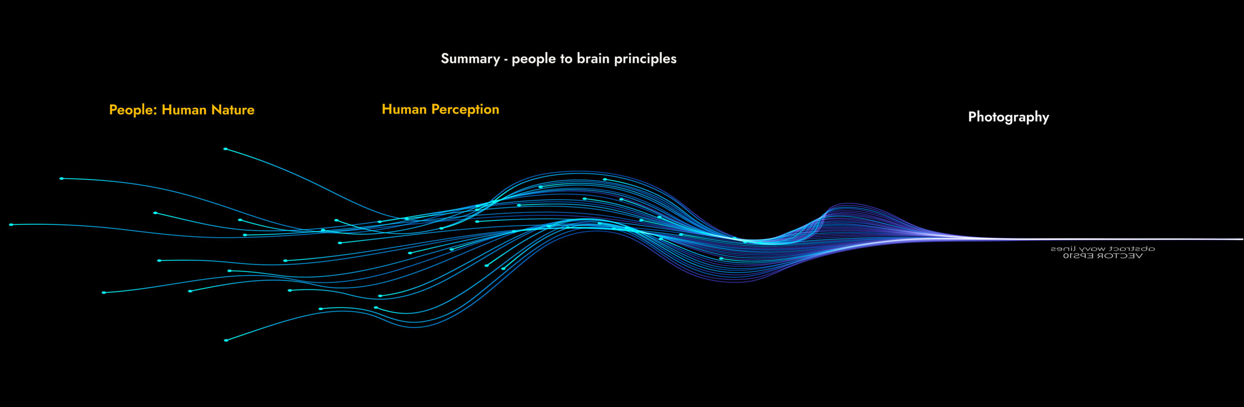
The World Of Art
The Feedback Loop: Subject Three.
The World Of Art.
The World Of Art: Translate Ideas Into Pictures.

STOP FOR A MINUTE.
What do we know so far?
People are the ultimate authority because they both create and use the pictures; nothing is more fundamental. Human nature and perception dictate the rules. Human nature dictates: “Purpose & Benefit”. Human perception dictates: “Visual Efficiency & Mental Stimulation”. – To create successful pictures, we only have creative freedom within the boundaries and restrictions that human nature and perception dictate. If we go beyond or ignore those boundaries, the brain can’t process our pictures correctly, and the viewer can’t understand them, so they don’t trigger a meaningful response, which is the purpose, benefit, and reward of looking. – This explains why so many pictures fail; they break the rules.
Look at it this way: If an aircraft designer designs a plane without accounting for gravity, that plane won’t go very far. The designer might not be aware of gravity, or might choose to ignore it; either way, it exists, and it doesn’t disappear for any reason, ignorance or choice. – Gravity is a higher law beyond our control, and an aircraft is designed to account for gravity; gravity doesn’t change due to the aircraft. We don’t design the aircraft first and then worry about gravity when it fails. Creating a picture without accounting for people is like designing a plane without accounting for gravity. – Just because you’re unaware that people’s human nature dictates the rules doesn’t make those rules not apply.

Production Knowledge: The World Of Art.
Let’s start again from the Art Perspective.
Now set aside the brain, human nature and perception, and start with a clean sheet of paper. For centuries, European painters explored how a two-dimensional surface could convincingly represent a three-dimensional world. Early religious images often served a different purpose: the sacred figure’s symbolic significance mattered more than its realism. – Over time, however, many artists increasingly investigated perspective, proportion, anatomy, light, form, colour, texture and depth. Over hundreds of years, artists developed a set of creative guidelines for making successful paintings; call these “The Art Principles”. In this section, you will see how artists made pictures work: the ten principles they refined, how light builds form and mood, and how painters planned a picture before committing to it. – How old masters created great paintings.
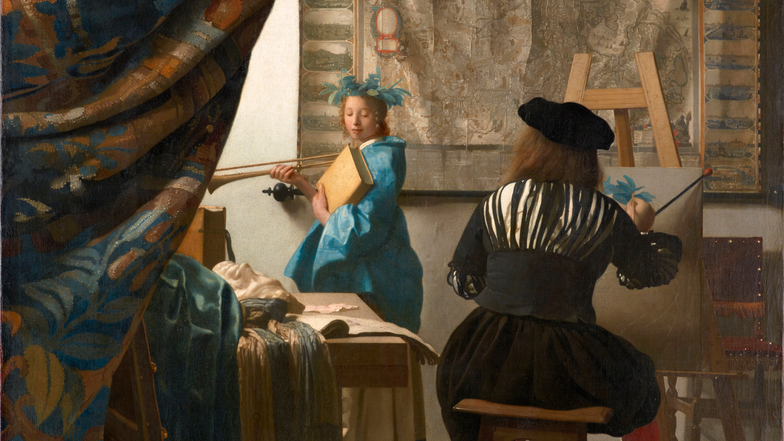
Creative Guidelines: The Art Principles.
A LIST OF ARTISTIC PRINCIPLES.
The components of Visual Language.
These are the Art Principles: ten creative principles artists have used for hundreds of years. They represent the fundamental building blocks of visual images. – The titles are in familiar art-education terms. Where art schools use another name, it is shown in brackets. They are guidelines that evolved over centuries by old masters, not rules, and none dictate a style; artists use them in any medium, from photography to painting to film and beyond; anyone working visually can use them. They form the vocabulary of the visual language we use to read and write visually.
01. Emphasis.
The picture’s first priority is to tell your viewer “where to look first”. – It’s all about “Visual Efficiency”. – From the brain’s perspective, Emphasis (art schools call it the “focal point”) shows where the most valuable information resides – the “area of high importance” – so the brain doesn’t waste time searching and can go straight there. It can invest its resources fast and efficiently. – Emphasis is your shop’s door. You don’t want the customer to find your shop, then struggle to find the door. Emphasis is a visual anomaly, a difference that tells the viewer where to begin.
02. Flow.
Emphasis tells the viewer where to begin; Flow (art schools say “movement”) tells them where to go next. The eye doesn’t wander randomly; it prefers not to jump, but to follow the path of least resistance – lines, edges, gestures and the direction a person looks pull it from one area of importance to the next. Give the eye a route, and it travels efficiently, collecting information along the way. A picture with flow creates a smooth, natural visual route to follow and explore. – Without flow, it searches, wasting time, effort, and resources, or simply drifts away.
03. Distance.
Distance (art schools say “space” or “depth”) tells the viewer “Where I am”. – The realism layer serves as a point of reference for understanding what the picture is about and what the viewer is seeing. Spatial depth is three-dimensional form at the “global level”; it tells us “Where I am”: our context within the overall landscape. The more we create a convincing illusion of distance and spatial depth, the more the picture “feels real” because it increases the “usefulness” of the data that our brain uses to update its mental three-dimensional model of the world.
04. 3D Form.
3D Form (art schools say “volume” or “modelling”) tells us “What it is”. – Three-dimensional form at the object level gives a feeling of roundness and volume. As with Distance, the more convincing the illusion, the more objects “feel real”, and the more we connect and engage with them. Together, distance and form give the picture its underlying structure of realism, the point of reference we use to understand it, and it’s one of the first qualities we connect with after mood. – Form also simplifies objects into basic shapes, “Geons”, which the brain can process faster.
05. Contrast.
Contrast makes the picture readable. Without it, everything looks the same. – It has two meanings. The most common one is “tonal contrast”, the quality that separates one object from another and conveys its shape and volume. The overlooked one is “opposite contrast”, where one quality is set against its opposite: large against small, warm against cold, detail against flat. – Each quality enhances the other. – A bright area feels brighter against darkness. An area of rich detail feels richer against flatness. – Contrast creates visual energy and gives the picture life.
06. Colour.
Colour is one of the most powerful visual differences. Warm, saturated colours attract the eye first and tend to advance; cool, muted colours recede and feel calming. – A single strong colour against a quiet palette creates immediate emphasis. – Colour, combined with tone, sets the mood and psychological tone; the feel of the picture before we understand the details of its content: warm light feels welcoming, cold light distant, green feels eerie and threatening. – A limited palette unifies and creates harmony; a wide palette adds energy but divides attention.
07. Variation.
Variation (art schools say “variety”) generates visual interest and keeps the viewer engaged. Anything that doesn’t change is safe, predictable and uninteresting. Change is different, and different catches the brain’s attention because it can’t predict what comes next. – A flat blue sky is “boring” because nothing changes, wherever you look. To keep a picture interesting, every area needs some variation, even if it’s minimal and subtle: a dark shadow is never perfectly flat. – A picture as a whole can’t hold interest if large areas are flat, even tones with no variation.
08. Simplicity.
Every element and detail in a picture costs the brain time and effort to process – regardless of whether it adds to or detracts from the picture. Simplicity (art schools say “economy”) means including only what serves the story and removing everything that competes with it – the visual noise that reduces efficiency. Clutter forces the brain to sort, group and then discard before it can understand, which is visually inefficient and wastes resources. – The question isn’t “What else can I add?” but “What can I remove?” – so that what does remain is at maximum efficiency.
09. Balance.
Balance starts with “visual weight”: every element carries weight relative to the image as a whole. – Larger, sharper, more colourful, darker or brighter areas, and above all people, attract more attention, so they “weigh more”. – But balance is position and relationship too. – A picture heavy on one side feels unbalanced. A small, bright element can counterweight a large, dark one and restore balance, making the image feel balanced again. – Much of composition relies on balance: each element’s weight, its position, and how the elements relate to one another.
10. Cohesion.
Cohesion (art schools say “unity”) ensures the picture works as a whole, and acts as a handbrake on every other principle. – We can’t maximise each quality in isolation. We must consider its effect on the picture as a whole. Cohesion limits any individual quality and unifies composition, balance, design and visual hierarchy, to give the brain one unified, structured shape to resolve instead of several competing ones. A picture it can process efficiently at many levels. – Cohesion makes the picture “feel good” because it’s unified and efficient data, presented correctly.
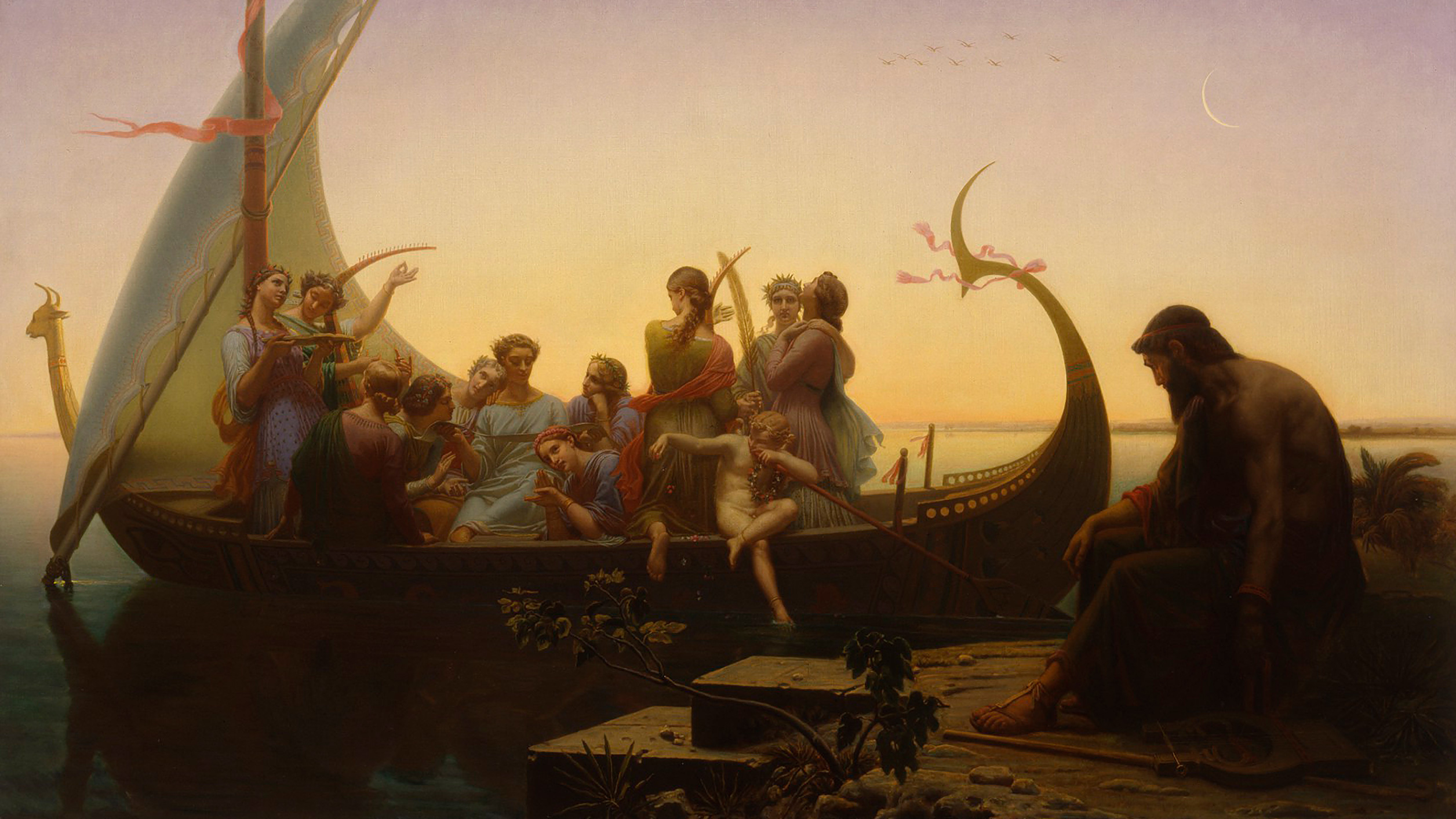
Light Communicates. Art Translates.
Light is the bridge between Art and Reality.
Imagine entering a seventeenth-century church. Many worshippers couldn’t read, and they saw few images. In the vast, dark interior, broken only by flickering candlelight, you see a towering painting of the crucifixion by a master like Rubens. You’ve never seen an image so immense, so luminous, so real. – The figures are lit from above, as if the light came from no earthly source; it’s holy light that leaps out from the church’s gloomy darkness. You’re not looking at a painting; you’re witnessing an event. The light created awe, like proof of something far greater. The painters used light to make faith and religion feel more real. – We underestimate the psychological impact this had on ordinary worshippers.
Light is the bridge between art and reality, the subject and emotion. But light isn’t just an artistic quality; it’s a psychological tool that strongly influences how viewers respond, like worshippers in the church. – Charles Gleyre’s painting above, Lost Illusions (1865), tells a story about lost youth and happiness slipping away. Golden light makes the departing world beautiful, while deep shadows isolate the old man and reinforce his loneliness and regret. In J.M.W. Turner’s painting below, the subject was light; the physical subject was just an excuse to portray it. Neither painting would work without the light. Light is integral to the story; without it, we have only a literal depiction of various figures and objects.
Compose the subject, shoot the light and create the mood. – We see the subject but feel the mood – therefore, prioritise mood over subject. Enhance the mood and atmosphere in post-production. Make your picture a creative transformation, not a literal depiction. – Life contains far more moods than just sunrise and sunset, and looking at paintings is a great way to learn how artists portrayed those various moods. Painters studied light in more detail than most photographers because they had to create it; photographers just record it at the push of a button. One weakness of photography is that cameras don’t force us to study in detail as painters do; cameras let us shoot and leave without ever seeing.
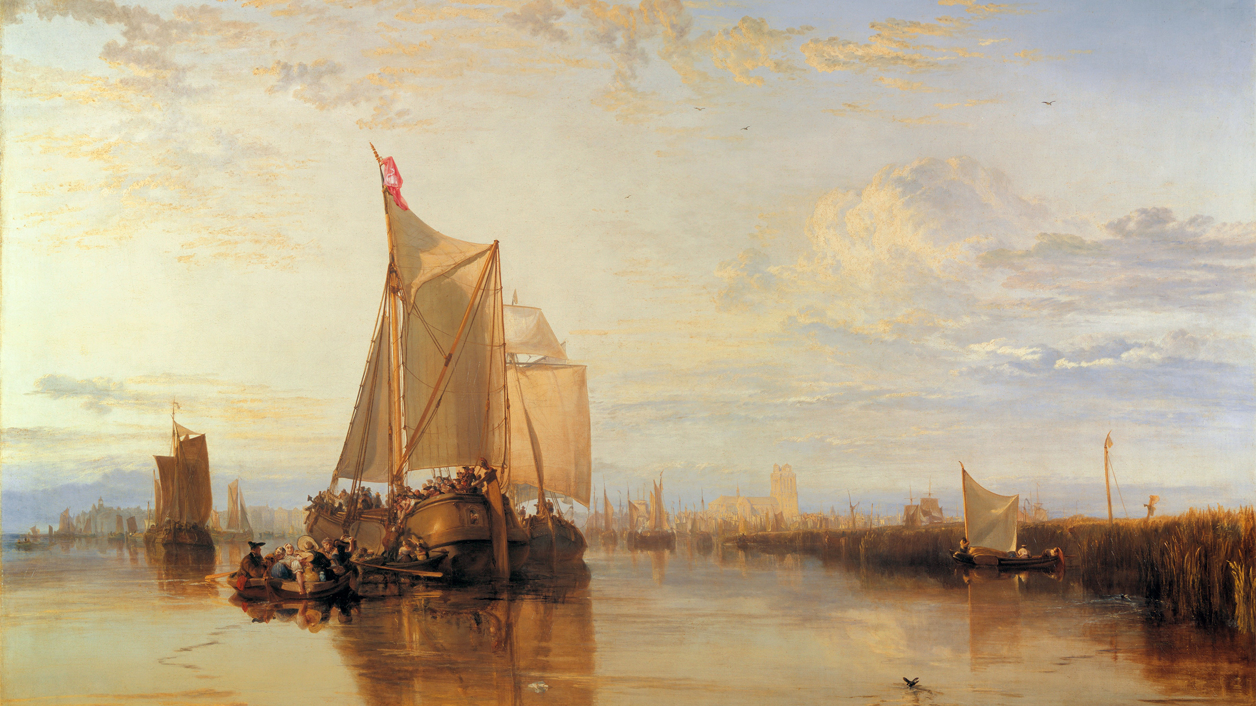
Light Creates Mood. The Light’s Direction.
The subject is What we see. The light is What we feel.
Expression conveys a person’s mood; light conveys the landscape’s mood, and its direction matters. – Below are three images lit by one light. The first picture is lit from the left, the second is front-lit, and the third is lit from the right. – I used a small bust, but the principles apply to any subject: people, architecture, and landscapes. When considering light direction, focus on its effects on three-dimensional form and the mood it creates. If we were taking a portrait in a studio, we could create the light. – Outdoors, we have to wait and have fewer options, but we still have choices in both the weather and the direction of light if we plan ahead. These three images explain what to plan for and how to choose.
The middle image is front-lit, which flattens its three-dimensional form; it has very little modelling, roundness, or volume. – It gives off a mood of openness. Everything is visible; nothing’s hidden. No work to do, nothing to investigate. The light does little more than record what we see. However, the first and last images feel totally different, with far greater three-dimensional form, roundness, and volume. – More importantly, both convey very different moods. In the first picture, the eyes and face, the parts we intuitively want to see, are hidden in dark shadow. This creates a sense of secrecy. In the last picture, the eyes and face are lit, emphasised and more dramatic. The mood is open and almost heroic.
In the first and last images, small but important details come from the old masters – the edge of contrast created by the shadow. In the first image, the shadow forms a clean triangle on the nose and defines the cheek, mouth, and chin. In the last image, the shadow creates a clean, almost triangular highlight on the cheek. The shadow under the nose is what often controls the light’s position. In both images, the forehead has roundness. These effects translate directly to outdoor architecture and landscape pictures. Think about the mood you wish to convey in the story you want to tell, then watch and wait as the shadows move and highlights change. As they move, the mood constantly changes.
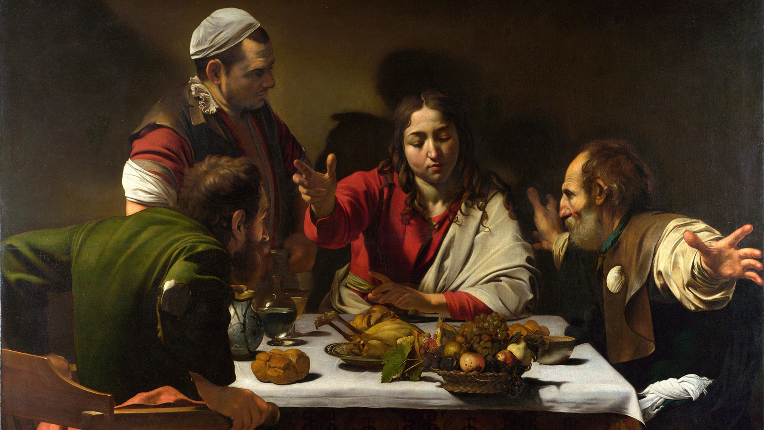
The Art Of Light & Shadow: Chiaroscuro.
Modelling with light to create Drama and Emotional Impact.
Chiaroscuro uses light and dark to create the impression of three-dimensional form, guide attention, and shape a picture’s mood. – The word combines the Italian words for “light” and “dark”. – Artists explored the technique during the Renaissance to make a flat surface look like solid form. Light modelling gives a body three-dimensional shape and volume, and it became especially powerful in seventeenth-century Baroque painting. Chiaroscuro means more than simply strong contrast: it suggests volume, atmosphere, mystery or drama. Light becomes part of the visual language, shaping what we notice, how we read the scene, and how it makes us feel. Chiaroscuro adds drama and emotional impact.
In Caravaggio’s Supper at Emmaus (1601), above, light and Chiaroscuro make the biblical moment immediate, dramatic and real. – It captures the moment when the resurrected Jesus Christ reveals his identity to two of his disciples and a stranger at an inn. The moment of shock and dramatic body language make it feel like a news photo; the gap between the figures makes you a participant at the table. – The drama isn’t only the event, but also the light; brilliant highlights against deep shadow – which emphasises the startled gestures and creates the striking three-dimensional form and spatial depth: realism. Think of Chiaroscuro as light against dark, and dark against light. Shaping form with light.
Shadow does two jobs at once. It shapes form and guides the eye to the brightest area, which makes the picture quick and easy to read, and it also hides part of the subject, as explained in the previous section, which explains why a strongly shadowed face can feel private, secretive or mysterious, while the same face in soft, even light looks open and calm. As photographers, we “compose the subject, shoot the light, and create the mood” – in post-production, we magnify and enhance the mood by pushing the picture’s light, shape, and form beyond what the camera recorded. – We add an artistic transformation to the raw image, applying the lessons of the old masters and using Chiaroscuro.
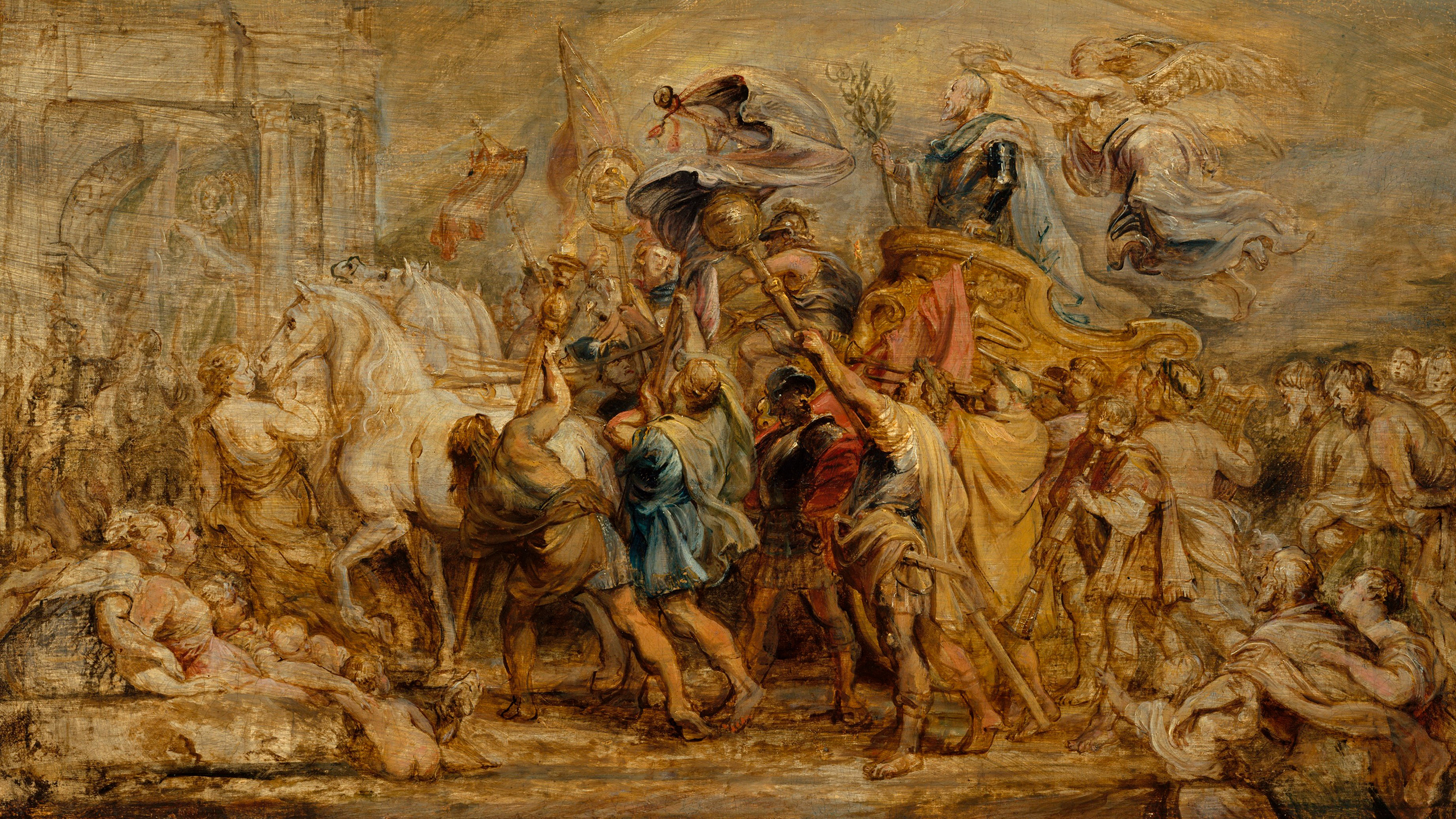
Building Pictures: Sketches & Underpainting.
The structure beneath the picture.
Many painters didn’t start with colour. – They began with a chalk, charcoal, ink, or thin-paint drawing to lay in the main shapes and decide the composition. – Then, often with a brush and a single colour, usually brown or grey for the shadows and white for the highlights, they painted in the dominant shadows and highlights to plan the painting, while changes could be made before committing to the final version. – This was the underpainting. A clear example of this is the picture above – “The Triumph of Henry IV” – a sketch by the Flemish master Rubens, ca. 1630. The beauty of these paintings is that we can see the painter’s mind at work, their problem-solving and solutions; the logic behind the picture.
The purpose of the sketch and its underpainting was to “create a picture that works”. Beyond Rubens’s genius for draftsmanship, let’s look at the “Creative Guidelines”: the ten “Art Principles” listed earlier and the “Chiaroscuro” we just discussed. The final painting must have cohesion, balance, flow, and emphasis – establishing this is the sketch’s primary function. All the action, energy, colour, detail, and contrast are focused in the centre, creating flow, balance and emphasis. – Within the central area, the nearest figures have more shape, form, and detail, bringing them forward; the man with the diagonal staff comes even closer, creating distance and depth. The light and “Chiaroscuro” are planned.
As photographers, we don’t have the same level of control over a picture as painters do, but we can still apply the “Creative Guidelines” – the ten “Art Principles” and “Chiaroscuro” at the camera when planning a photograph and looking at the scene – then later in the post-production stage to enhance and transform our picture. Despite photography’s restrictions, we can still shift photography from a literal recording process to an artistic and creative one: “Cameras Record. People Create”. We have the tools: the camera to record; editing software to transform, like a painter’s brush, paint, and canvas. – Today, the limitation isn’t gear or technology, but our knowledge and desire to be more creative.
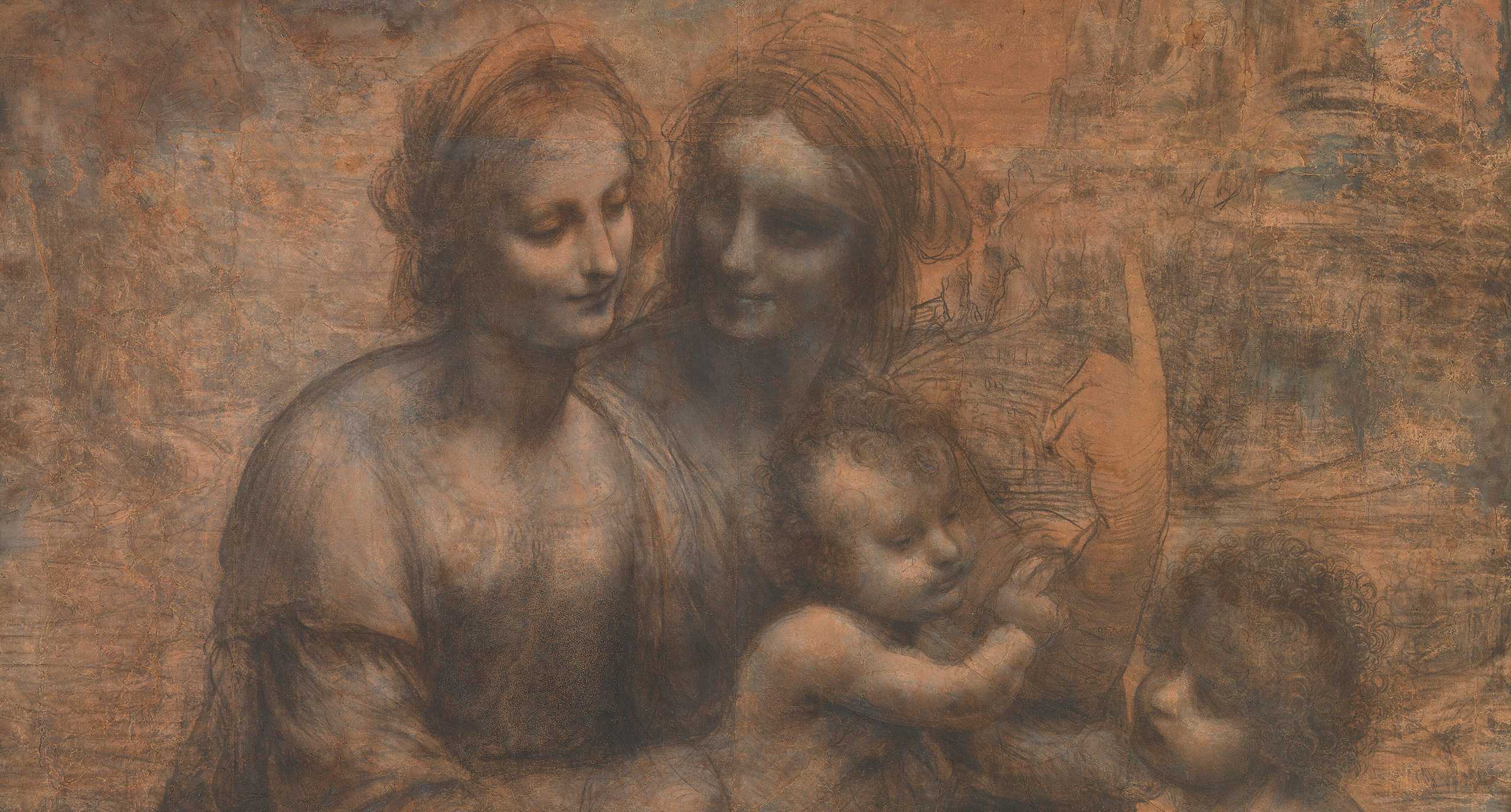
Tone First. Colour Second.
Tone builds the picture. Colour gives it identity and feeling.
Leonardo’s Burlington House Cartoon above is a full-size monochrome drawing in charcoal and white chalk. Yet it’s complete as a picture. The figures have weight and roundness, and light falls across them from one direction. The figures feel alive and occupy real space. Only light and dark alone define every relationship between them, their gestures and glances. The drawing shows what painters knew: tone alone can build form, depth and focus. Before choosing any single colour, Leonardo solved the foundational problems of how to make the picture work first; colour would be overlaid and only enrich the underlying structure already created. – Many old masters began with tone first, colour second.
Tone does most of the work in how we read a picture. The visual system relies on light and dark to determine form, depth, and shape. Colour is processed at the same time and added to that tonal structure. Colour helps separate objects of similar brightness, signals surface cues such as fruit ripeness, and sets mood. For painters, a tonal drawing, monochrome underpainting, or sketch lets them settle on where the light falls, what comes forward, and what recedes before they lay on the colour. Mistakes were easier to correct in one colour. Colour can hide a weak structure by adding noise and confusion to the initial planning phase. Think of the tone as the architectural plan before construction begins.
A building offers a useful comparison. The structure is built from tone. Blacks are the foundation, giving the picture strength and a solid base. The mid-greys are the walls, giving objects their three-dimensional form and sense of distance, and setting much of the overall mood. Lights add the life and sparkle. Colour is the paint added to the finished building. Colour gives the building its identity and feeling; it’s what people “see”. Colour shapes how people perceive the building, but it doesn’t affect the building’s structural integrity – the part you don’t “see”, but that makes the building work. – A building can look pretty on the outside, but the exterior paint can hide severe structural flaws inside.
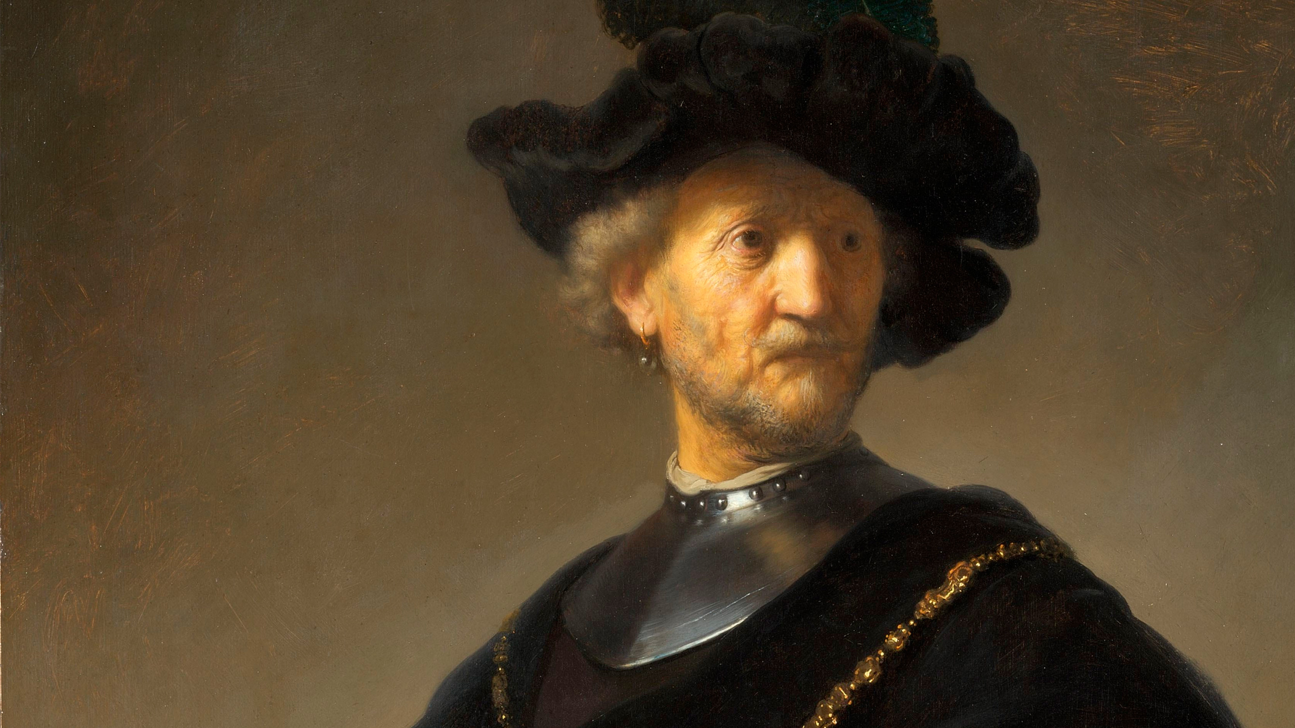
Rembrandt van Rijn. 1606 – 1669.
Not everything needs detail to convince.
Rembrandt’s portraits are perfect examples of “Visual Efficiency” because he uses “emphasis” to direct the eye to what matters most: the face. The eye goes first to the brightest tones and sharpest edges: detail he places on the face. This area of high-frequency information creates the visual energy, which makes the face feel alive. The three-dimensional form, roundness and volume give the portraits realism and believability. However, the majority of the painting is roughly painted and has little detail because it’s less important – it’s low-frequency information with low visual energy that rests the eye. The portraits’ emphasis, flow, simplicity and composition make them visually efficient.
Visual efficiency is about the journey, but there’s no purpose in a journey that goes nowhere. – The destination is always “Mental Stimulation”. Rembrandt’s portraits have strong psychological presence: we meet a real, living person, not just a likeness. The same darkness that rests the eye also creates mood and atmosphere, ambiguity and mystery. The light and expression convey a moment caught in time. The darkness invites us to investigate the shadows and fill in the missing detail of the velvet, fur and folds. The psychological power, the “Mental Stimulation”, comes from the sense that there’s more going on than we see.
Let’s use Rembrandt’s portraits to clarify “Work”. In this tutorial, it may seem I contradict myself about “Work”, yet work is key to a successful picture, and Rembrandt’s portraits illustrate this work balance perfectly. We want “Visual Efficiency” to limit the work involved in the journey to understanding the picture. – However, when the viewer arrives at the destination, we want them to do some work, “Mental Stimulation”, or there’s no reward. We must challenge the viewer so they earn their benefit. – Rembrandt’s design makes his portraits easy to read; mental stimulation makes them worth reading. – A literal, balanced portrait with nothing to investigate is understood at a glance and forgotten.
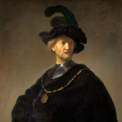
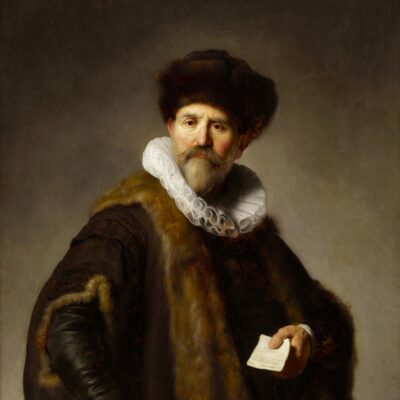

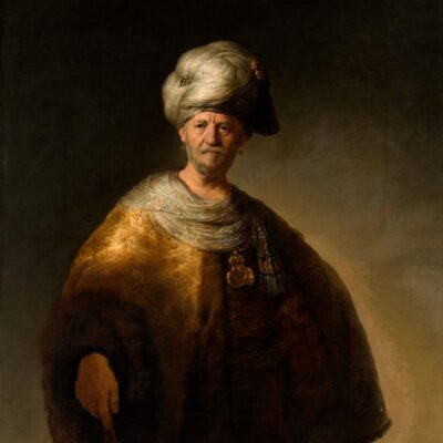
Convergence
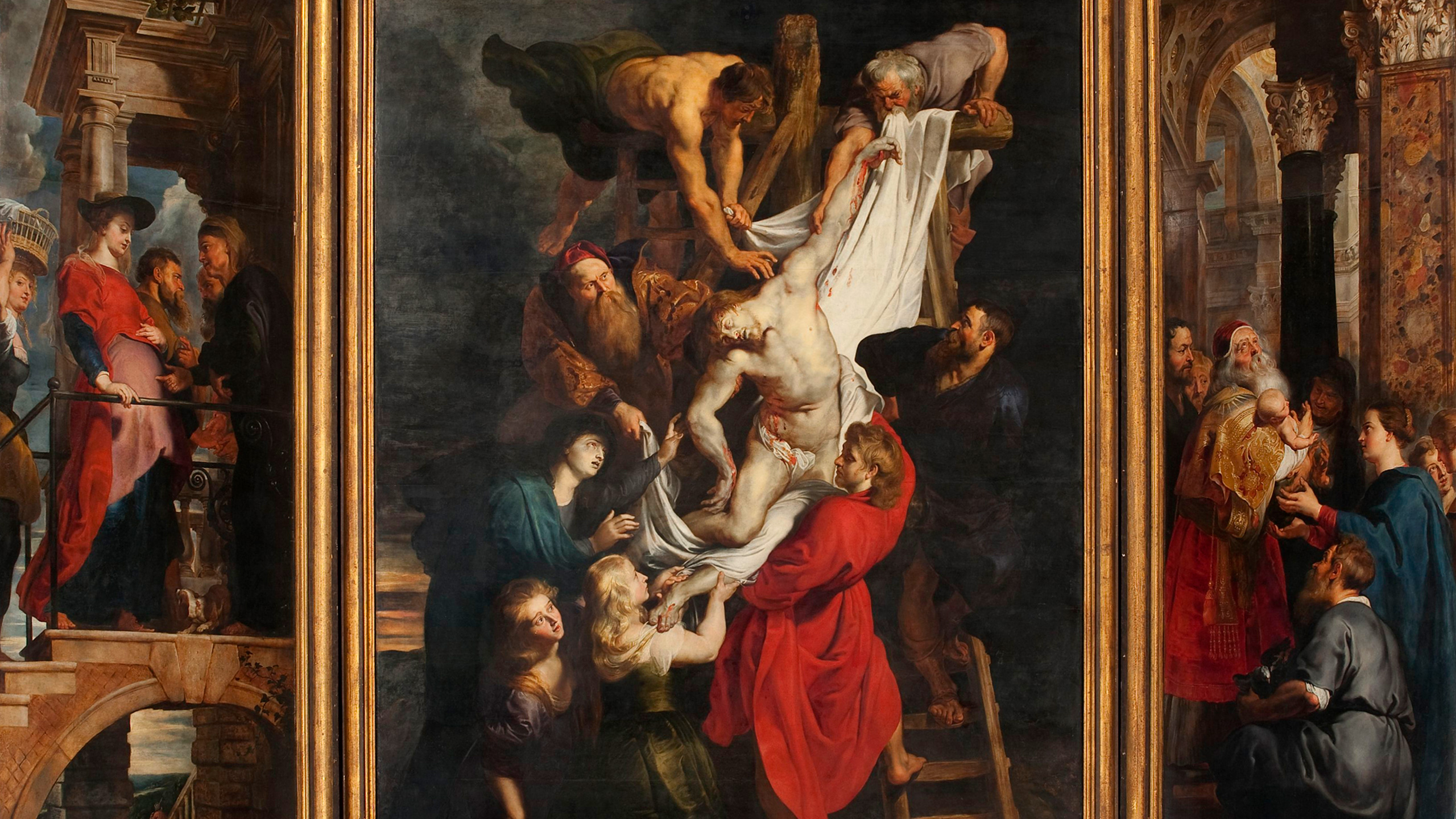
My Moment Of Clarity Explained: Convergence.
Two sets of principles combine to create one successful picture.
My moment of clarity in Venice was the realisation that “People judge photography by intuition, not by their knowledge of photography” and that “Photography doesn’t dictate the rules; people do”. I couldn’t explain why people responded the way they did on the Accademia Bridge, but now I can. People dictate the rules through their Human Nature – the need for “Purpose & Benefit” and Human Perception – the need for “Visual Efficiency & Mental Stimulation”. A picture must be “written” in visual language people can “read”, so they process it easily, understand it quickly and gain the benefit efficiently. – My pictures met those criteria, which helps explain their immediate and positive response.
People dictate the rules. We only have creative freedom within the rules people dictate – if we want our picture to be successful: to engage the viewer and provide a benefit. – On the human side, “The Brain Principles” tell us what our brain filters for, and the “Stimulation Principles” tell us what creates engagement and evokes the emotional response. – The World of Art comes from a different direction and gives us the “Art Principles” – creative guidelines for making pictures. These are two largely independent routes, one from science and one from art, yet both arrive at the same destination: a picture that gives the viewer “Purpose & Benefit”, which in turn satisfies our human-nature demands.
The “Brain Principles” define the requirements, the “Art Principles” supply the solutions, and the “Purpose & Benefit” satisfies Human Nature. – The diagram below shows how both arguments come from different directions but come to the same conclusion and converge in one place. Human principles take precedence over artistic principles because the human level is the most fundamental and universal – therefore, they dictate the boundaries of our creative freedom. – Also, creating visually is a learned “writing” skill, not an intuitive “reading” skill, – whereas human principles are totally intuitive and universal, not learned. Convergence shows where science meets art, all without personal opinion.
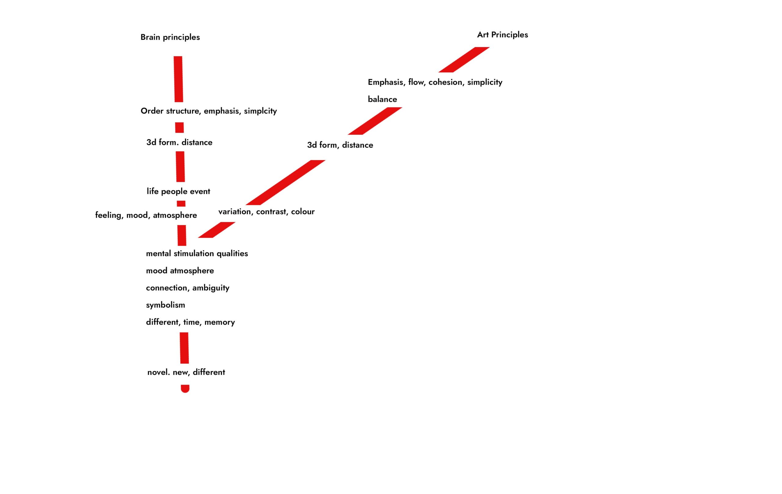
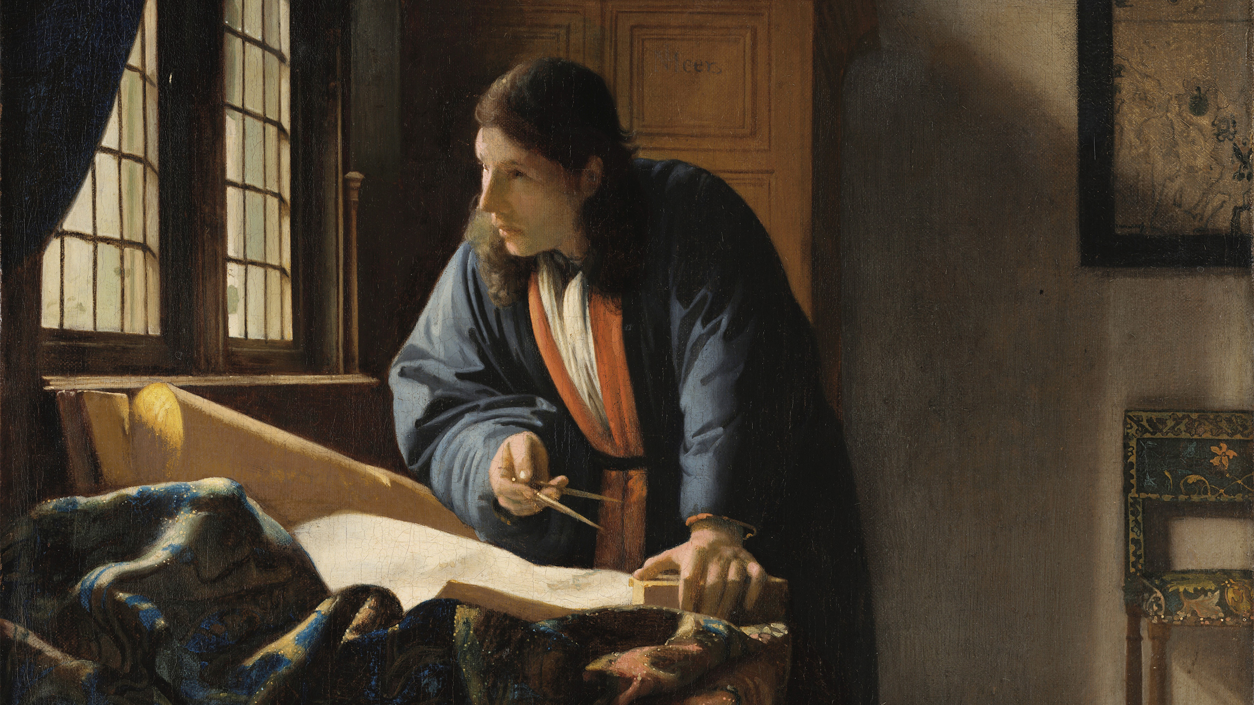


Photography
The Feedback Loop: Subject Four.
Photography Is Our Production Method.
Production Knowledge: Photography.
From knowledge to production.
So far, we have covered “The engineering behind the pictures”. – Pre-production knowledge about what people want from pictures and how they get it. Now we must look at the production side, where theories and principles are put into practice. The first concept to consider is that, nowadays, the photograph is digital – it’s the final product of software, not the camera, unlike in the film days. This means we can downgrade the camera to second place and elevate editing software to first. – Instead of relying entirely on getting the picture “in-camera” – we can use the camera as a recording tool to generate the digital assets we need for the editing software, which is where we create the final picture.
Analogy: The Writers.
Imagine William Shakespeare, Charles Dickens, Yeats, Wordsworth, and other great writers meeting up for a social drink in the afterlife; I can’t imagine them sitting around all night discussing “Pens”. Nor can I imagine Rubens, Rembrandt, Monet and Picasso talking about their “Brushes” all night. – Now, maybe I’m wrong, and they do – but I find it easier to imagine with photographers. – Pens, brushes or cameras don’t dictate great
Good tools make good pictures, but only when combined with knowledge.
The camera doesn’t record what you see.
Photography is data collection, and the camera alters the data compared with what we “see”. – The camera doesn’t record what you see; it changes the tones. Knowing what the camera changes helps you factor those changes into your picture-making to create a better picture.
The camera doesn’t record what you see. You see through an eye and brain that scan the scene, adapt to bright and dark areas, and decide what matters. A camera makes a single exposure with a limited range and records light. It doesn’t record emphasis, mood or story. Nothing tells the camera what matters, so it treats every part of the scene as equal. This is why photography is only data collection. The important question is what the data is for: what purpose does it serve, and what benefit does it give the viewer? The camera creates the initial signal, and what happens to that signal next decides whether it becomes a picture or stays raw material.
None of this is a fault. A camera was designed to record light accurately and consistently, not to replicate what your eye and brain do to a scene in real time. A raw file straight out of the camera is a weak, low-contrast, imprecise starting point for exactly that reason. It is a starting point, not a verdict. The camera has done what it was built to do, which is to collect the data. Turning that data into a picture with emphasis, mood and a story is a separate job, and it is the job the rest of production exists to do. The camera is a recorder, and a very good one, but a recorder is not an editor.
What The Camera Does To Tone.
Put back what the camera took out.
As we saw in the art section, tone does most of the work in how we read a picture. When a camera records a scene, it must fit a wide range of brightness into the narrow range of a print or screen, and its response curve changes the tones to do so. I plotted my own camera’s curve, and the graphs below show it, together with the bracketed exposures. It adds 45% more contrast to the highlights, darkens the mid-point by 2.5 stops, lowers the dark tones by 55% and the darkest shadow tones by 80%. The tonal relationships in the picture are no longer the ones in the scene. The camera has rewritten the scene’s tonal structure.
The curve is not a fault. It is the camera’s solution to a hard problem. But it does change the picture’s underlying structure: the highlights, midtones and shadows that give a picture its form, depth and mood are no longer in the proportions the scene had. We must put back what the camera took out, even when we don’t want a radical artistic transformation. Tonal values are the engine of the image, and we must get them right so that the photograph performs. The same scene can look alive in front of us and flat in the file, because the camera recorded the data but not the balance. Restoring that balance is the first and most important job afterwards.
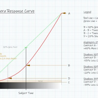
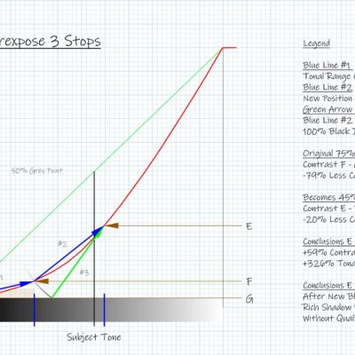
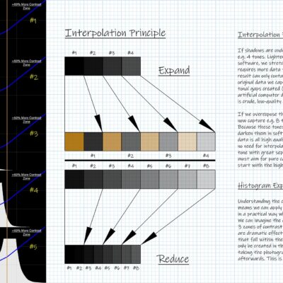
Production Knowledge: Photography.
Global v Local Contrast.
A structural problem in tone, not colour.
There is also a structural problem that the camera cannot solve. To fit the scene’s dynamic range into the narrower range of a photograph, we have to compress it. That reduces global contrast, the difference between the brightest and darkest areas, but by default it also reduces local contrast, the difference between neighbouring tones within an area. Local contrast is what gives a picture life. It separates a leaf from the leaf beside it, a brick from a brick, a cheekbone from a cheek. This is a problem of tone, not colour. Our ideal is low global contrast with areas of high local contrast; otherwise, the picture feels dead. The tonal values must therefore be rebalanced afterwards.
Each part of the tonal range has its own job, as the building comparison showed. The highlights give the picture its light, life and sparkle. The midtones give it three-dimensional form and mood. The shadows give it structure. The camera does not treat them equally, which is why the balance between them shifts. When that balance is lost, the picture loses what each part provides. A flat, lifeless picture is often not a colour problem or a subject problem. More often, the tonal balance that made the scene feel alive was lost on the way from the scene into the file, and restoring it is an essential part of finishing the picture, not an optional extra.
What Only The Camera Can Do.
We can’t create what we don’t have, but we can enhance what we do have.
If the camera only records data, does the camera stage matter less? The opposite is true. Everything that follows can only work with what the camera captured. Four decisions are made at the camera and cannot be added later: where you stand, what the light is doing, which moment you choose, and how you compose the frame. Together, they decide what data you collect. Stepping a few paces left, waiting for the cloud to move or waiting one second longer can change everything. Finishing a picture can clean, simplify and strengthen what is there, but it cannot create what was never recorded. We can’t create what we don’t have, but we can enhance what we do have.
That is why the knowledge in this tutorial matters at the camera as well as afterwards. Knowing what a picture needs tells you what to look for before you press the button: where the emphasis will fall, how the light shapes the mood, which moment carries the story. The better the signal you capture, the less is lost in everything that follows. A weak or confused signal can be improved, but only so far, and the best place to begin is where the data is collected. A painter chooses every mark. A photographer’s first choices are what to point the camera at and when to press the button, and those belong to you, not to the camera.
Cameras Don’t Make Photographers.
The limit isn’t the gear.
A pen doesn’t make a good writer. Imagine a group of writers: would they sit around discussing pens? Understanding photography is not learning how to use the camera, any more than the basics of painting are learning how to use a brush. A visual language, like a written or spoken one, must be learned, and the more fluent you are, the better your pictures will be. Fluency comes from knowing how pictures work, not from the equipment. The camera records what you point it at. What it records, and what you do with it, is up to you. A better camera records the same scene in more detail, but it cannot tell you what is worth recording.
Production Knowledge: Editing Software.
Where Photography Meets Art.
Digital removed the divide.
Photography and painting have long lived in separate realms because of a technical divide. Photographers “took” pictures to record the world, while painters “made” pictures to interpret it. Altering a photograph was possible in the darkroom, but it was slow, difficult and limited, so most photographers relied on what the camera captured. As a result, photography was seen as a documentary medium more than an artistic and creative one, and a photograph was regarded as the product of the camera. Whatever the photographer felt about a scene, the picture that reached the viewer was largely what the camera happened to record, and very little more. For most photographers, the camera set the limit of what a picture could become.
Digital photography changed that. Today, a photographer’s pictures are the products of editing software, not of the camera alone. This has given photographers the artistic freedom painters have enjoyed for centuries and has closed the creative divide between them. It brings real satisfaction, because creativity now extends beyond taking pictures and recording the world literally. You no longer have to depend on the camera to do all the work. You are no longer a prisoner of literal, generic-looking photographs, provided you have the knowledge to do more. The limit is no longer the technology. It is knowing what a picture needs and how to give it. In effect, the photographer now holds something closer to a painter’s tools.
Is Editing Cheating?
Cameras record. People create.
Cameras record. People create. Who decided that what a camera records is perfect? A raw file is a weak, low-contrast starting point, and nobody has ever seen the world like that. Editing isn’t correcting a mistake. It is completing a process the camera was only ever able to start. It is also the creative opportunity, where you can add your own vision and style so that the picture is not literal and generic-looking. It is where you put your personality into the image. Editing, understood this way, is not an optional extra or a trick. It is the second half of making a picture. Without that step, the picture stays an accurate record and never becomes an interpretation.
There is nothing new in this. Darkroom printers always made decisions about tone and contrast, holding light back from some areas and adding it to others. Ansel Adams compared the negative to a musical score and the print to its performance. Editing software gives photographers the same freedom with far greater precision and control. The tools have changed, but the principle has not. A score played exactly as written, without interpretation, is accurate but rarely moving. The same is true of a picture. The camera supplies the score; the person decides how it is performed. Whether editing is cheating is the wrong question. The right one is whether the picture does what it was made to do.
Simplify, Amplify And Enhance.
Clean the signal.
The camera records everything it sees, and what it sees may be chaotic and visually confusing. There is a limit to how much order, structure and emphasis composition alone can achieve. Every unnecessary element costs the viewer effort. Think of the picture as a signal sent to the viewer. Some of it will be lost in transit, so the purer the signal, the more efficient and effective it is; a weak, confused or noisy signal does not communicate well. When we alter the signal going in, we alter the response coming out. Editing is where we clean and strengthen the signal: we amplify the useful data, and reduce or remove the useless data, the background noise.
Simplify, Amplify and Enhance are the three jobs, and each draws on the Art Principles. Simplify removes what competes with the story: Simplicity, Balance and Cohesion. Amplify strengthens what matters most: Emphasis, Contrast and Flow. Enhance brings out the picture’s form, depth and feeling: 3D Form, Distance, Colour, Variation and light. Together they simplify, refine and strengthen the story so that it communicates more effectively. These are the same principles from the art section, now applied as production decisions. The order matters, because there is no point strengthening something that ought to be removed. Editing turns the camera’s raw signal into the signal the story actually needs, so that nothing in the picture works against the story.
The camera raw file is a “Low-quality signal”.
The camera raw file is a “low-quality signal”. – Image editing cleans and boosts the signal. Amplify the “useful data”, downplay and remove the “useless data”; the background noise. – But, editing also has a rule: “If you contradict the rules of nature, your photograph won’t be perceived as real”. If you have mountains that tonally recede into the background, they are perceived as real 3D data, but if you make them too black for “graphic effect”, they now contradict the “laws of science that govern how we perceive spatial distance”. The brain will instantly downgrade the original high-value 3D data to low-value 2D data because “you contradicted the laws of nature”. Post-production must be done carefully.
The picture is the product of Photoshop, not the camera. The camera only records the components for Photoshop. Photography is only data collection; the important issue is what’s the purpose of that data, and what benefit does it give the viewer. Photoshop changes the data: it simplifies, emphasises, and enhances the data. Photography creates the initial signal; Photoshop cleans the signal.
Straight out of the camera, a raw file is a weak, low-contrast, imprecise starting point — not because the camera is bad, but because a camera was never designed to replicate what your eye and brain do to a scene in real time. It records light. It doesn’t record emphasis, mood, or story. That work still has to happen.
Production Knowledge: Editing Software.
The Laws Of Perception.
Believability has rules.
Editing has one overriding rule: if you contradict the laws of perception, the picture won’t be perceived as real. Consider mountains that recede tonally into the distance. The brain reads them as real three-dimensional data, because distant things are paler, bluer and lower in contrast through haze. If you make those mountains too black for graphic effect, the picture now contradicts the laws that govern how we perceive distance. The brain instantly downgrades what was high-value 3D data to low-value 2D graphic information, because the effect finds no match in its prior knowledge of the real world. We cannot break the laws of perception and expect the picture to be believed. Believability follows rules the brain already knows.
The same applies to any edit that creates something that could not exist in real life: a shadow with no gradation at all, or tones that contradict the depth of the scene. The brain does not reject these because they are ugly. It rejects them because they match no real-life scenario it knows, so it labels the picture a graphic effect and not an image of the world. The picture then loses the realism that created the viewer’s understanding in the first place. This is why creative editing must be done with care. Freedom is wide, but it has a boundary, and the boundary is what the brain is able to believe. It is a limit of perception, not taste.
Creative, Not Just Corrective.
Realism creates understanding. Different triggers curiosity.
Photographers often go to one of two extremes when editing. Some go for realism and create literal, generic-looking pictures that the brain ignores because they trigger no curiosity. Others go for a dramatic, entirely graphic feel and create pictures the brain also ignores, because it labels them low-importance 2D graphics and not real-world data. In both cases, the viewer gets nothing worth keeping and moves on. Neither extreme creates the most mental stimulation. Mental stimulation is greatest when there is a blend of both realism and difference. Realism creates understanding. Different triggers curiosity and imagination. A third failure is common to both extremes: the picture has no emphasis, order or structure, so it is visually inefficient.
This is the sweet spot again, now applied at the production stage: strengthen the point of reference the brain needs, and sharpen the element that is different, which earns the attention. Realism is the anchor and difference is the reward; too much of either fails. Don’t be good, be different, but do different very well. Different ignites curiosity and imagination, while better only sparks appreciation, and generic or literal work encourages boredom. Good photography is a psychological mind game, and it is also logical, but it is not just pushing the button. Editing is therefore a creative process, not only a corrective one. Used only to recreate what you saw, it produces pictures that are literal, generic and uninteresting.
Editing Must Respect The Genre.
Same rule, different balance.
Everything in this tutorial so far applies to pictures in general, across all genres, subjects and styles. Editing, however, must respect the genre. A news or documentary photograph cannot have anything added, removed or transformed, because we must trust it as an honest visual record of a person or event. All the picture qualities still apply, but they must be created at the camera, through composition and timing, and not afterwards. The viewer’s trust is part of the purpose and benefit of such a picture. If that trust is broken, the picture fails, however good it looks. That is not a limit on creativity. It is what defines the genre. Skill with composition and timing carries the load.
An obviously artistic photograph, with no intent to mislead or misrepresent, can be transformed as far as feels right for the picture and what it is trying to communicate. Between the two lie many genres, each with its own balance of realism and difference. The same underlying rule governs all of them: the brain must be able to believe what it sees. What changes is how much difference the genre allows. So the question before any edit is not only whether the picture will look better. It is also what this picture is, who it is for, and what the viewer has a right to expect. No single setting is correct. The right balance depends on the picture’s purpose.
Production Knowledge: Vision & Style.
Where do you sit between real and polished?
Between realism and difference there is a scale. At one end, gritty pictures feel raw, real and believable. In the middle, natural pictures feel honest but considered. Polished pictures are idealised and romantic, and slick pictures are smooth and artificial. The more slick a picture becomes, the further it moves from reality and believability, and the weaker the viewer’s connection with it. None of these is wrong. Each makes a different promise, and each should fit what the picture is saying about its subject. Moving along the scale changes the mood of a picture, just as light does. Choosing a position on the scale is one of the most important decisions in editing, and it is a creative one.
Your decisions about where to sit on that scale, and about each Art Principle, give your pictures a unique look, because your decisions are unique to you. That look is your artistic style. As your style develops, it becomes easier to imagine it applied to a subject before you press the button. That is artistic vision: picturing an interpretation and not a literal depiction, with the subject as an opportunity to apply your style. Viewers also want to feel that a person made the picture, someone with an opinion about the subject, and not a cold, clinical machine. Style is how that person shows. It also makes your pictures feel, over time, as though they belong together.
The Art of Tonal Painting.
Transform “Rough Diamonds” into “Sparkling Jewels”.
The camera records the image. Editing polishes the picture and refines the story so that it communicates more effectively. Production begins at the camera and ends in editing; it is one continuous process that carries a single idea from the scene to the print. It is not a case of taking a photograph without an idea and then applying software to invent one. The idea comes first, and every stage serves it. The camera alone allows no refinement; it records everything it sees with cold impartiality. Editing allows fine-tuning in selective areas. For us, editing software is what a brush is to a painter. It is not a rescue. It is the instrument that makes the picture.
What It Can Become.
Before I photograph a subject, I ask one question: if I were a painter, what would I paint to make this my perfect picture? That question changes everything that follows. I no longer look for a finished picture in front of me. I look for raw material, and I judge the subject not as it is now, but by what it can become. The subject is the rough diamond. What it can become depends first on what I can imagine, and then on whether I have the knowledge and the skill to make that imagination believable to someone who has never seen the scene. That is the standard I hold every subject to before I press the shutter.
This is why two photographers can stand in the same place and make completely different pictures. The subject is only raw material, and neither picture is more correct; they are different answers to one question. The picture is my personal interpretation of it, made from the choices I make about light, tone, emphasis and mood. Those choices are what a viewer feels as a point of view. If I only record the subject as I find it, I give the viewer a description. If I imagine what it can become, I give them an interpretation, and an interpretation is something a camera alone cannot produce. It needs a person who has decided what the picture should say.
The Camera Collects The Assets.
Because the picture is finished in editing, the camera’s job is to collect assets. My mindset is to get the complete photograph in a single base exposure, and then take further exposures to improve it. They fall into three groups. Technical exposures improve the tonal and technical quality of the picture. Artistic exposures improve its content: the life, the moment, or the light that falls on one part of the landscape at a different time. Sky and cloud exposures supply the mood. Each group answers a different question about the picture I imagined. I shoot only one composition, but I shoot many assets, because volume gives me more creative choices when I come to make the picture.
Sky and clouds are the picture’s silent heroes, and their importance is vastly overlooked. They set much of the mood and drama, yet the sky I find is rarely the sky the picture needs. Most often, it has the wrong mood for the picture I have imagined. So I photograph skies as deliberately as I photograph subjects, because the sky is part of the picture’s emotional design. I decide what the picture needs first, and then collect it. Photography, for me, is data collection with a purpose, and the purpose is always the picture I have already imagined, not the one the scene happened to offer. Collecting them properly is what makes the later choices possible.
The Art of Tonal Painting.
Stage One: The Composite.
Stage one is the composite: combining the assets into a single image. This stage is concerned only with bringing the data together, and the final picture must look like a single frame taken from a camera. It begins with a quick sketch, as a painter’s would, to find the best content and the overall light and mood I want to create. Everything I collected is a choice and not an obligation, and what I leave out matters as much as what goes in. This is artistic photography, made with no intent to mislead, and it follows the rule of every other edit: the brain must be able to believe what it sees. The composite is a means, not an aim.
Stage Two: Technical Perfection.
The literal picture.
Stage two builds the literal picture. Its job is the three-dimensional illusion of reality: the form and the spatial depth that make a scene feel real. Objects are simplified into basic shapes the brain reads instantly, and the shadows are made rich and detailed. My priority at this stage is cohesion, order, structure and emphasis, not artistic style. Style comes later. I call this stage Technical Perfection because nothing in it is a matter of taste. It is the part of the picture that either works for the brain or does not, and it is the part that a viewer notices only when it is missing. Without it, even a beautiful subject looks like a flat recording.
This gives the picture a foundation of realism: a point of reference the viewer uses to understand it. The picture is already efficient at this stage. A viewer would find it clear, orderly and believable, but it is not yet personal. It is accurate, not yet an interpretation. That is deliberate. Every stage has one job, and the stage that follows depends on this one being done properly. A picture that skips it may look striking for a moment, but the brain cannot build a believable world from it, and it soon loses interest. The transformation can only be as strong as the structure beneath it. Technical Perfection is not the goal. It is the platform.
Stage Three: Aesthetic Quality.
The transformation.
Stage three is the transformation: the move away from a literal depiction of reality and towards my personal interpretation, one that appeals to the senses. Light is the main tool, and it does more than illuminate; it decides what the viewer feels. Shadows matter as much as highlights. I use light to create mood, drama and atmosphere, and the changes I make can be extreme. But one rule never bends. I never contradict the laws of perception. I will not create a scene that could not physically happen in real life, because the brain would reject it at once as a graphic effect. The aim is a picture that feels different from reality while still feeling real.
Extreme and believable can sit together, which surprises many photographers. In my experience, the more of the picture’s structure is already in place, the further the transformation can go before it breaks. That is why Technical Perfection comes first. A weak structure cannot carry a strong transformation. This is the stage where the picture stops being a record and becomes mine. It works only because the two stages before it were done first. The realism gives the viewer something to understand, and the transformation gives them a reason to keep looking. Without the first, the second is a graphic effect. Without the second, the first is a literal, generic picture that the viewer understands and forgets.
The Art of Tonal Painting.
The technique and the logic
Tonal Painting.The heart of the look.
All of this rests on one technique, which I call Tonal-Painting. The camera file contains the data, but not the rich, subtle greys that make a picture look beautifully rich, whether it is black-and-white or colour. Those tones are created in editing, not by the camera. Applied well, they give a picture a Rembrandt-like richness of light, with a depth and structure that a camera does not produce on its own. Each tone is a decision. Together, the decisions decide whether the picture has weight, form and presence, or whether it looks like a recording of a scene that someone happened to stand in front of. The difference between a flat picture and a rich one is often tonal.
Every picture I make begins as a black-and-white image. My colour pictures are black-and-white pictures with the colour turned on. The colour is not a separate technique added at the end. It is a layer on a tonal structure that is already sound, which is why the same approach is used in all of my work, whether it ends up in colour or not. The order is the point. Colour attracts the eye, so it is introduced only when the structure can carry it. That one decision, made every time, is much of the difference between a picture that looks rich and one that merely looks colourful. It is a simple idea, but it changes how the whole picture is built.
The Workflow Follows The Theory.
None of these stages is arbitrary. Each answers a requirement from earlier in this tutorial. The composite collects the data. Technical Perfection delivers Visual Efficiency: the structure, emphasis and believable point of reference that the brain can read quickly and trust. Aesthetic Quality delivers Mental Stimulation: the difference, mood and personal view that give the viewer a reason to keep looking. Efficiency comes first, because a picture that is hard to read is ignored before it can reward anyone. Stimulation comes second, because a picture that is easy to read but offers nothing is understood and forgotten. The order of the workflow is the order the viewer meets the picture. That is the logic of the whole workflow.
This is the loop in practice. People set the requirements, the brain sets the limits, art supplies the tools, and production puts them in the right order. The workflow is the tutorial in the order of making. That is why it is repeatable, and why it can be learned. A system built on how people respond to pictures works for any subject and any style, because it was never built around a style in the first place. The pictures look like mine because the decisions are mine. The logic behind them belongs to anyone who takes the trouble to learn it, and the same logic can help you find a look of your own. It is learned, not inherited.
The Logic Is Here. The Craft Is Another Matter.
This section gives you the logic of the workflow, but not the methods, and the difference is large. Knowing that a composite must look like a single frame does not tell you how to build one without a seam. Knowing that shadows need richness does not tell you how to create it. Knowing that a picture can be transformed a long way and still stay believable does not tell you how far to go, or where to stop. Each stage has its own methods, built up over years. Understanding comes first, and that is the part you now have. Everything after it is practice. The logic explains why these pictures work. The craft is what makes them yours.
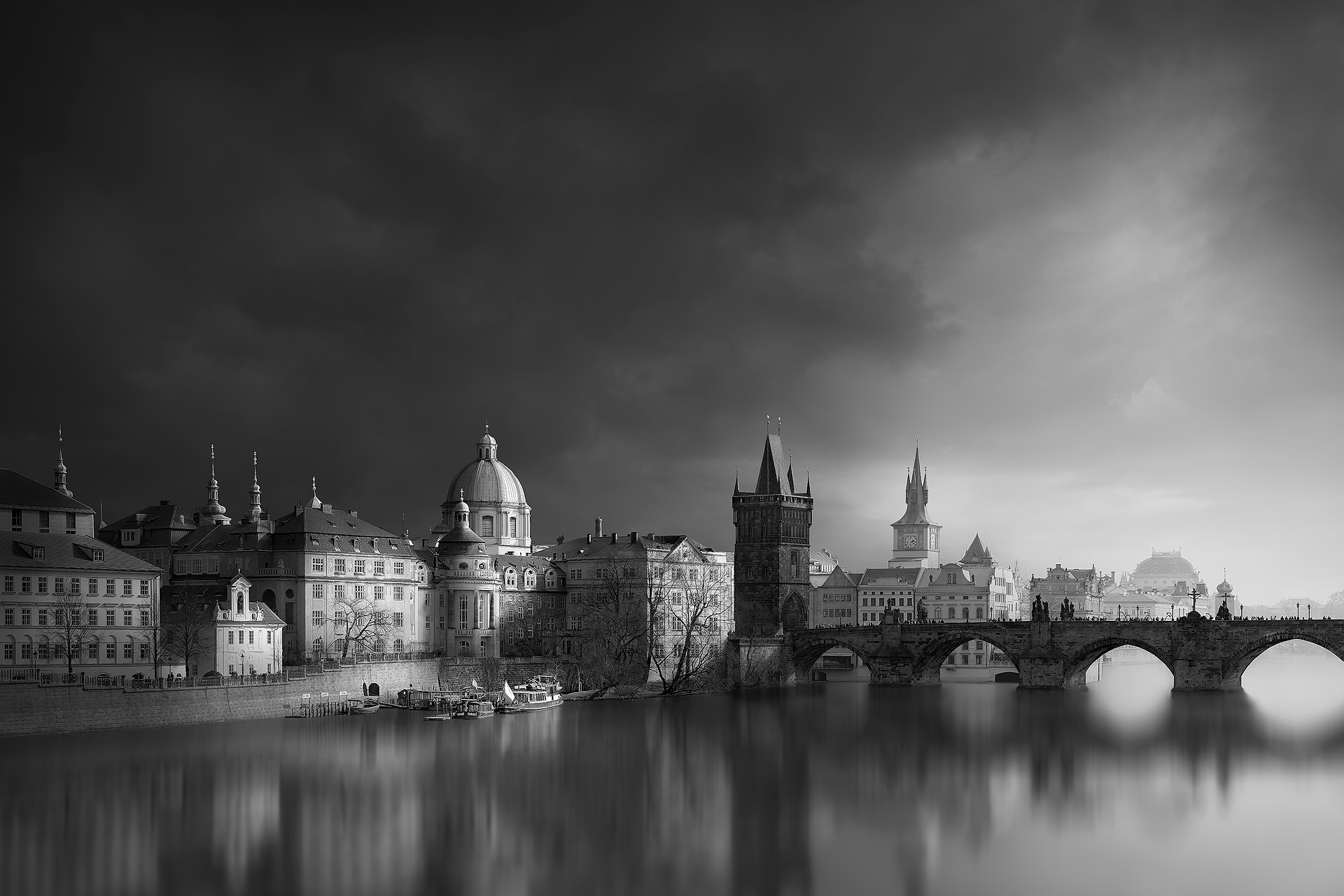

The Story: A beautiful, lonely, and isolated old building with a surreal and timeless feel. – Holborn Viaduct, London.
The Picture
The Feedback Loop: Subject Five.
The Photograph Is The Product.
Production Result: The Picture.
A Picture With Nothing To Say Says Nothing.
Tell the viewer something.
Your job as the photographer is to tell the viewer something. Would you read a book you gained nothing from? If you only record what you saw, you have made a statement of fact, not started a conversation. You have made no comment for the viewer to respond to, and a conversation with no comment is a dead end. It is like being told to cook your own meal at a restaurant. That is not the deal. The viewer has come to be given something, and handing them an unprocessed scene asks them to do your job, find their own story and decide for themselves why it matters. It leaves them all the effort and none of the reward.
Think of an ordinary conversation. Would you stay engaged with someone who had nothing worthwhile to say, or whose point you could not follow? You would politely look for a way out. Pictures are no different. Viewers leave a picture for the same two reasons: they do not understand what it is saying, or they find what it says dull and uninteresting. Both are failures of the story, not of the camera, the subject or the light. A story is not an extra added to a good picture. It is what the viewer came for, and it is the reward for looking. Without it, there is nothing to receive. Both can be fixed before the camera is raised.
Keep The Story Very Simple.
A picture is not a book.
A picture is not a book, so keep the story very simple. For six years from 2002, I documented the construction of Heathrow’s Terminal 5 in London, a £4 billion project, which meant project management, planning and photography. It was a wealth of little micro-stories, and none of the good ones were complicated. One was a construction worker whose body language said, “Sorry mate, you can’t come through here, I’m working,” as though he had the power to decide the fate of a jumbo jet. The worker stood for construction, the aircraft for the airport, and the exchange between them was funny. A simple story can make a simple picture imply a crazy scenario. Simple stories travel furthest.
What Are You Telling Me About The Subject?
Make me feel what you felt.
Don’t just show me what you saw. Tell me something interesting about what you saw. Suppose you photograph a waterfall. What is special about yours? What makes it different from any other waterfall? Is it enormous, with a powerful flow of water? Or very small, but in a beautiful place? Is it in a tranquil village, or isolated in lonely mountains? The waterfall is your subject. Your story is the feeling you want to convey: enormous, small, beautiful, tranquil, isolated or lonely. That is the feeling you had when you looked at the subject, and it is why you wanted to photograph it at all. Every subject has a quality like this, and finding it is the first step.
It is your job to make me feel what you felt. The picture isn’t about the waterfall; it is about how you felt about the waterfall. Two people can stand at the same waterfall with the same camera and tell completely different stories, because the story is not in the subject. It is in the quality you choose to emphasise. The subject tells the viewer what it is, or where you are. The feeling tells them why you cared. The camera records the water. Only the photographer can add the feeling. That feeling is the story, and without it the viewer has nothing to respond to. That is the opportunity. The next question is how to build it.
Production Knowledge: Editing Software.
Create The Story Logically.
The lighthouse.
Imagine you are at a lighthouse on the coast. The subject tells you what the picture should be. Ask yourself: what is the purpose of a lighthouse? Its purpose is to warn ships of the rocks in bad weather. Therefore the ideal picture includes the sea, because that is what the lighthouse is for, and shows the lighthouse in stormy weather, because that is when it matters. The three core components of the story fall out of that one question. The subject is the lighthouse. The context is the sea. The mood is stormy weather. Nothing had to be guessed or invented, because the purpose supplied the picture straight away. It sounds incredibly obvious, and it really is.
This logical process gives you what I call story clarity. You are no longer hoping that a good picture will arrive. You know what the picture must contain and what mood it needs before you have raised the camera. What remains is composition and timing, which means finding the position and then waiting for the weather, the light and the moment to match the story. Notice that the story came first and the technique second. A subject’s purpose is a reliable starting point, because it tells you which context belongs in the picture and which mood makes it make sense. Without this step, photographers often shoot first and look for a story afterwards, and very rarely find one.
Let’s imagine that I’m at a Lighthouse by the coast. The subject tells you “The Picture”. – Ask yourself, “What is the purpose of a Lighthouse”? “The purpose of a Lighthouse is to warn ships of the rocks in bad weather”. – Therefore, the ideal picture is: My picture must include the sea, because that’s the function of the Lighthouse, and I must show the Lighthouse in stormy weather, because that’s its purpose. The three core components of your “Story” are: The subject is “The Lighthouse”. The context is “The Sea”. The mood is “Stormy Weather”. It sounds incredibly obvious, and it really is. – This logical process instantly gives you “Story Clarity”. – Now, it’s just a matter of composition and timing. Waiting.
Subject, Context And Mood.
One picture, one story, one hero.
A picture is made of three elements: subject, context and mood. Combined, they form the basis of a story. Use word association. At the camera, break your composition down into the fewest possible words, and make one of them an adjective. A cottage (subject), mountains (context) and isolated (mood). A portrait might be person, room and happy. An event might be demonstration, London and violent. Reducing the scene to a handful of words tells you what the core components of your story are, and what everything else is. One picture, one story, one hero. If you cannot reduce it to a few words, the story is not yet clear. The adjective matters most, because it is the mood.
Mood Brings The Subject To Life.
Think of portraits. The physical subject only describes what the person looks like. Their mood, expression and surroundings tell me something unique about them; they bring them to life. What you show tells me what it is, or where you are. The mood tells me how you feel. A story means telling me something more than coldly and mechanically recording what you see. It is the difference between a description and a point of view, and the viewer can tell which one they have been given within a second or two of looking. Two portraits of the same person can tell completely different stories, one of confidence and one of doubt, without a single feature changing.
So identify a particular quality that makes your subject unique, emphasise it, and communicate it visually. Is it beautiful, ugly or mysterious? Old or modern? Big or small? The quality does not have to be dramatic. It only has to be true to the subject and clear to the viewer. Then use light to convey the mood you want viewers to feel, because light is how a viewer senses the quality before they have put a name to it. If you have nothing to say, you have no story, and no picture. Write the quality down in one word before you press the shutter, and every later decision, from where to stand to what to leave out, becomes easier.
Production Knowledge: Editing Software.
Every Picture Is A Play With One Lead Actor.
Think of your composition as a theatrical play. Your subject is the lead actor. The context is the supporting cast and the stage backdrop. The mood is the stage lighting. Together they need a visual hierarchy: order, structure and emphasis in proportion to the importance of each component. Your lead actor, the hero, is emphasised so that the viewer can identify them instantly. Build the whole picture around the lead actor and what you want to say about them. Everything else is downgraded to a supporting role. The stage lighting creates the mood, which is how you wish the viewers to feel. Without a hierarchy, every component competes, and the viewer cannot tell who the play is about.
The viewer then creates the story in their imagination. You provide the stage, the cast and the light, and they supply the meaning. That is the difference between a factual statement and a theatrical play. A factual statement says what is there, and the viewer files it away. A play makes the viewer a spectator who wants to know what happens next. Directing the picture means deciding who the lead actor is, what the supporting cast adds, and how the lighting should feel. Are your pictures factual statements, or theatrical plays? A quiet picture can still be a play, as long as one subject leads and the rest supports it. The drama is in the direction, not the subject.
Think of your composition as a theatrical play. Your subject is the lead actor. The context is the supporting cast and stage backdrop. The mood is the stage lighting. – We must create a “Visual Hierarchy”, order, structure and emphasis relative to the importance of each component. Your lead actor, the “hero”, is emphasised to make them instantly identifiable to the viewer. Build the entire photograph around the lead actor and what you want to say about them. Everything else is downgraded to a supporting role. The stage lighting creates your mood – how you wish viewers to feel. – The viewer creates “The Story” in their imagination. – Are your photographs just “Factual Statements” or “Theatrical Plays”?
The Purpose Of A Story Is To Stimulate The Mind.
Give clues, not answers.
Order, Structure, Emphasis and Simplicity are what we call Visual Efficiency. We also need Mental Stimulation, and it is only when you combine both that you create a great picture. Photographers commonly make a mistake: they believe good photography means easy-to-read clarity. But a picture that gives everything away leaves no work for the viewer. There is nothing to make them think, so it is understood at a glance and forgotten. That is why so many pictures look like postcards, and why postcards are so rarely remembered. Clarity is the journey, not the destination. It gets the viewer in, but it gives them no reason to stay. The photographer who delivers only clarity has done half of the job.
So make the viewer do some work. Your picture supplies the clues, not the answer; the viewer creates the answer in their imagination. Don’t be literal. Be slightly ambiguous, and create a feeling of mystery. Alfred Hitchcock built suspense by implying what he did not show, and the audience’s imagination did the rest. Show the evidence, not the event, and the viewer builds the event in their mind, along with the feelings that come with imagining it. Too much work overwhelms, and too little gives no reward. Aim for enough clues to make the viewer curious about what is not shown. The aim is a question in the viewer’s mind, not an answer on the page.
Don’t Overlook The Element Of Time.
Time is life.
The story may be about a static object. In my case it is old architecture; in yours, a landscape. Time is life. Without life, a picture feels dead, but inject time, and it comes alive. If the story is about a static object, let life come to you; don’t chase it. Compose the main subject and the overall stage, and then wait for fleeting light or a passing person to walk on. Be patient; it will happen. That momentary element changes the whole feel of the picture. Equally, the story may be a timeless feeling of having been there forever, in which case you want the opposite: stillness and calm, the feeling that nothing ever changes.
Production Knowledge: Editing Software.
A Story In One Scene.
Bringing it together
Imagine a long road crossing open country, with a single car on it. The road is the lead actor. The car is the supporting cast. The landscape is the stage backdrop, and the mood is the stage lighting. The car does a second job: it is the focal point, the place the eye goes first, and it is also the momentary element of time, because the car will not be there in a minute. Subject, context and mood are all present, the hierarchy is clear, and there is a clue about where the journey leads. Each part of the scene has one job, and every part serves the story. It can be described in a sentence.
Every Genre Tells A Story.
The principle stays the same; only the message changes.
The universal principle of the story is that pictures visually communicate information. Viewers enjoy the mental stimulation and emotional response they get from engaging with a picture. There are many genres: news, documentary, portrait, fashion, still life, landscape, architecture and more. All share the same goal, a story in some form. The principle remains the same; only the message changes. A news picture tells what happened. A portrait tells who someone is. A landscape tells how a place feels. A good story answers the viewer’s first question within seconds: what is this about? Each genre has its own form of story, but a story underpins the picture regardless of subject, style, colour or black and white.
The stimulation a story creates comes from the six triggers: Mood & Atmosphere, Connection, Symbolism, Ambiguity, Different and Time. A story does not need all of them. It needs one that is strong and clear. The waterfall worked through Mood & Atmosphere. The lighthouse worked through mood and through the connection between the tower and the sea. The construction worker and the jumbo jet worked through Symbolism and Connection, with a little humour. Which trigger you use matters less than choosing it deliberately, before the camera is raised and not afterwards. Choosing one deliberately also protects the picture from clutter, because a weak story tries to use them all.
The Story Is Where The Tutorial Comes Together.
Everything in this tutorial meets in the story. Human nature wants a reward, and the story is that reward: the purpose and benefit of looking. Human perception demands economy, so the brain’s filter asks five questions of every picture, and a clear story answers them. One hero and a clear hierarchy give Order, Structure and Emphasis. The mood gives Feeling and Atmosphere. The context gives Three-Dimensional Form and Distance, a real place to stand. Time gives life. A clue gives something Different. The triggers then decide whether the viewer stays, and the story chooses which of them to use. Each earlier idea now has a job to do. Nothing is added; it is all put to work in one picture.
The Art Principles are the tools that carry it out. Emphasis makes the lead actor obvious, Flow carries the eye to the supporting cast, Simplicity removes what has no part in the play, and Cohesion holds the production together. Light and tone supply the mood, and Contrast and Colour sharpen it. That is why the story is decided first: it tells you what to emphasise, what to remove, what light to wait for and what to leave unsaid. Without a story, the principles have nothing to serve, and a picture can follow every one of them and still say nothing. The story is the part no principle can supply for you. Test every decision against one question: does this serve the story?
Production Knowledge: Editing Software.
What Good Photography Is.
The photographer’s job is to communicate an idea or story to the viewer. Photography is a form of visual communication, with a visual language of its own. That means prioritising the picture and the viewer. The story your picture communicates is both its purpose and its benefit to the viewer, and its purpose is to make them think. To understand good photography, we have to look beyond our own enjoyment. We take pictures because we enjoy it, and that is a good reason. But a picture that rewards only the photographer gives the viewer nothing, and the viewer is the one who decides whether it succeeds. That is the point of everything that came before it.
Write The Caption Before You Shoot.
Think more. Shoot less.
To help you think more and shoot less, write a very short caption before you shoot that summarises your story. Your picture is then a simple illustration of that caption. Ask yourself three questions, in this order. The first gives you the subject, the second gives you the story, and the third gives you the context and the mood that carry it. If you cannot answer the second, the camera will not answer it for you, and no amount of composition or editing will supply what was never decided. A caption that fits in one short line is usually a story that is ready to be photographed. Keep it to one story and one hero.
What is the subject of my photograph?
What do I want to tell you about my subject?
How am I going to tell you that in a visual way?
One story. One picture.
Don’t just show me what you saw. Tell me something about what you saw. Do your pictures contain a story?
The Story: I want to show you the beautiful architecture of Prague Castle, Czech Republic, in the golden light of early morning. – Say something very simple, but say it very well.
To help Think More and shoot less: – Ask yourself this:
What is the subject of my photograph?
What do I want to tell you about my subject?
How am I going to tell you that in a visual way?
One story. One picture
Don’t just show me “what you saw”. – Tell me something about “what you saw”. – Do your images contain a story?
The Proof of Concept
“The Unified Theory of Image-Making”.
The Conclusion: The Proof of Concept.
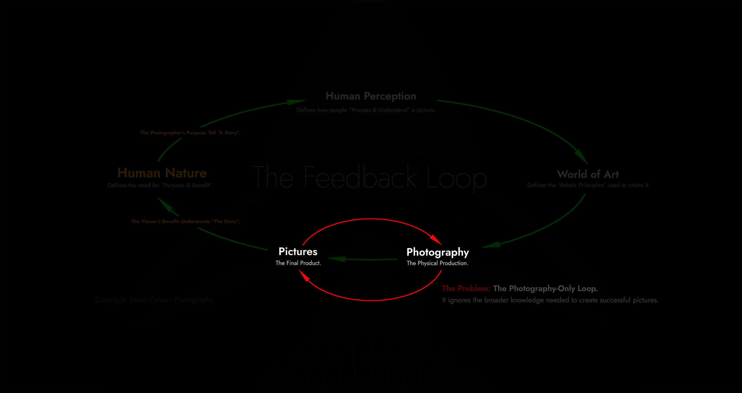
Look How Much Knowledge You Overlook.
The Loop Most Photographers Work In.
This is the diagram you met at the start, with three of its nodes switched off. What remains is Photography and Pictures, and an arrow that carries the photographer from one to the other and back again. It is the loop most photographers work in: take a picture, judge it by how it feels to you, adjust the tools or the technique, and take another. It is easy to see why. The tools, the technique and the result are all within reach, and every cycle feels like progress. But look at what the loop leaves out. Human Nature, Human Perception and The World of Art are greyed out, and they are the subjects that decide whether anyone else wants to look at the result.
A Loop With No New Information.
Nothing in the loop is wrong. Skill with the tools and skill in the technique both matter. The difficulty is where the judgement comes from. Inside the loop, the only person judging the picture is the photographer, and the measure is the photographer’s own enjoyment. The viewer, who decides whether a picture is kept, never enters the circuit. Pictures fail when the natural flow from pictures to people is broken, and the break usually happens outside photography, at the human or artistic level. The loop cannot see it, because nothing new ever enters it. Each pass repeats the same assumptions, so the same weaknesses return. The way out is not to abandon the loop, but to switch the other three subjects back on.
Look Beneath The Surface.
The picture is only the visible part, as the iceberg at the start of this tutorial showed. Everything below the waterline is knowledge, and the loop touches only the top of it: Photography, the production method. Beneath it lie the subjects the loop leaves out. The World of Art adds ten principles, tested by painters over centuries. Human Perception adds the brain’s filter, five questions it asks of every picture, and six triggers that give a viewer a reason to stay. At the foundation, Human Nature adds the purpose and benefit that explain why anyone looks at all. That is twenty-one questions and a three-part product test, and none of them depends on the tools you own.
Proof Of Concept.
A Theory Must Predict.
A theory is only useful if it predicts. This one makes a claim anyone can check: every successful picture is both Visually Efficient and Mentally Stimulating. The claim did not come from a single source. Science reached it by studying the brain’s filter, art reached it through the Art Principles, and the two routes met. That is evidence the claim is sound, but evidence is not yet a test. A test needs a prediction that could turn out to be wrong. If the theory is right, a picture that loses either quality should fail in a specific and visible way, and a picture that has both should be kept. Those outcomes can be observed in any picture.
The Prediction.
The prediction follows from the two requirements. If a picture fails Visual Efficiency, the brain’s filter rejects it quickly, and the viewer moves on without being aware of having decided. If it is efficient but not stimulating, the viewer understands it at once, has no reason to stay, and forgets it. If it meets both, the viewer keeps it, thinks about it and gains a reward from looking. That gives three outcomes, each tied to one gate: ignored at a glance, understood and forgotten, or kept. Notice that the theory names the failure before it is observed. It does not wait for a picture to fail and then explain why. That is what makes it testable.
The Method.
The method has two steps, and both use one picture. First, read the picture in the order the viewer does: the filter first, then the triggers. Every answer comes from lists you already have, so nothing new is introduced. Second, break the picture on purpose. Remove one principle at a time and see whether it fails at the gate the theory predicts. If the theory is right, each edit should push the picture towards ignored or forgotten, for a reason you can name. These are illustrations rather than experiments, and they are no substitute for testing your own pictures. They show how the theory behaves when it is put to work.
Decoding A Picture.
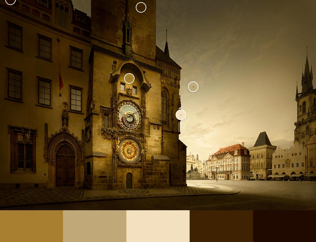
The Efficiency Read.
Start where the viewer starts, at the gate. The eye lands first on [the hero], the one place the picture says: begin here. Emphasis answers the first filter question, and Flow carries the eye from there along [the route] to the supporting elements, so the eye does not have to search. Simplicity has removed whatever did not belong, while Balance and Cohesion make the parts feel like one picture rather than several. Distance and 3D Form give the scene a place to stand in and give objects volume, so the brain can classify what it sees almost at once. Tone does the structural work: the picture holds its shape even when reduced to light and dark.
The Stimulation Read.
Once the picture has passed the gate, it has to give the viewer a reason to stay. The mood is [mood word], and it is felt before any detail is understood. [Name the strongest trigger: Connection, Symbolism, Ambiguity or Time] gives the viewer something to work out, so thinking begins. One element is [different], a small disruption in an otherwise predictable scene, which moves the picture from fast, automatic processing to conscious attention. The story is one subject, one context and one mood, and each carries the same message. The viewer supplies the rest. This is where understanding turns into engagement, and where a picture earns a longer look.
The Product Test.
Now compare the result with the product test. The purpose is the story the picture tells. The benefit is what the viewer receives from reading it: a feeling, a connection, a question or a moment worth keeping. The end user is the viewer, who has spent a little time and attention and been given something in return. Nothing was added for the photographer’s own enjoyment of the process. Every element was doing a job the lists predict, and each job can be named. That is what a decoded picture looks like: not a mystery of talent, but a set of decisions that can be checked. The next step is to see what happens when they are removed.
Breaking The Picture.

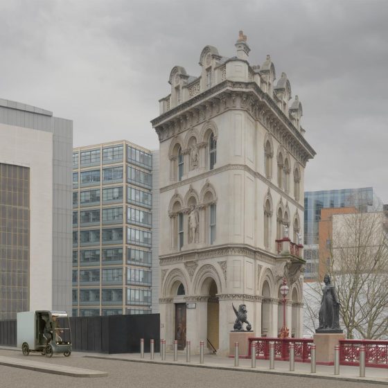
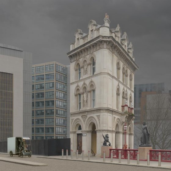
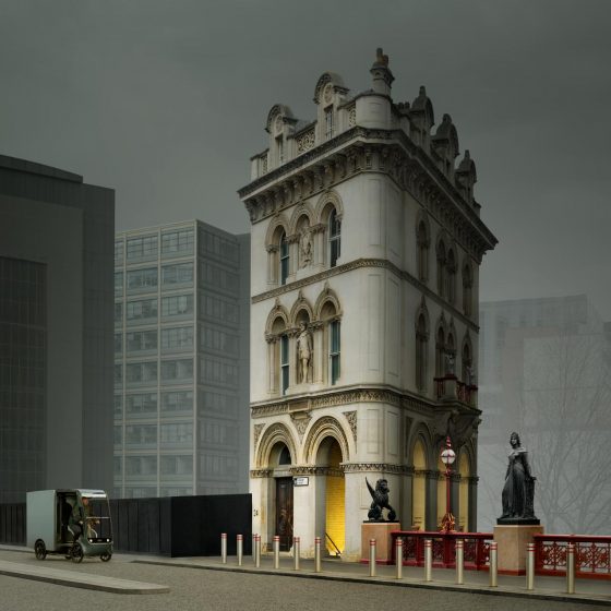
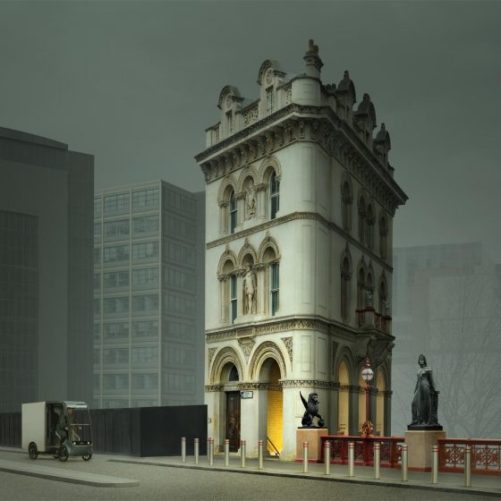











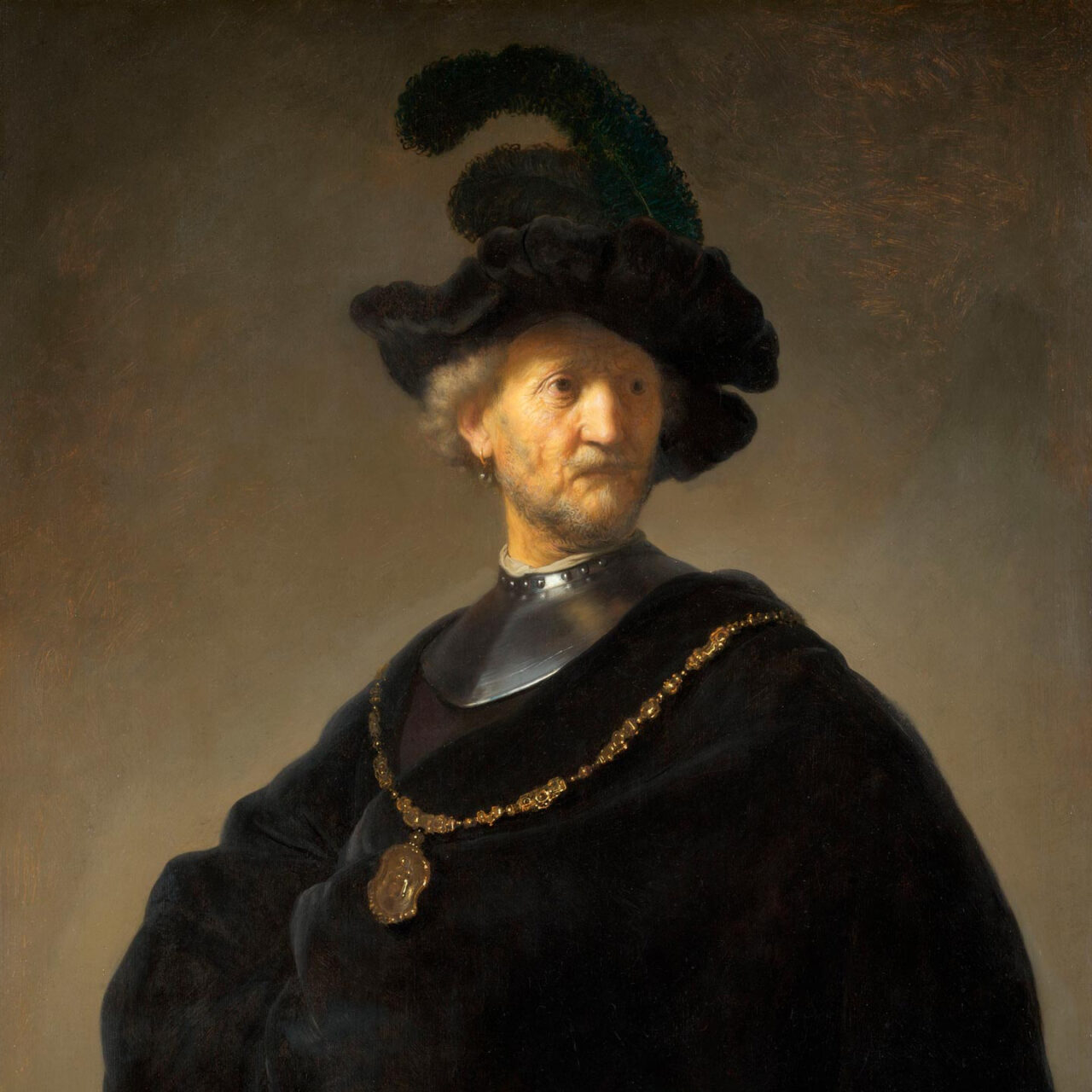
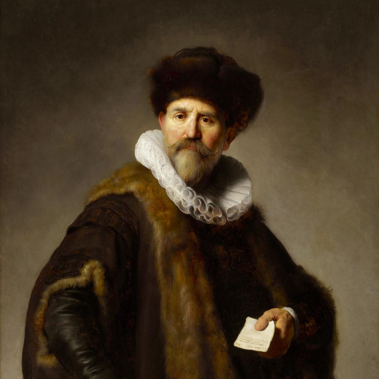
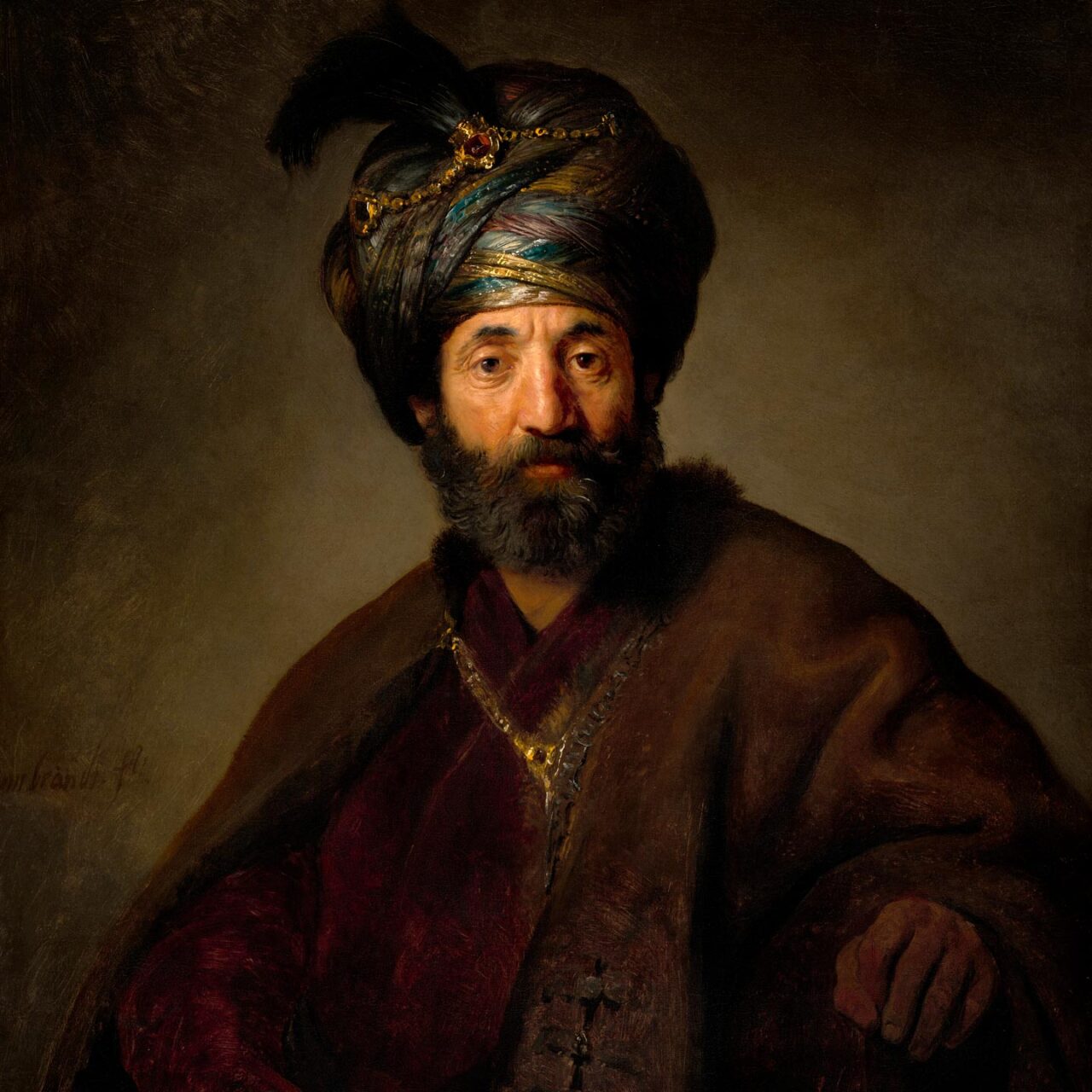
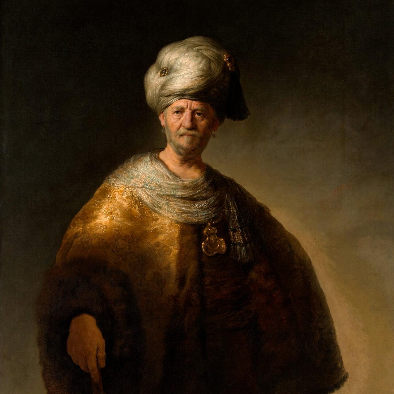
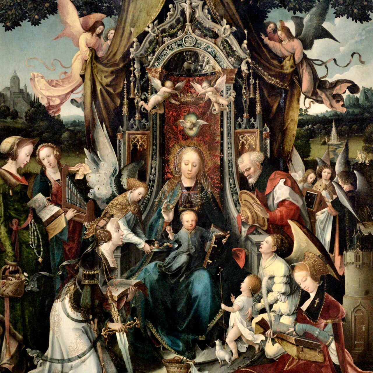
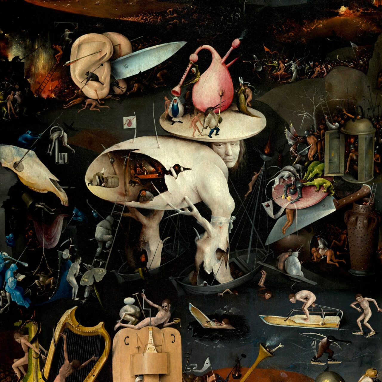
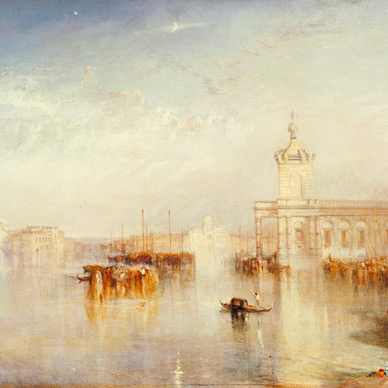
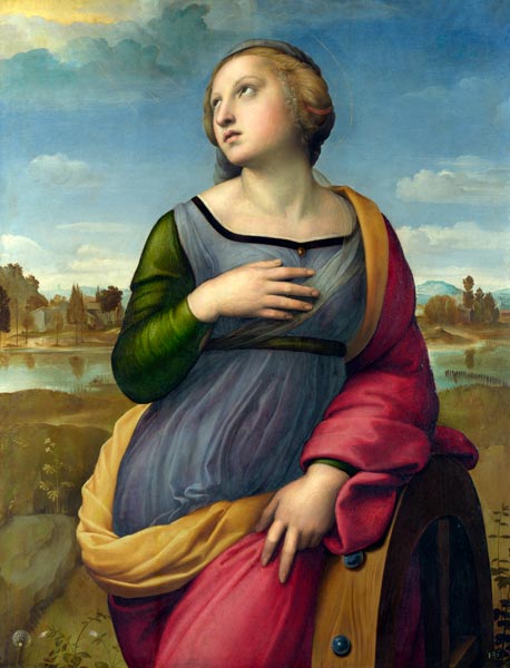
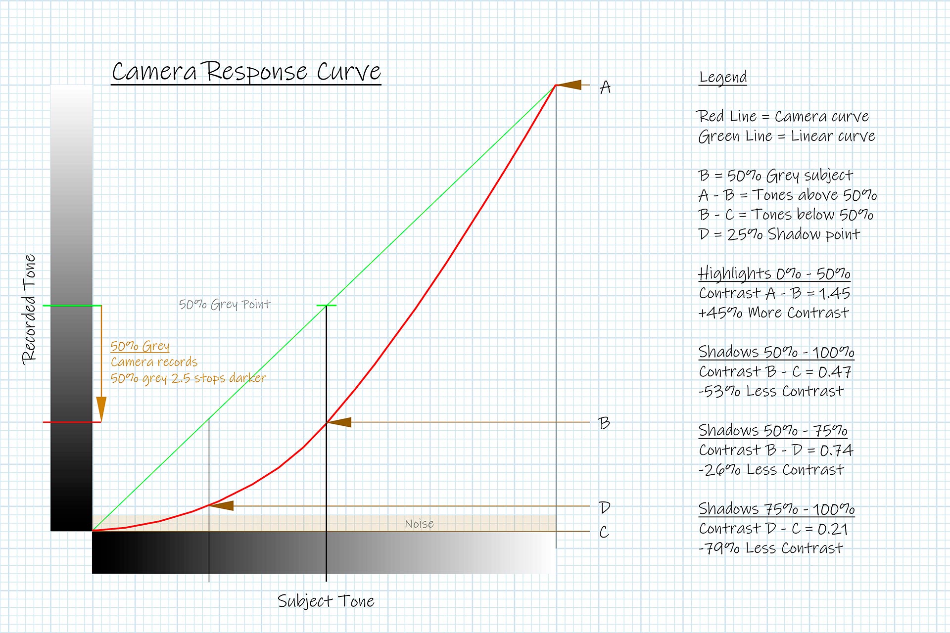
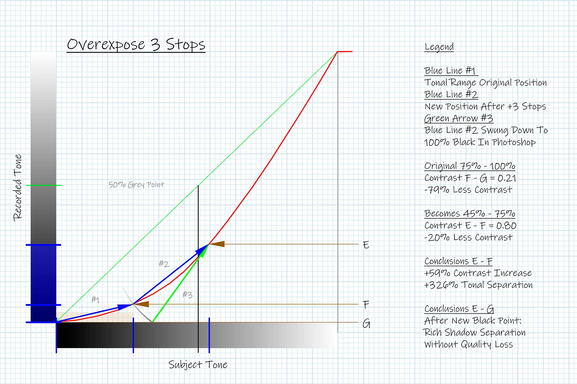
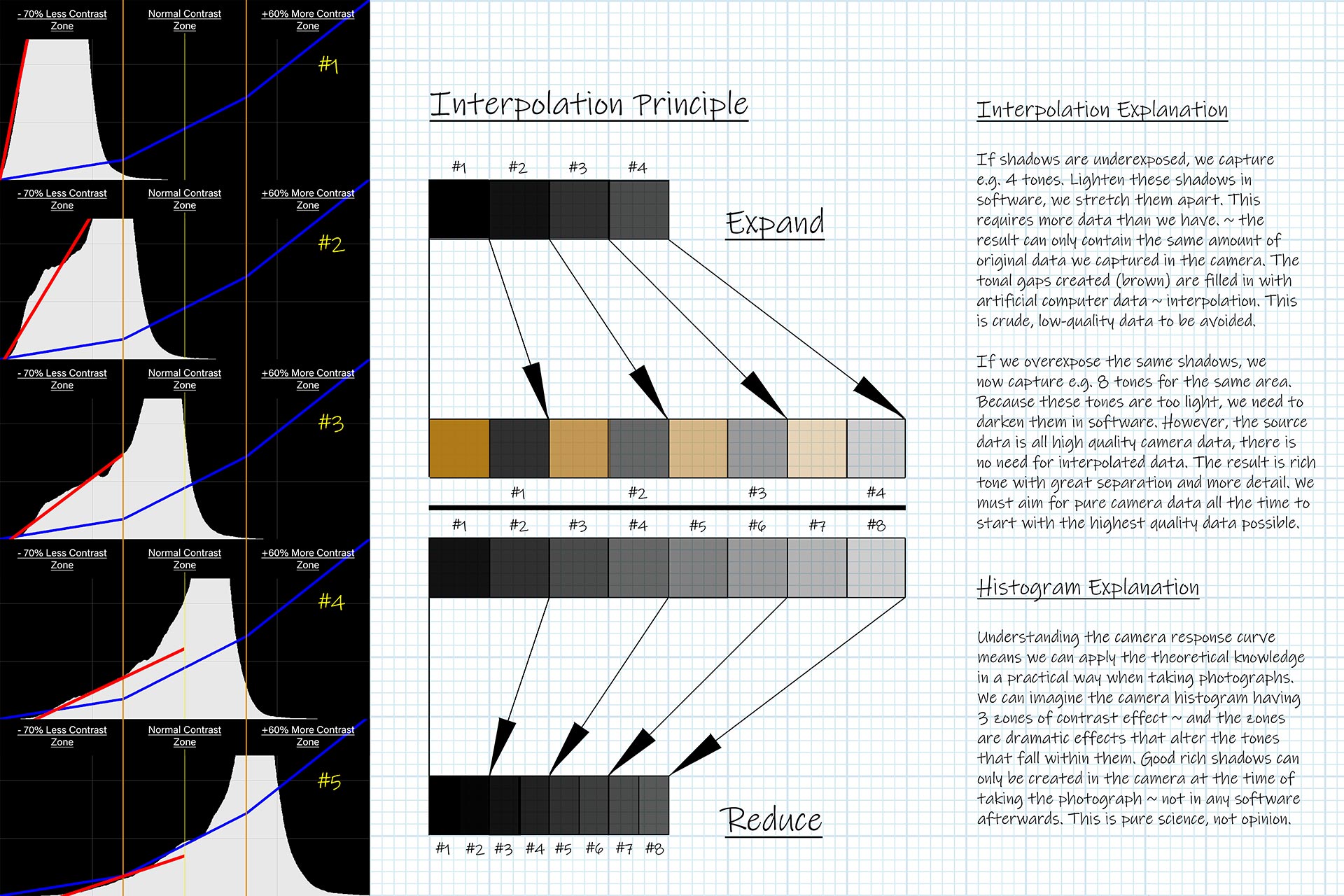

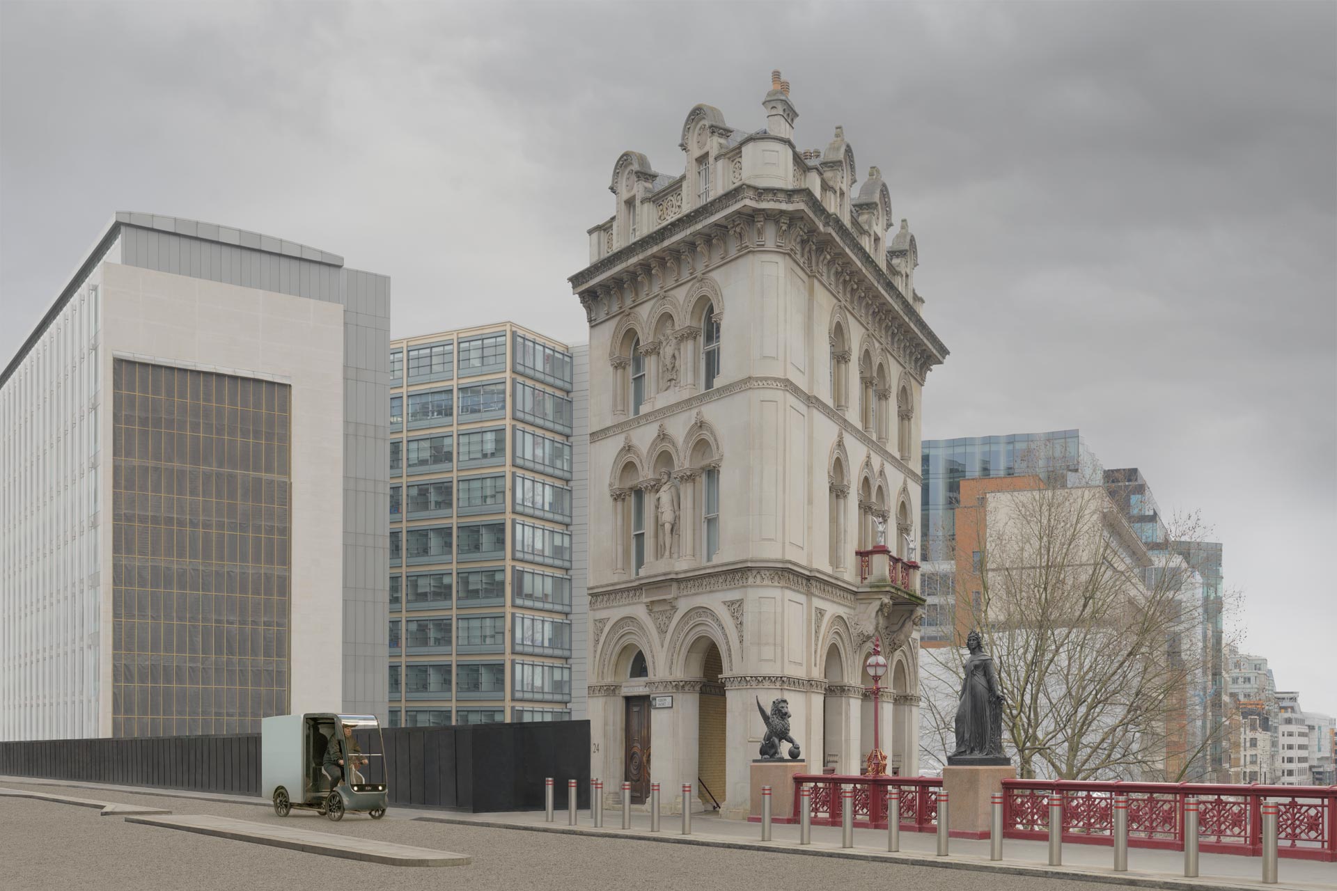
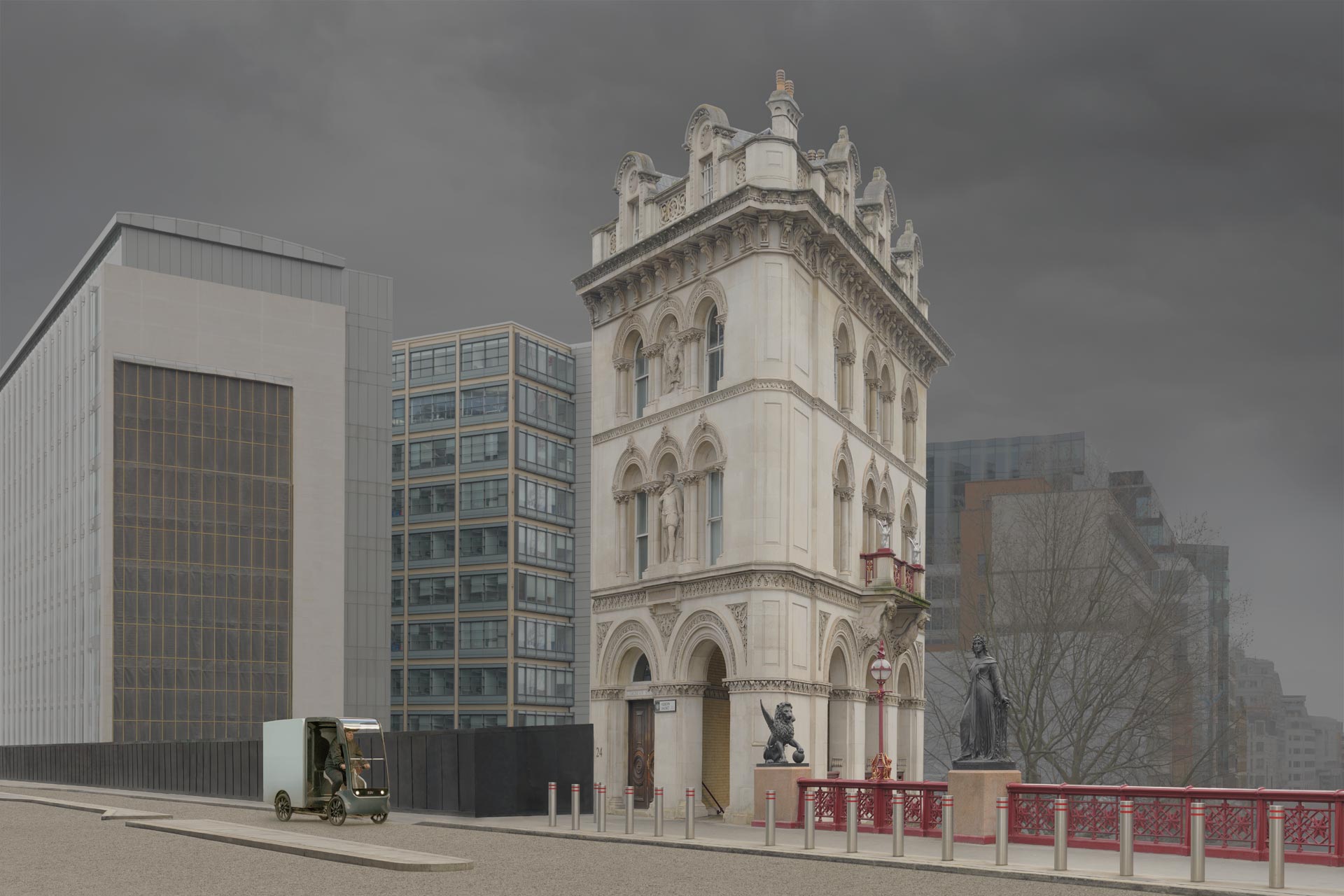
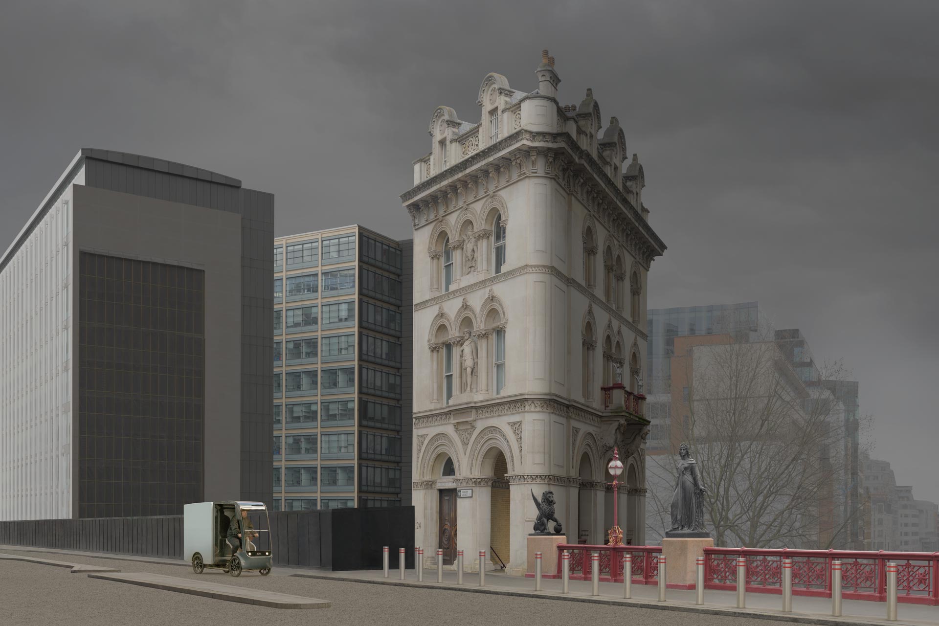

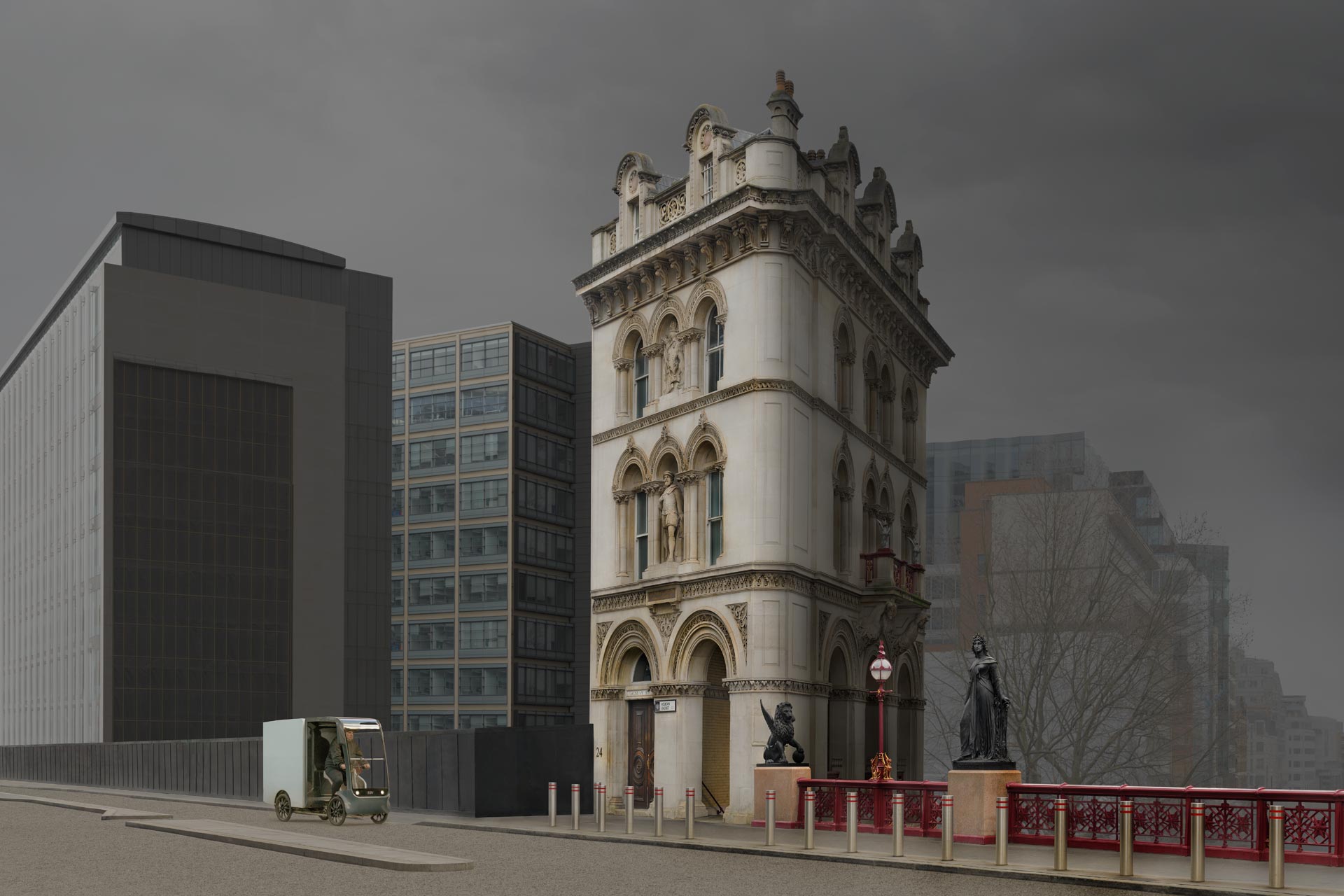
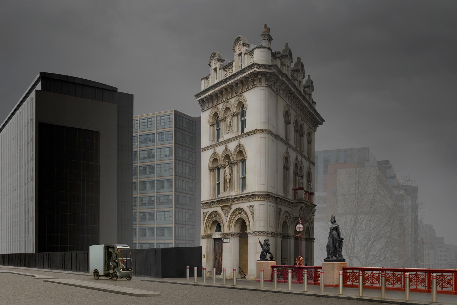
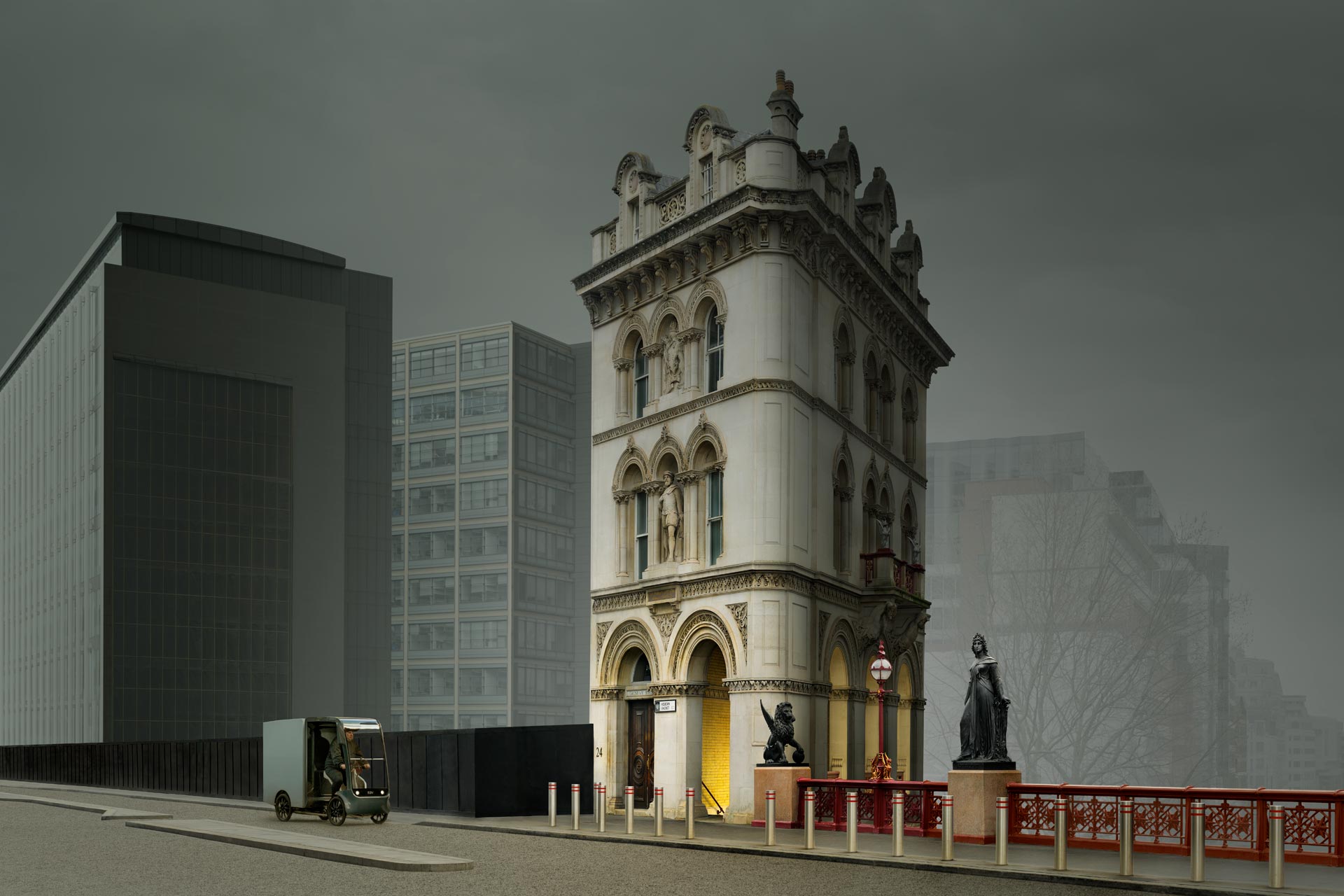
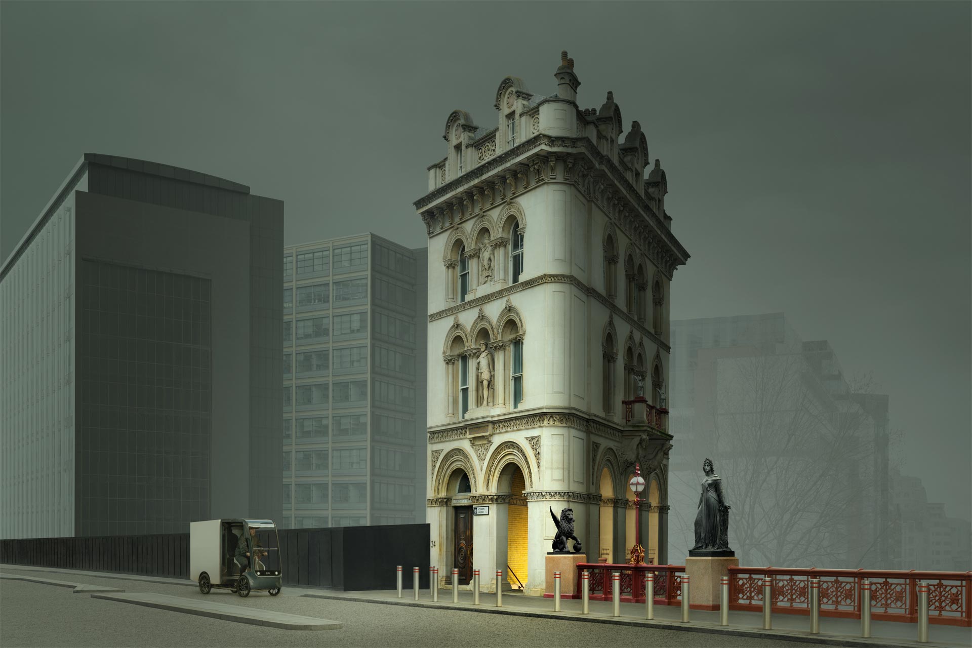
One Change At A Time.
Take the same picture and change one thing. Add clutter, remove the emphasis, flatten the light, collapse the distance, or let colour take the lead. Each version removes one principle and leaves the rest alone. The theory makes a prediction for each edit, stated before you look: which gate the picture should now fail, and how. This is the difference between explaining a failure afterwards and predicting it beforehand. Afterwards, any explanation sounds convincing. Beforehand, the prediction can be wrong. Check each prediction against what you see, and notice how often the failure arrives where the theory said it would.
What The Theory Predicts.
• Clutter added. Simplicity is lost, so the eye must sort before it can read. Predicted: ignored at a glance.
• Emphasis removed. There is nowhere to begin, so the brain searches, then moves on. Predicted: ignored at a glance.
• Light flattened. Mood and form fade, so the picture is understood and then forgotten. Predicted: forgotten.
• Distance collapsed. The scene stops feeling like a real place, so the brain gives it less weight. Predicted: ignored or forgotten.
• Colour leading. Tone and structure are hidden behind colour, so form weakens and the picture loses solidity. Predicted: forgotten.
Illustrations, Not Experiments.
These are illustrations, not experiments. One picture and one photographer cannot establish a law, and the edits were chosen to show each principle clearly. They are useful for a different reason: they let you watch the theory work on a picture you know well. Try the same with your own. Remove the emphasis from a favourite picture, or crop out the one thing that carries the mood, and notice how the picture changes. If the theory is wrong, you will find a picture that survives. If it is right, you will see for yourself why it matters. Either result is worth having.
Why Good Pictures Stay Average.
The Plateau.
Many photographers, like many painters and designers, reach a stage where their pictures are technically sound and still not special. Technique, finish and composition are in order, and yet the pictures get a polite nod rather than a second look. Improvement slows because the cause is not in the tools. The theory predicts two kinds of failure: the picture is ignored at a glance, or it is understood and forgotten. Seven common patterns show how that happens. Each one is a version of one of those failures, and each has a cause you can name and a test you can try in a minute. The useful question is never “what is wrong with this picture?” It is “which gate did it fail?”
Seven Patterns.
| Pattern | What you see, and why | One-minute test | Look at |
| 1. The Postcard | Technically perfect and understood at once, then forgotten. The cause is a missing story: there is no clear mood, no connection and no gap for the viewer to fill, so nothing invites a longer look. It passes the efficiency gate and fails the stimulation gate. | Name the mood in one word. If you cannot, the viewer cannot either. | Choose a trigger first, and ask what the viewer is meant to feel or work out. |
| 2. The Everything Shot | Everything is included and nothing comes first. The cause is weak Emphasis and too little Simplicity, so the brain has to sort before it can read. It fails at the gate: ignored at a glance. | Squint. What stands out? If nothing does, or several things compete, the eye has no place to begin. | Decide the hero, then remove what does not support it. |
| 3. The Flat Day | The scene is there but the picture lacks life. The cause is weak 3D Form and Distance and a thin tonal structure, so objects look like shapes and the scene looks like a surface. | Look at it in greyscale. Does it still have volume and depth, or does it collapse? | Look at where light and dark describe form, and where they do not. |
| 4. The Wandering Eye | The eye lands on the subject, then leaves. The cause is weak Flow: nothing leads on from the hero, so the eye drifts to an edge and out of the frame. | After the first point, where does your eye go second? If it leaves the picture, the route is broken. | Look for lines, edges and glances that carry the eye inwards. |
| 5. The Colour Crutch | The picture depends on colour to hold attention. The cause is working in colour first, which draws attention away from three-dimensional form and structure, so a weak structure can go unnoticed. | Look at it in greyscale. If it falls apart without colour, the structure was never there. | Judge tone and form first, then let colour enrich them. |
| 6. The Private Picture | It means a lot to you and little to anyone else. The cause is personal memory: the meaning lives in your head, and the picture does not carry it to a stranger. | Show it to someone who was not there. Ask what they felt and what they think it is about. | Ask what a stranger would find in it. |
| 7. The Repeat | The same picture again and again. The cause is little Variation and nothing new or different: the brain predicts it, confirms the prediction and moves on. | Lay ten of your recent pictures side by side. If they look like one picture, a viewer’s brain will treat them as one. | Ask what in this picture the viewer would not predict. |
Five Tests In Five Minutes.
The Squint Test.
Half close your eyes until the detail dissolves into masses of light and dark. What remains is what the brain receives first. If one area still stands out, the picture has Emphasis. If nothing does, or several compete, it does not. If your eye drifts straight off the edge, Flow is weak. The squint test takes five seconds and removes the distraction of detail, which is why painters have long used it. A picture that fails it will usually be ignored at a glance, because the brain makes the same reduction before it decides whether to look any further. Try it on your last ten pictures and keep a note of the ones that survive.
The Greyscale Test.
Remove the colour and look again. Tone carries most of a picture’s structure, so if it holds its form, depth and mood in grey, the foundation is sound and colour will enrich it. If it falls apart, colour was hiding a weak structure. This is the same order painters worked in when they laid in tone before colour. Greyscale also shows whether the light is doing its job. Flat grey means flat light, little form and little mood. A picture that passes this test usually reads quickly. One that fails it often feels dull without anyone being able to say why.
The Stranger Test.
Show the picture to someone for three seconds, then take it away. Ask two questions: what did you see first, and how did it make you feel? The first answer tests Emphasis and the second tests Mood & Atmosphere. If they name your hero, the efficiency is working. If they name a feeling, the picture has begun to stimulate. If they shrug, ask what they remember an hour later. Choose someone who will tell you the truth and who does not know what you intended. Their answers show how the picture performs without the photographer’s knowledge of what was meant, and that is the knowledge a viewer never has.
Check Your Last Picture.
How To Use It.
Choose one recent picture and answer ten questions honestly, yes or no. The first six check the gate. The last four check whether the picture gives the viewer a reason to stay. Each question comes straight from the lists in this tutorial, so there is no new theory to learn. Judge the picture as a stranger would, not as the photographer who remembers being there. Five or more yes answers in the first group means the picture is likely to pass the filter. One strong yes in the second is enough, because a story needs only one trigger that is strong and clear. This is a check against the theory, not a measure of quality in general.
The Ten Questions.
Visual Efficiency: does it pass the gate?
☐ 1. Can you say where the eye lands first? (Emphasis)
☐ 2. Does the eye have a route from there? (Flow)
☐ 3. Is every element earning its place? (Simplicity)
☐ 4. Does the picture feel like a real place, with objects that have volume? (Distance, 3D Form)
☐ 5. Does it hold its structure in greyscale and at thumbnail size? (Contrast, tone)
☐ 6. Do the parts feel balanced and as if they belong together? (Balance, Cohesion)
Mental Stimulation: does it give a reason to stay?
☐ 7. Can you name the mood in one word? (Mood & Atmosphere)
☐ 8. Is there something to work out: a connection, a symbol or a gap? (Connection, Symbolism, Ambiguity)
☐ 9. Is anything different or unexpected, and does it earn the attention? (Different)
☐ 10. Is there life, a moment, or a sense of time? (Time)
What Your Answers Mean.
• Fewer than five yes in the first group: the picture is likely to be ignored at a glance. Return to Emphasis, Flow and Simplicity first.
• Five or more in the first group, but no strong yes in the second: the picture is likely to be understood and forgotten. Return to the triggers and choose one.
• Five or more in the first group and at least one strong yes in the second: the picture has both qualities, and it is likely to be kept.
Your Next Step.
If Your Pictures Are Ignored At A Glance.
Work on a single emphasis point in every picture for one month. Before you begin, say what the hero is, and check that nothing else is competing with it. At the end of each week, choose your best three pictures and run the squint test on them. You are training the first habit the filter rewards: knowing where the viewer should look. Keep the exercise small. One principle at a time is enough to see a change, and every other principle depends on this one.
If They Are Understood And Forgotten.
Write a one-line caption before you start, using subject, context and mood, and name the trigger the picture will use. Then imagine the picture is a still from a film: what is the story, and what scene does it set? At the end of the month, show your best five pictures to someone who was not there and ask what they felt. You are training the second habit: giving the viewer a reason to stay. A short caption is the quickest way to find out whether the story exists. If you cannot write it, the picture is not ready to be made.
If They Are Kept.
Keep going, and go deeper. Take one of your best pictures and decode it as the earlier picture was decoded: filter first, triggers second. Then ask what you would remove to make the story clearer. Pictures that already work have room to improve in precision. Look for the principle you rely on too often and the one you rarely use. Variation and Time are common gaps, because both ask you to wait. Choose one and practise it until it becomes a habit. The aim is not more pictures that work. It is fewer pictures that you had to rescue.
Full Circle. xxx.
A Theory For Anyone Who Makes Pictures.
Pictures that stop, captivate and reward.
This tutorial was written from a photographer’s chair, because that is where I work, but the theory belongs to anyone who makes pictures. Swap photographer for painter, illustrator, graphic designer or art director, and the argument still holds. The viewer is the same, the brain is the same and the principles are the same. Only the production method differs. It is all about the picture, not the tools: a brush, a camera or software. That brings us back to where the tutorial began. Human Nature wants a reward, and a picture gives one when it has a purpose and a benefit for the person looking. That person, not the maker, decides.
Your Own Vision & Style.
You met this earlier, in Vision & Style, and it matters most now. Knowledge does not dictate your style. It gives you the fundamentals, and how you apply them is what makes the style yours. Instruction usually either concentrates on technique or shows you someone else’s style to copy. Neither gives you the groundwork to find your own. The principles apply to pictures, not to a subject, a genre or a medium, so they are within everyone’s reach. Use the Art Principles as guidelines, not rules. Where you choose to bend them, and why, is where a personal style begins. Knowledge removes guesswork, and guesswork causes failure.
Remember The Bridge In Venice?
At the start of this tutorial, strangers with no photographic knowledge reacted to the same photographs in the same way. That was not luck, and it was not about talent, theirs or mine. It was human perception, doing what you have now studied. You know why it happened, and you know how to make it happen deliberately in your own pictures. Every time you complete the loop, you return to Human Nature with a little more understanding than before. The mechanism stays the same for the rest of your life. You do not. Stop, captivate and reward your viewer. Think more. Shoot less. The three greyed-out subjects are switched on, and your pictures can now be made for the person looking.
The Theory On One Page.
Why Some Pictures Work – And Others Don’t.
Human Nature wants a reward: purpose and benefit. Human Perception demands economy. A good picture delivers both: Visual Efficiency & Mental Stimulation.
The Filter: The Brain Principles
What gives the viewer a reason to stay? One strong trigger is enough.
| Mood & Atmosphere | What does it feel like? Felt before it is understood. |
| Connection | What is the relationship between the elements? |
| Symbolism | What does it stand for? Needs shared knowledge. |
| Ambiguity | What is missing for the viewer to fill in? |
| Different | What is unexpected? |
| Time | What moment is this? What came before, and what comes next? |
Not Memory: personal, not universal. Not Design: design makes a picture easy to read, not worth reading.
The Mental Stimulation Triggers
What gives the viewer a reason to stay? One strong trigger is enough.
| Mood & Atmosphere | What does it feel like? Felt before it is understood. |
| Connection | What is the relationship between the elements? |
| Symbolism | What does it stand for? Needs shared knowledge. |
| Ambiguity | What is missing for the viewer to fill in? |
| Different | What is unexpected? |
| Time | What moment is this? What came before, and what comes next? |
Not Memory: personal, not universal. Not Design: design makes a picture easy to read, not worth reading.
The Art Principles
The tools. Guidelines, not rules.
| Emphasis | Where do I look first? |
| Flow | Where does the eye go next? |
| Distance | Where am I? |
| 3D Form | What is it? |
| Contrast | What stands out against what? (tonal and opposite) |
| Colour | Which colour leads? Is the palette limited? |
| Variation | Does every area change, even a little? |
| Simplicity | What can I remove? |
| Balance | Do the visual weights feel right? |
| Cohesion | Does it work as one picture? |
The Product And The Story
Every product has three parts. Every story has three parts.
| Product | Purpose? Benefit? End user (the viewer)? |
| Story | Subject? Context? Mood (one adjective)? |
| Caption, before you start | What is the subject of my picture? What do I want to tell you about my subject? How am I going to tell you that in a visual way? |
One story. One picture. One hero.
The Picture Check Card.
Ten questions for any picture. Answer as a stranger would.
Visual Efficiency: does it pass the gate?
☐ 1. Can you say where the eye lands first? (Emphasis)
☐ 2. Does the eye have a route from there? (Flow)
☐ 3. Is every element earning its place? (Simplicity)
☐ 4. Does the picture feel like a real place, with objects that have volume? (Distance, 3D Form)
☐ 5. Does it hold its structure in greyscale and at thumbnail size? (Contrast, tone)
☐ 6. Do the parts feel balanced and as if they belong together? (Balance, Cohesion)
Mental Stimulation: does it give a reason to stay?
☐ 7. Can you name the mood in one word? (Mood & Atmosphere)
☐ 8. Is there something to work out: a connection, a symbol or a gap? (Connection, Symbolism, Ambiguity)
☐ 9. Is anything different or unexpected, and does it earn the attention? (Different)
☐ 10. Is there life, a moment, or a sense of time? (Time)
Outcomes
• Fewer than five yes in the first group: likely to be ignored at a glance.
• Five or more in the first group, no strong yes in the second: likely to be understood and forgotten.
• Five or more in the first group and one strong yes in the second: likely to be kept.
A check against the theory, not a measure of quality in general.
Retouching: The camera will not give you these beautiful, subtle, rich tones; only retouching will. – It’s called “Tonal Painting”.

David Osborn Photography
69 Grange Gardens, Southgate,
London N14 6QN, England.
UK +44 (0) 771 204 5126